
Caisse d’Épargne Riviera
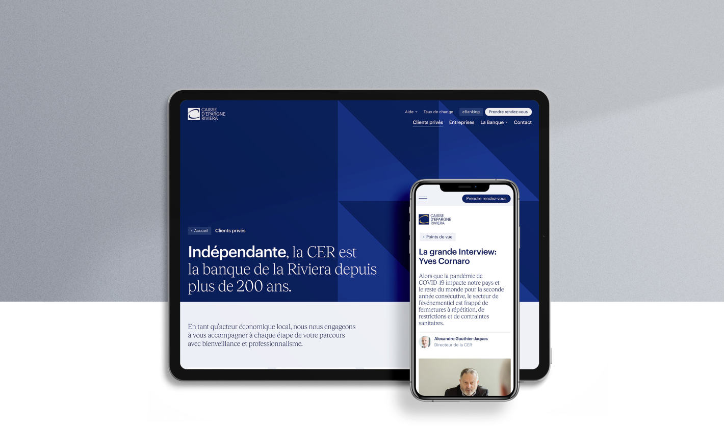
A website and a campaign for CER
A new website and advertising campaign for the Caisse d'Epargne Riviera
cer.chBranding
- Brand values
- Positioning
Design
- Interaction design
- Visual design
Project management
- KPIs and performance monitoring
- Measurements and reporting
Web Development
- JavaScript development
Branding
- Brand values
- Positioning
Design
- Interaction design
- Visual design
Project management
- KPIs and performance monitoring
- Measurements and reporting
Web Development
- JavaScript development
Caisse d’Epargne Riviera (CER) has been supporting Riviera residents and local businesses in achieving their ambitions for over 200 years. As an independent company rooted in the community, CER actively engages in its initiatives—a philosophy we share at Antistatique. We are thrilled about this collaboration.
Comprehensive Approach
Our support for Caisse d’Epargne Riviera (CER) included developing their brand identity, creating their new website, and launching an awareness campaign. This collaboration provided an opportunity to showcase our expertise and diverse skills in strategy, branding, design, web development, and marketing campaigns.
CER primarily serves individuals and businesses in the Riviera region, offering personalized and independent guidance.
Brand Platform
We worked on CER's brand identity to refine its positioning and ensure precise communication. This thorough process led to the creation of a manifesto, which guided our decisions throughout the project.
Brand Awareness Campaign
Brand Awareness Campaign
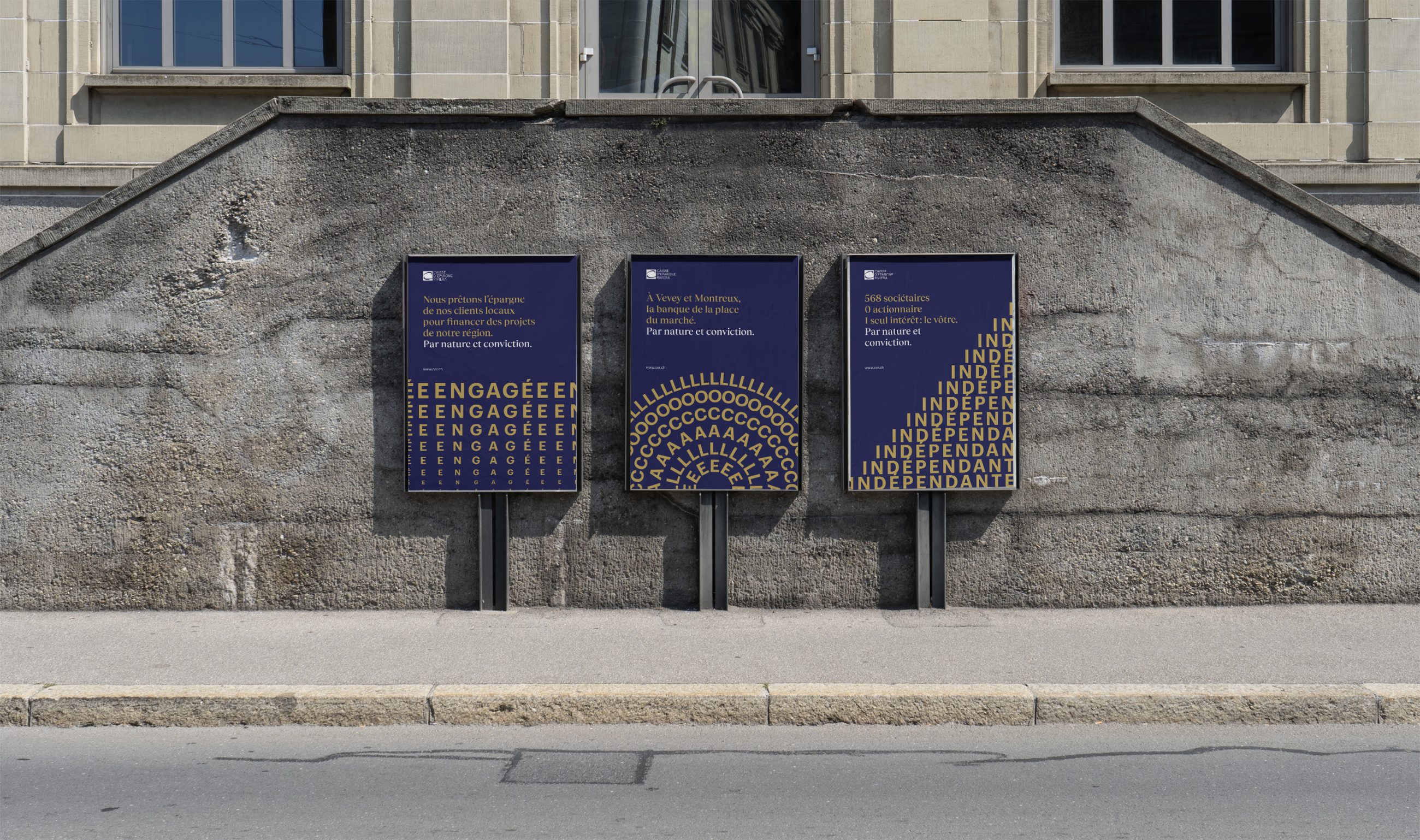
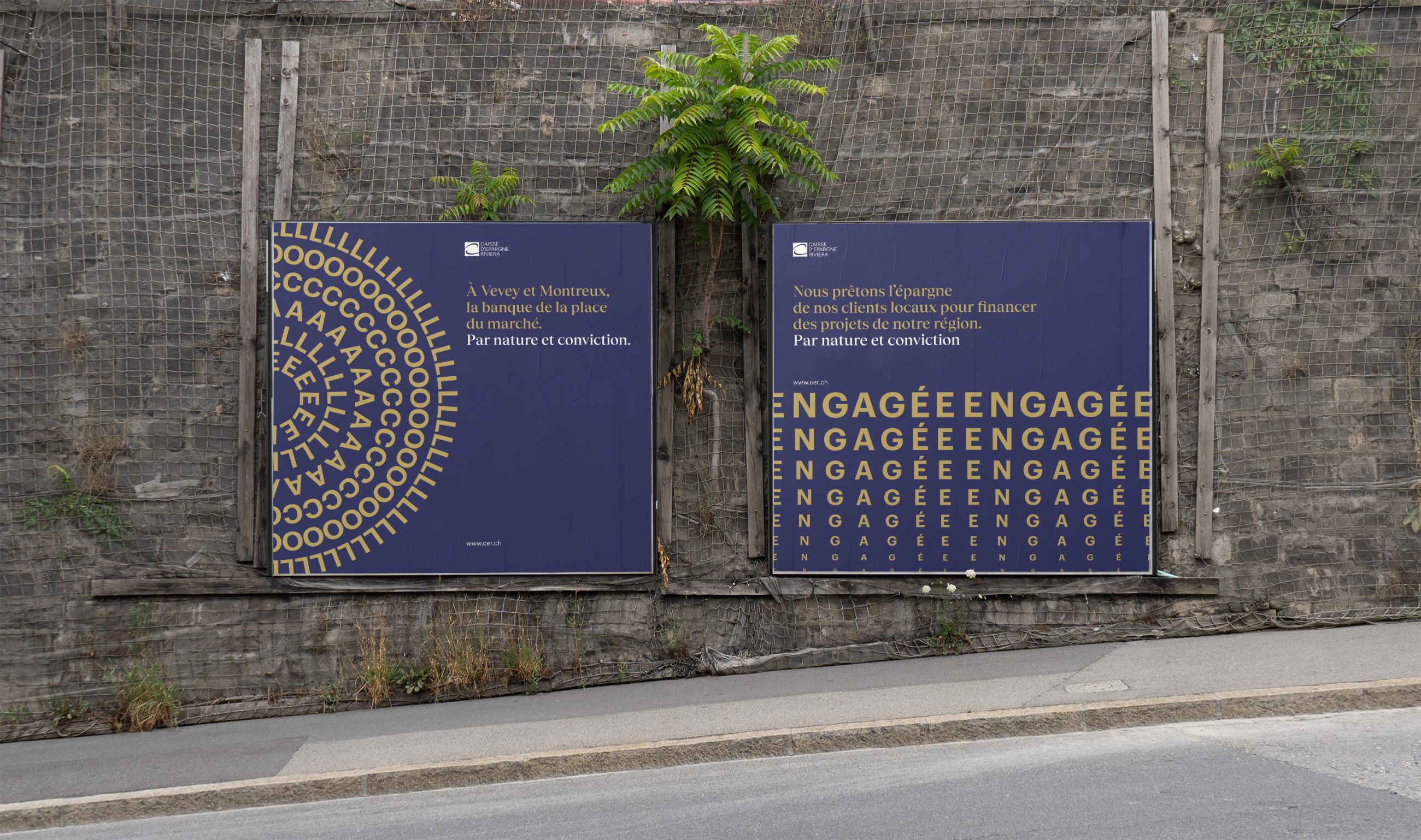
Our challenge was to create a distinctive and impactful communication campaign without using images or illustrations, while adhering to Caisse d’Epargne Riviera's brand guidelines. We developed a series of static and animated visuals inspired by the bank's values and brand identity.
CER Objectives
Caisse d’Epargne Riviera (CER) distinguishes itself through its strong customer relationships, knowing and supporting them over the long term. Its primary goal is not to massively increase the number of clients but to build lasting partnerships and foster loyalty.
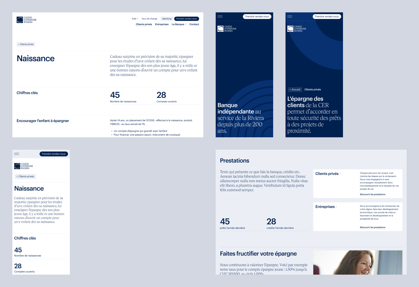
An essential feature of the new website is its user-friendly design, particularly for easy contact. Specific components were designed and integrated to enhance the user experience.
The site also offers the convenience of scheduling appointments online via agenda.ch, a significant advantage for busy individuals or those visiting the site outside of business hours.
The site's design is clean, intuitive, and fast, facilitating contact establishment as human relationships remain paramount, especially in financial matters.
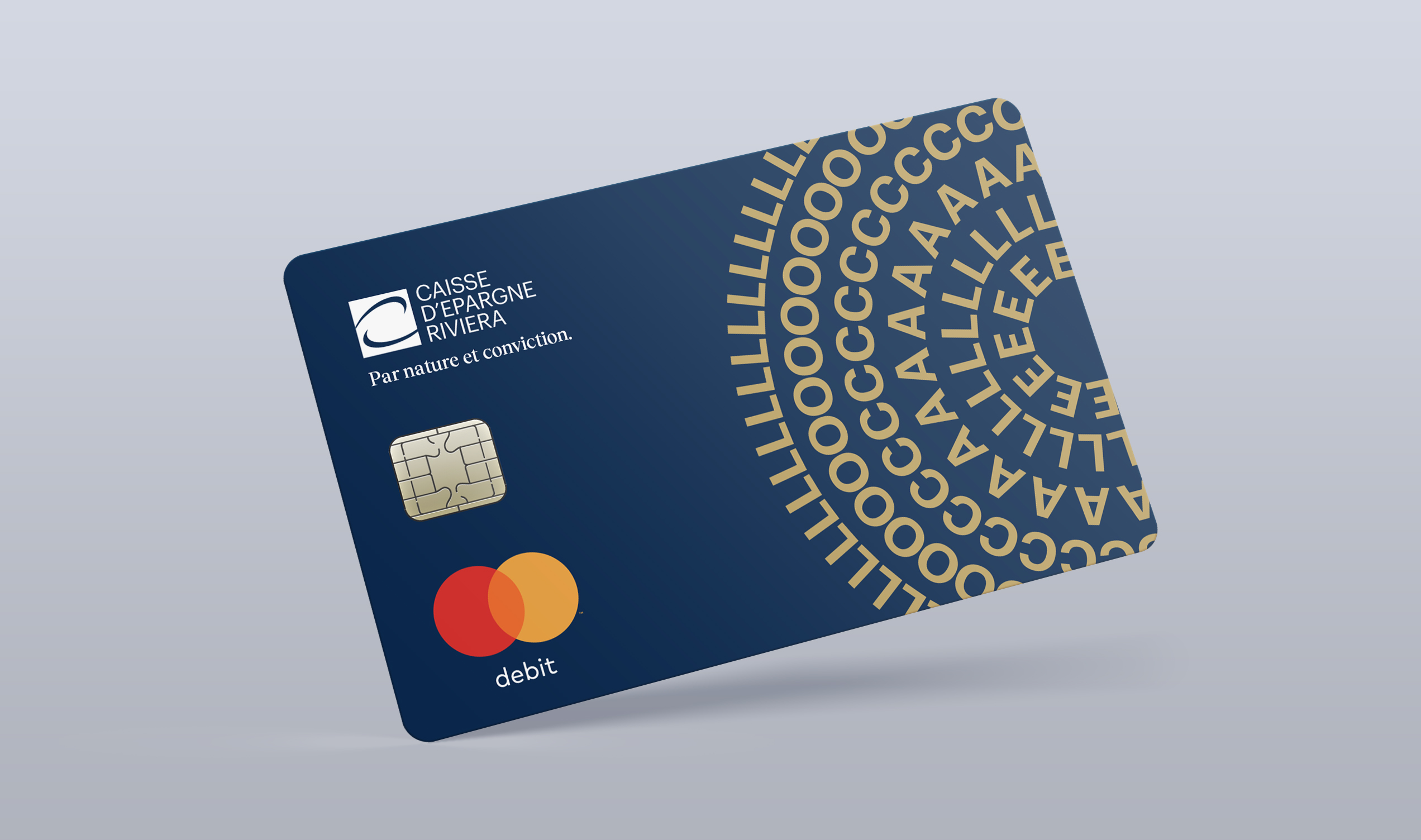
We used the keywords "Engaged," "Local," and "Independent" to create playful and elegant graphic compositions that reflect the essence of each concept.
To enhance the impact and understanding of the campaign, we also created a slogan for each visual.
We are proud of the result, which combines effectiveness, simplicity, and potential for future adaptations.
Development of a CMS-Free Website
Considering the technical requirements for the CER website, we opted for a static site using the AstroJS framework, chosen for its lightweight nature and performance. This allowed us to quickly produce static pages while integrating interactive components for an enhanced user experience.
Les performances de haut niveau
Afin d'ajouter du dynamisme au site sans compromettre les performances, nous avons privilégié l'utilisation de CSS pour l'animation, réduisant ainsi le recours au JavaScript.
Monitoring and Measurement of Results
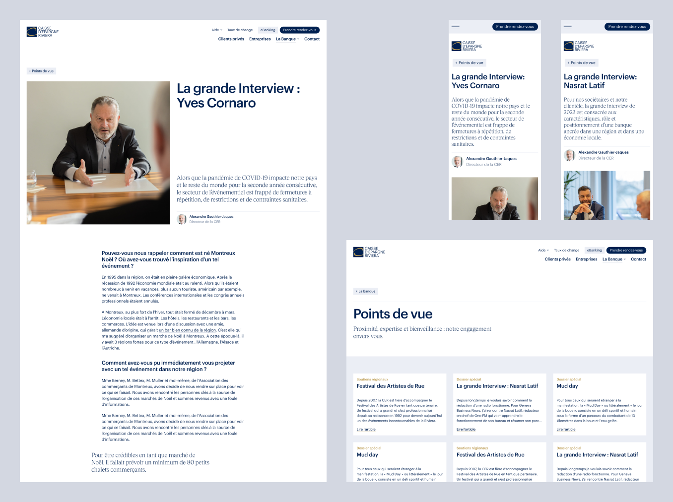
Key objectives and indicators were established at the outset of the project. For tracking website usage, we chose Plausible, a privacy-friendly tool that does not require cookies.

TL Transports publics lausannois
project.teaser.a11y.servicesSite Web

Migros
project.teaser.a11y.servicesCampagne