
Luxury Tribune
Digital platform dedicated to the luxury industry
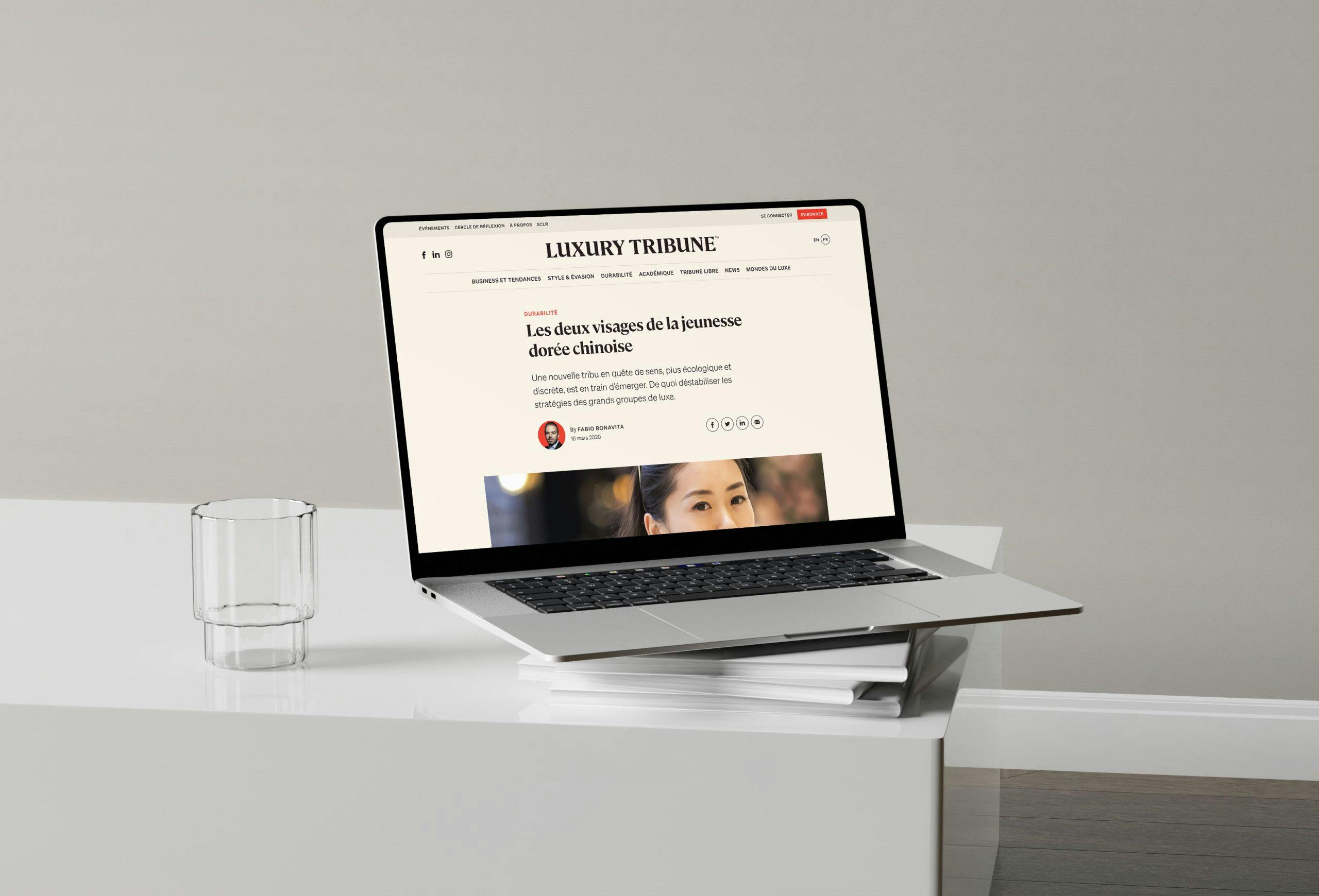
Cristina D'Agostino and Fabio Bonavita came to us with the desire to build a new digital media dedicated to the luxury industry. Its vocation: to scan the news and issues of the sector thanks to a consortium of international journalists and academic researchers.
luxurytribune.comBranding
- Artistic direction
- Brand values
- Charter and documentation
- Positioning
- Visual identity
Design
- Information architecture
- Interaction design
- Visual design
- Web accessibility
Web Development
- API: design & implementation
- CMS Drupal & Wordpress + Symfony
- JavaScript development
- Mobile development
Branding
- Artistic direction
- Brand values
- Charter and documentation
- Positioning
- Visual identity
Design
- Information architecture
- Interaction design
- Visual design
- Web accessibility
Web Development
- API: design & implementation
- CMS Drupal & Wordpress + Symfony
- JavaScript development
- Mobile development
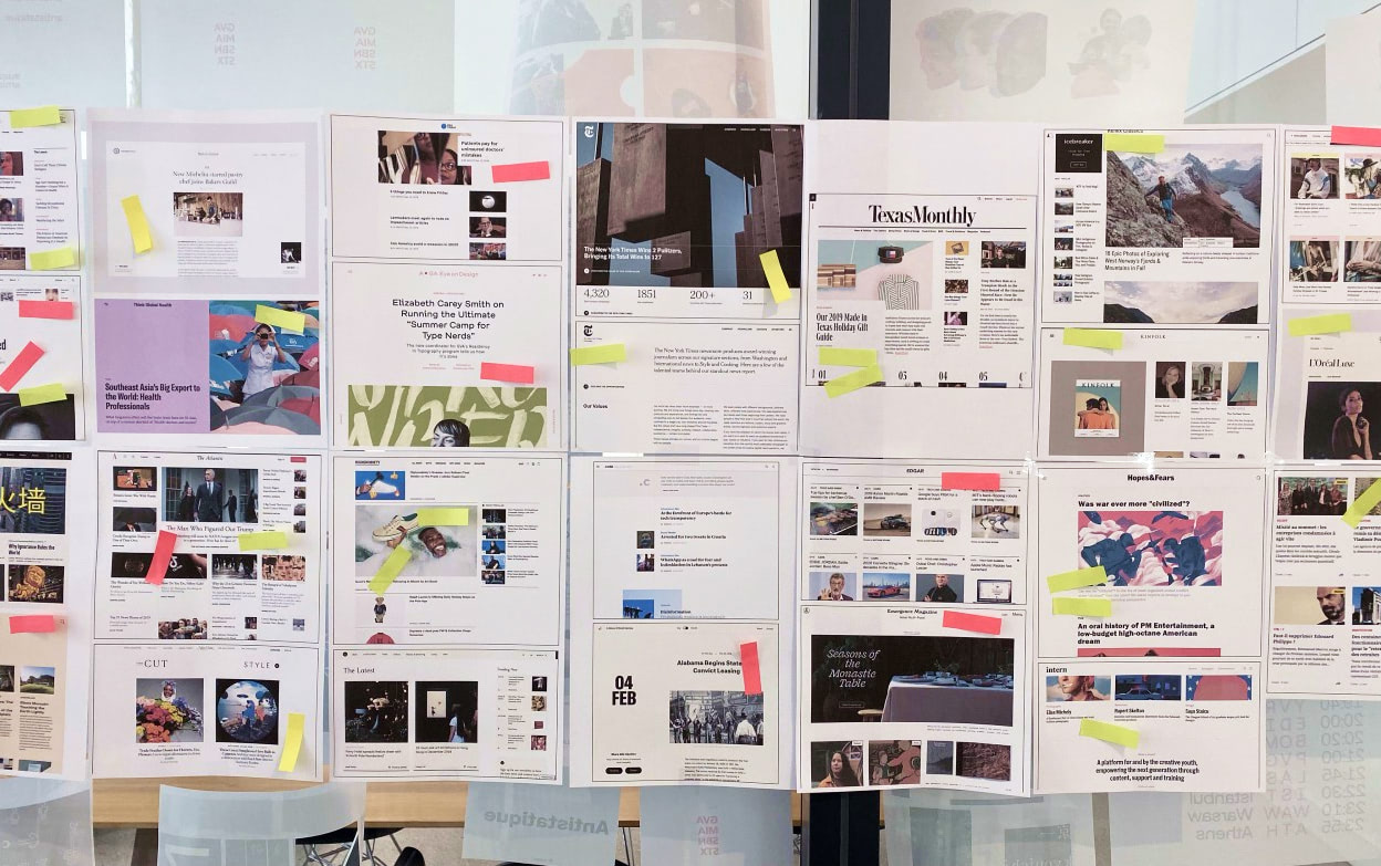
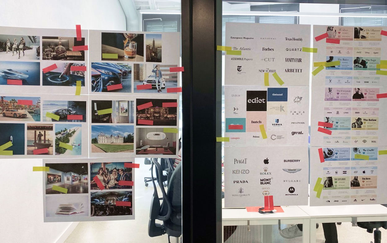
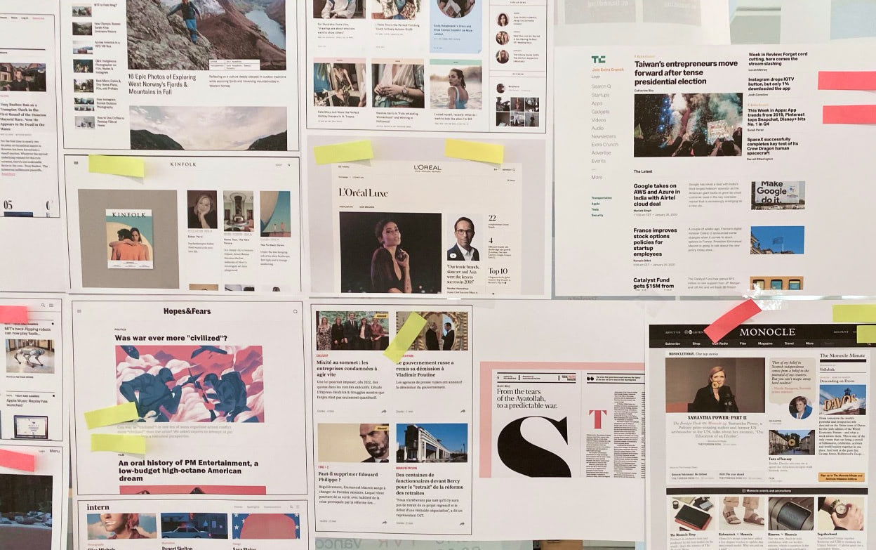
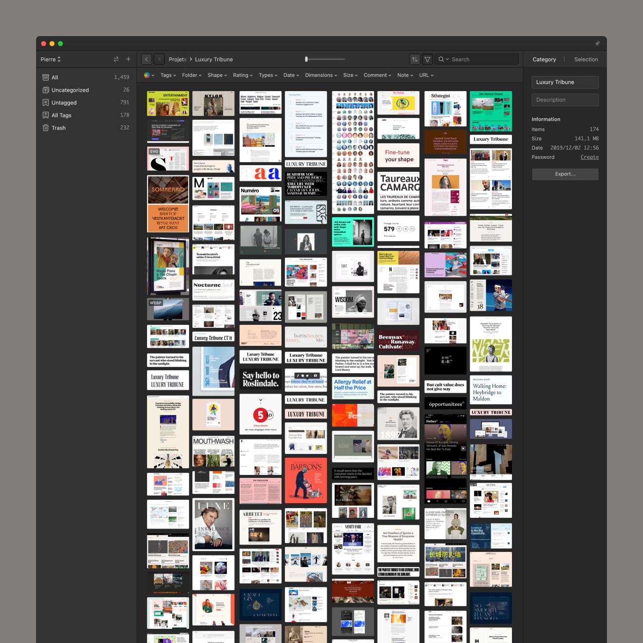
100 images workshop and research
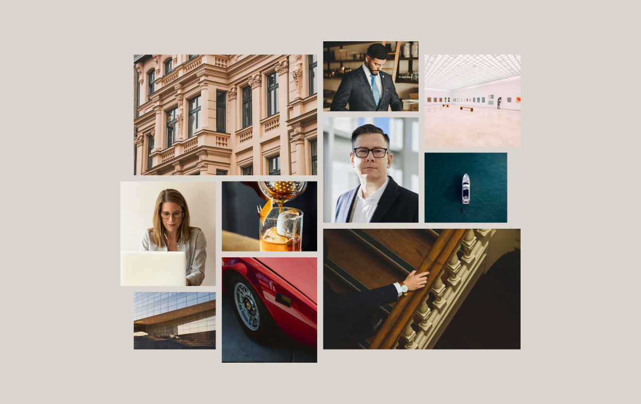
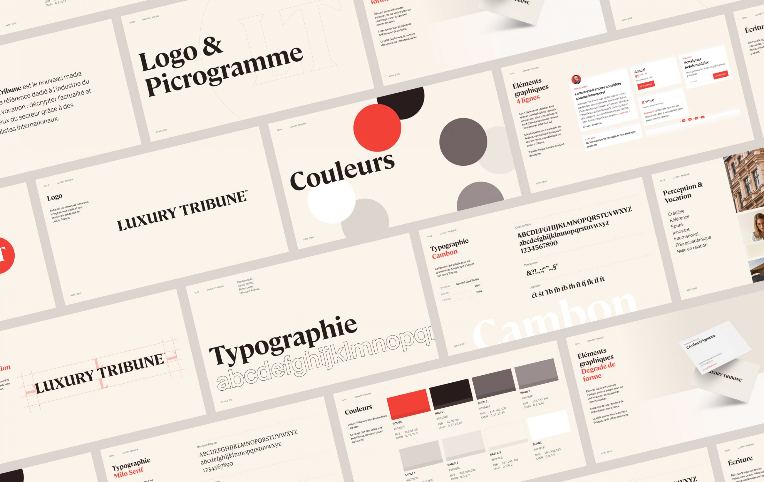
Everything had to be built. We began the project with a workshop entitled "100 images" to define the values, positioning and image that Luxury Tribune should reflect. The main characteristics that should be reflected in the visuals were: credibility, reference and purity.
Branding
La carte est visible sur les pages produits
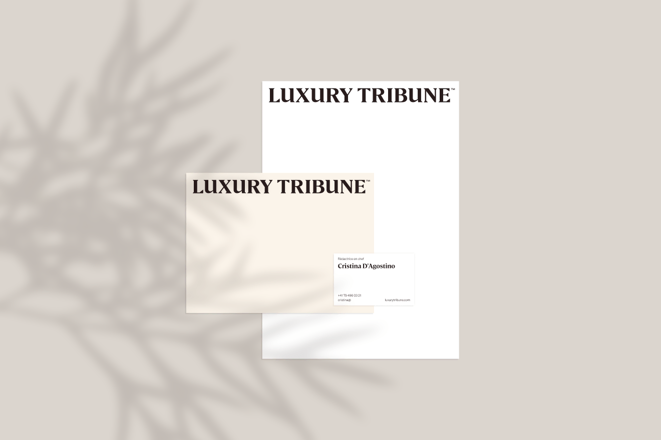
Papeterie : carte de visite, lettre et enveloppe.
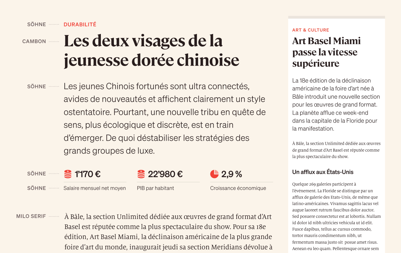
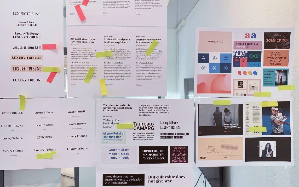
Trois typographies pour souligner l’univers fin et riche du média.
Social Networks
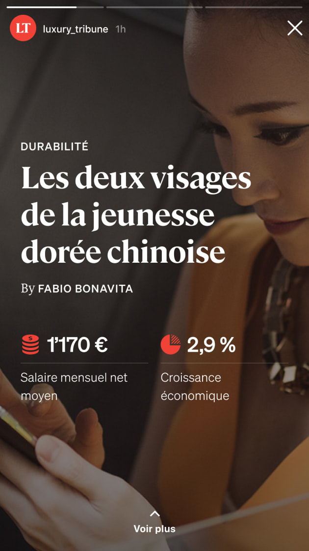
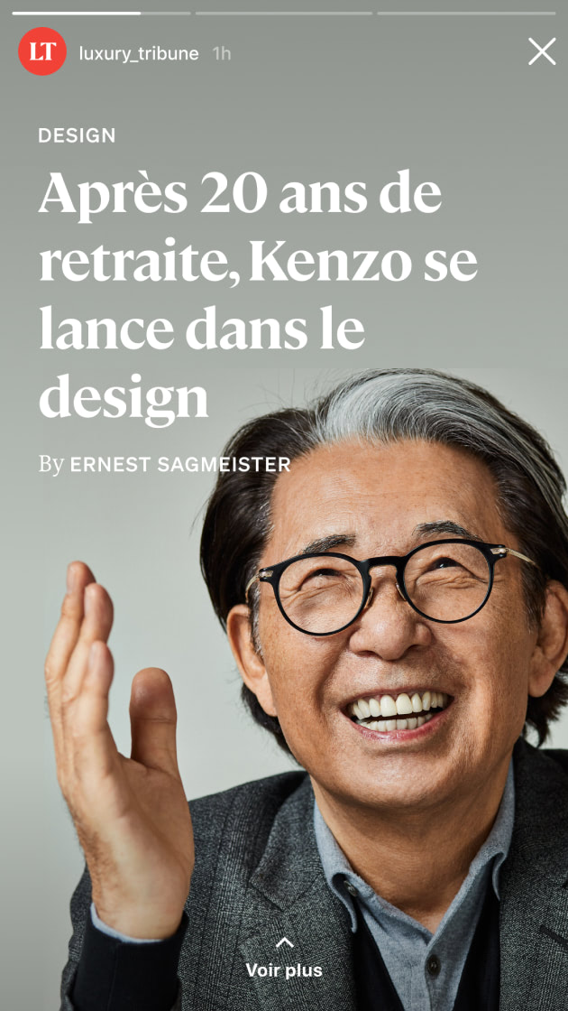
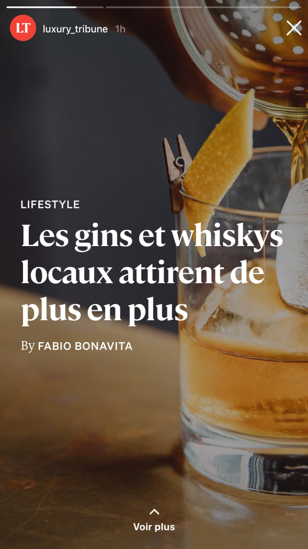
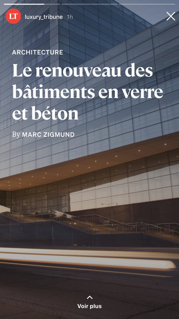
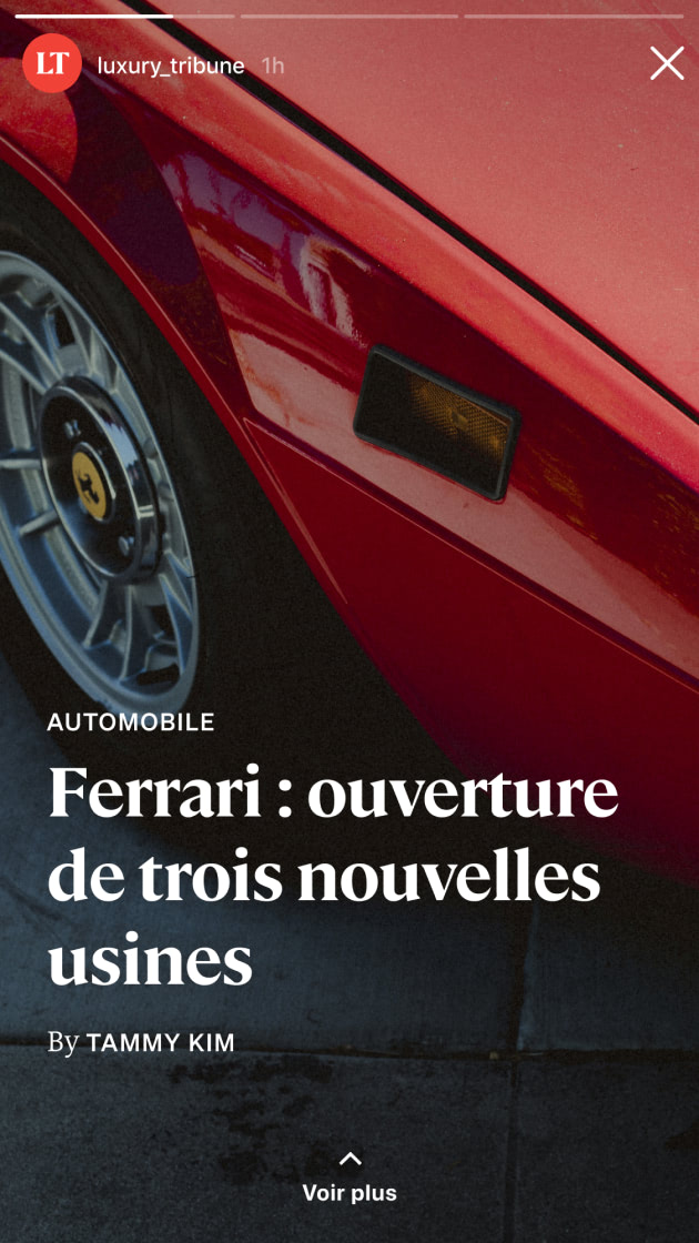
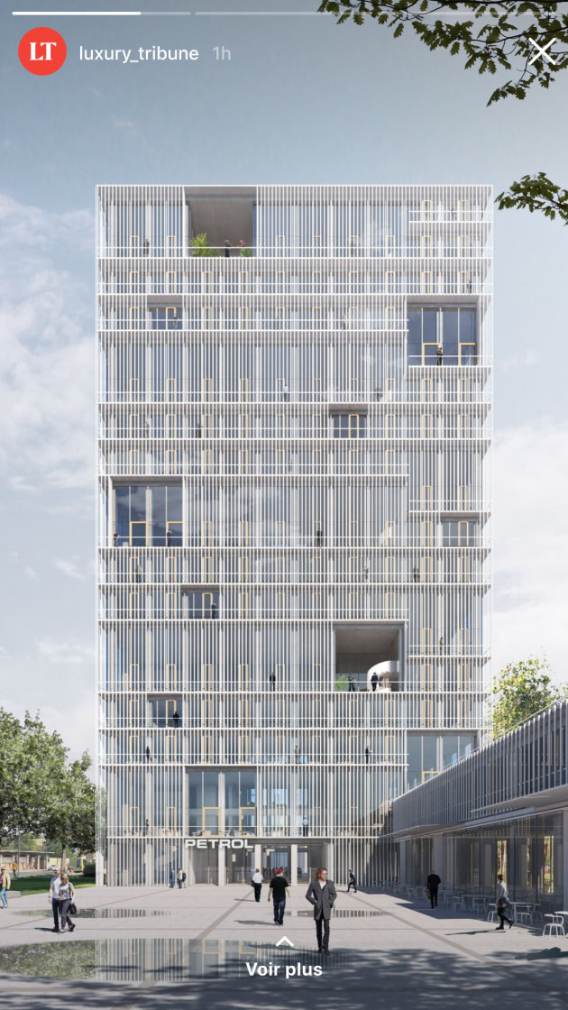
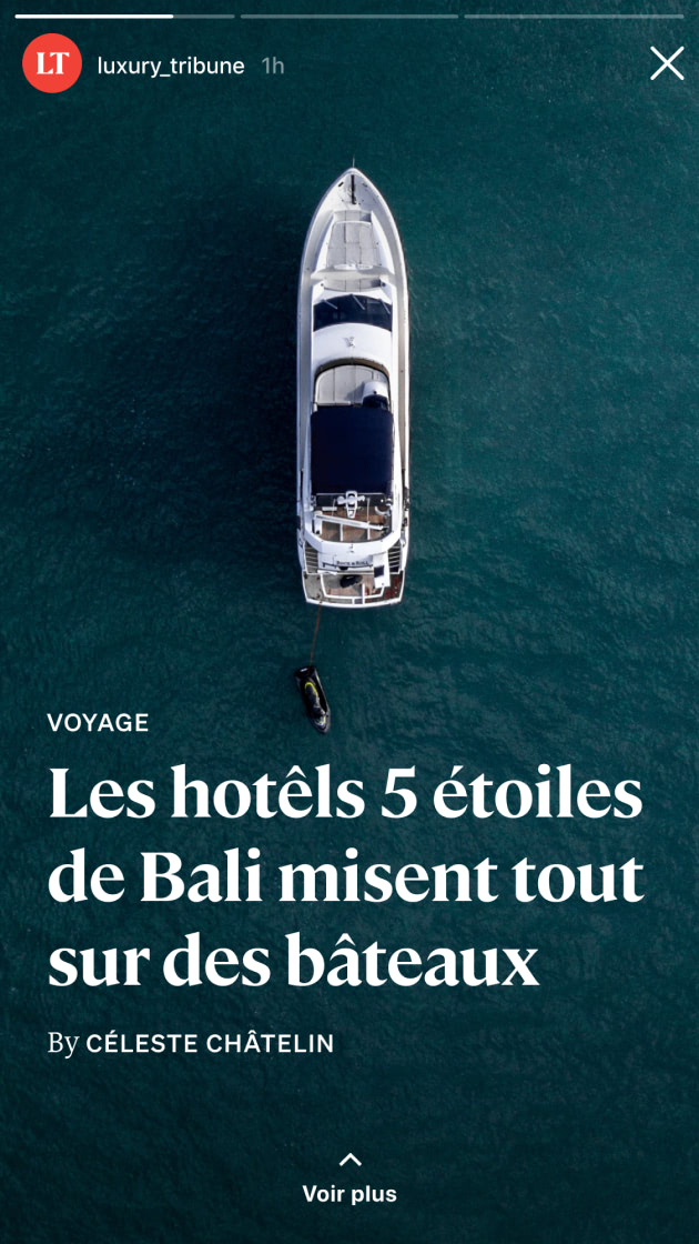
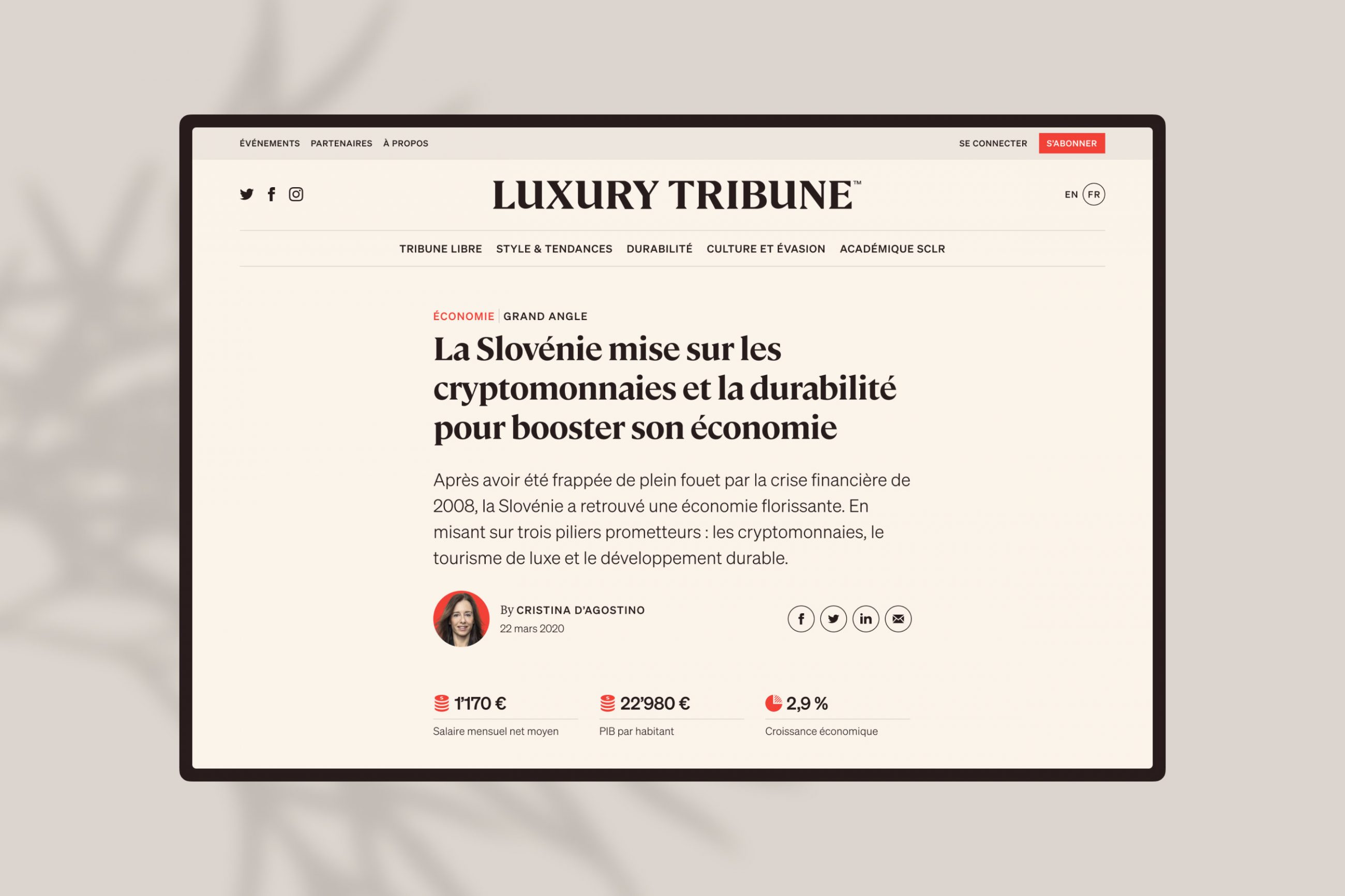
From the start, social networks were integrated into the communication strategy. Some of the site's content, such as the Worlds of Luxury, directly echoes to Instagram stories, and vice versa.
Website
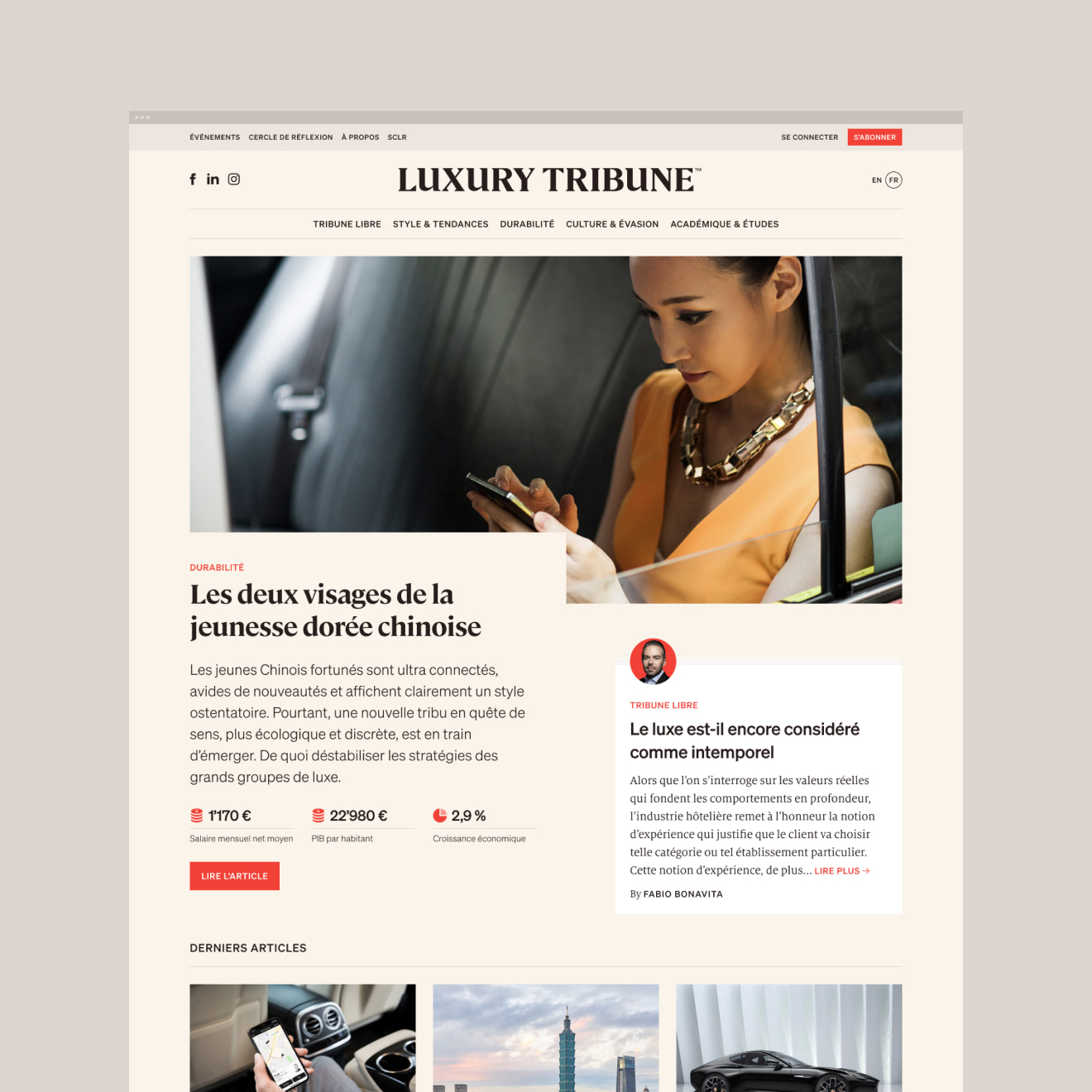
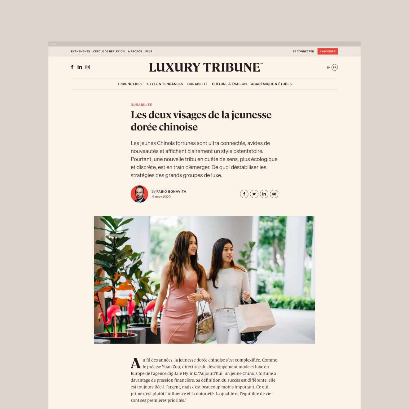
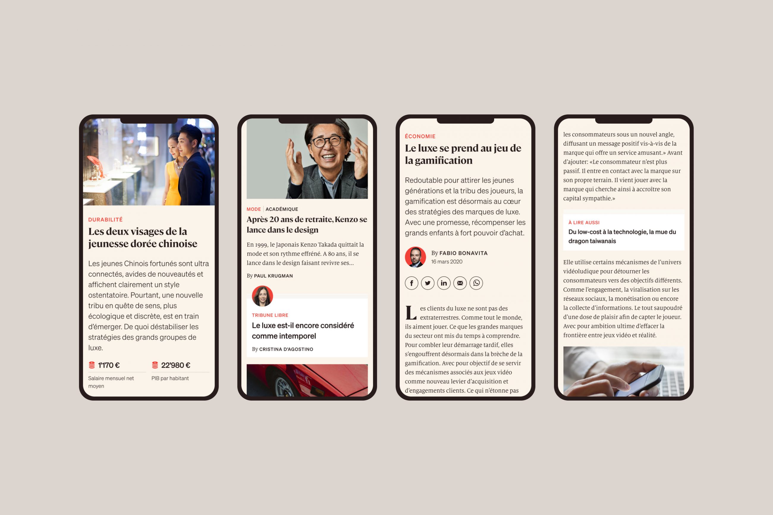
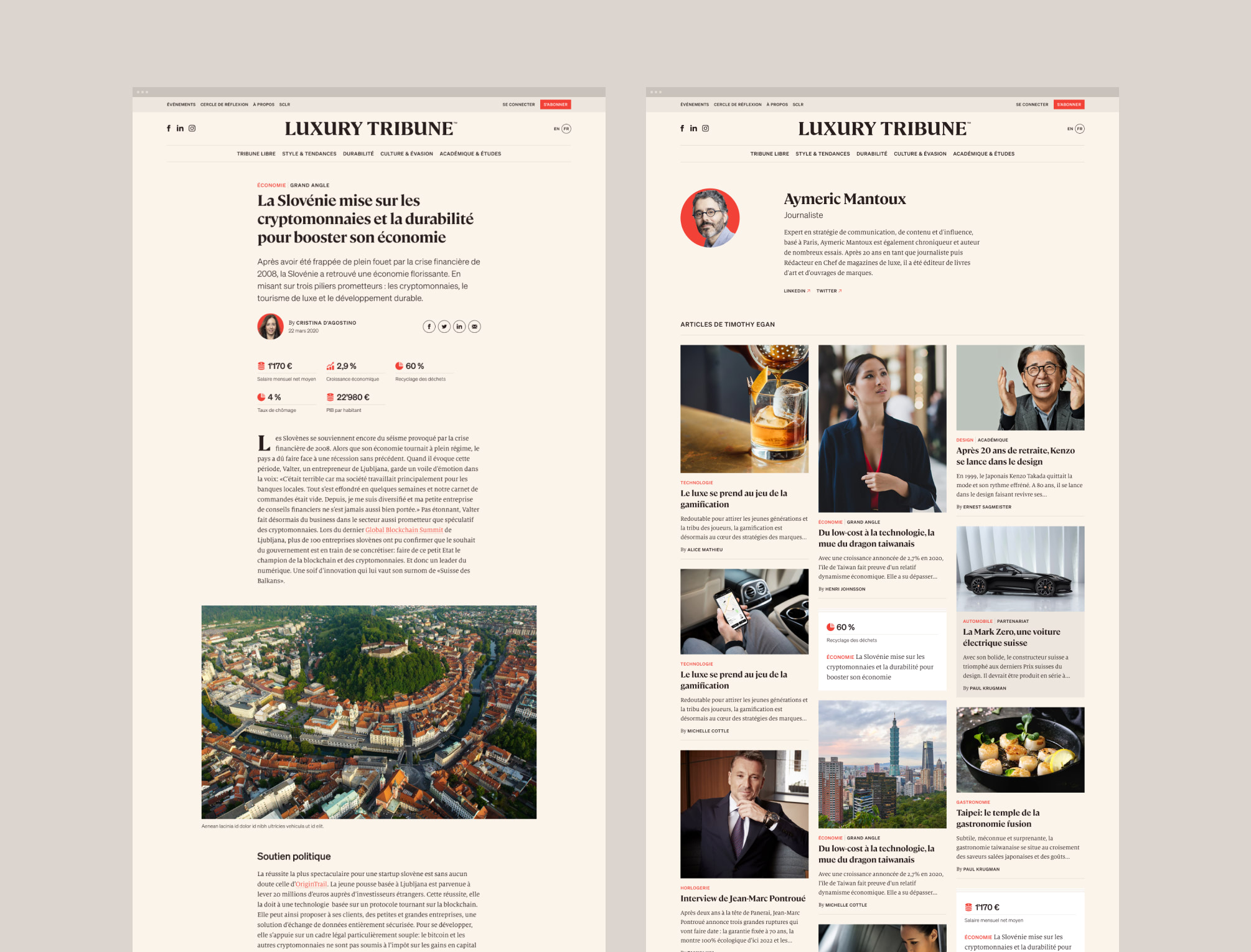
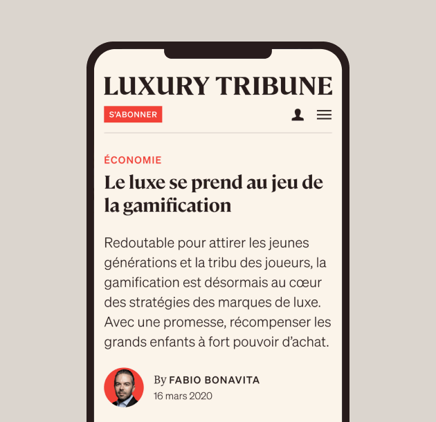
Editing of articles
Development
Progress
We are excited to continue this fruitful and efficient collaboration with the Luxury Tribune team!
“ Thank you to the entire Antistatic team! The collaboration was very efficient. And the tool is just as effective. Congratulations to all! ”Cristina D'Agostino
Editor-in-Chief of Luxury Tribune
