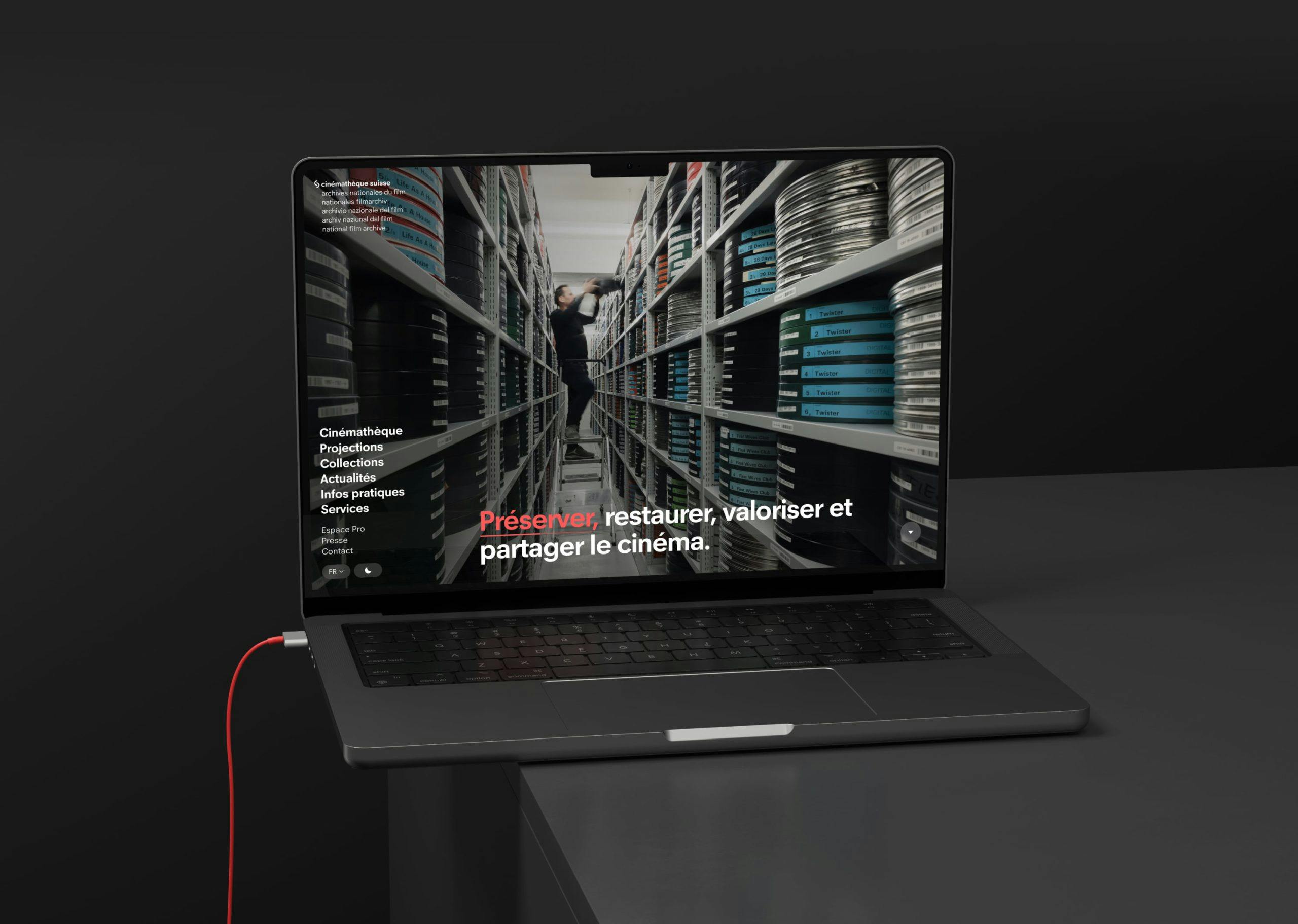

Cinémathèque Suisse
Refonte web de la Cinémathèque
Complete redesign of the Swiss Film Archive website: a multilingual Drupal site integrated with an ERP and external platforms.
cinematheque.chDesign
- Design system & styleguide
- Information architecture
- Interaction design
- User research
- Visual design
- Web accessibility
Project management
- Digital transformation
- KPIs and performance monitoring
- Measurements and reporting
- Specifications Writing
Web Development
- API: design & implementation
- CMS Drupal & Wordpress + Symfony
- Code and performance audit
- Technical architecture
- Web accessibility (dev)
Design
- Design system & styleguide
- Information architecture
- Interaction design
- User research
- Visual design
- Web accessibility
Project management
- Digital transformation
- KPIs and performance monitoring
- Measurements and reporting
- Specifications Writing
Web Development
- API: design & implementation
- CMS Drupal & Wordpress + Symfony
- Code and performance audit
- Technical architecture
- Web accessibility (dev)
An exceptional project
The Swiss Film Archive needs no introduction. Founded in 1948, it shines through the diversity and quality of its collections. It is an immense honor for our agency to create this new version. A project involving information architecture, visual design, and technical development (CMS + Business Application) that we are proud to present in this portfolio.
Visual Identity
The previous site was created before the establishment of the visual identity of the Swiss Film Archive. We based our work on printed materials and live events. Therefore, we had to understand its codes and, of course, translate and adapt them for the web, which has its own constraints and peculiarities. The goal was to ensure consistent branding across different media.

Colors
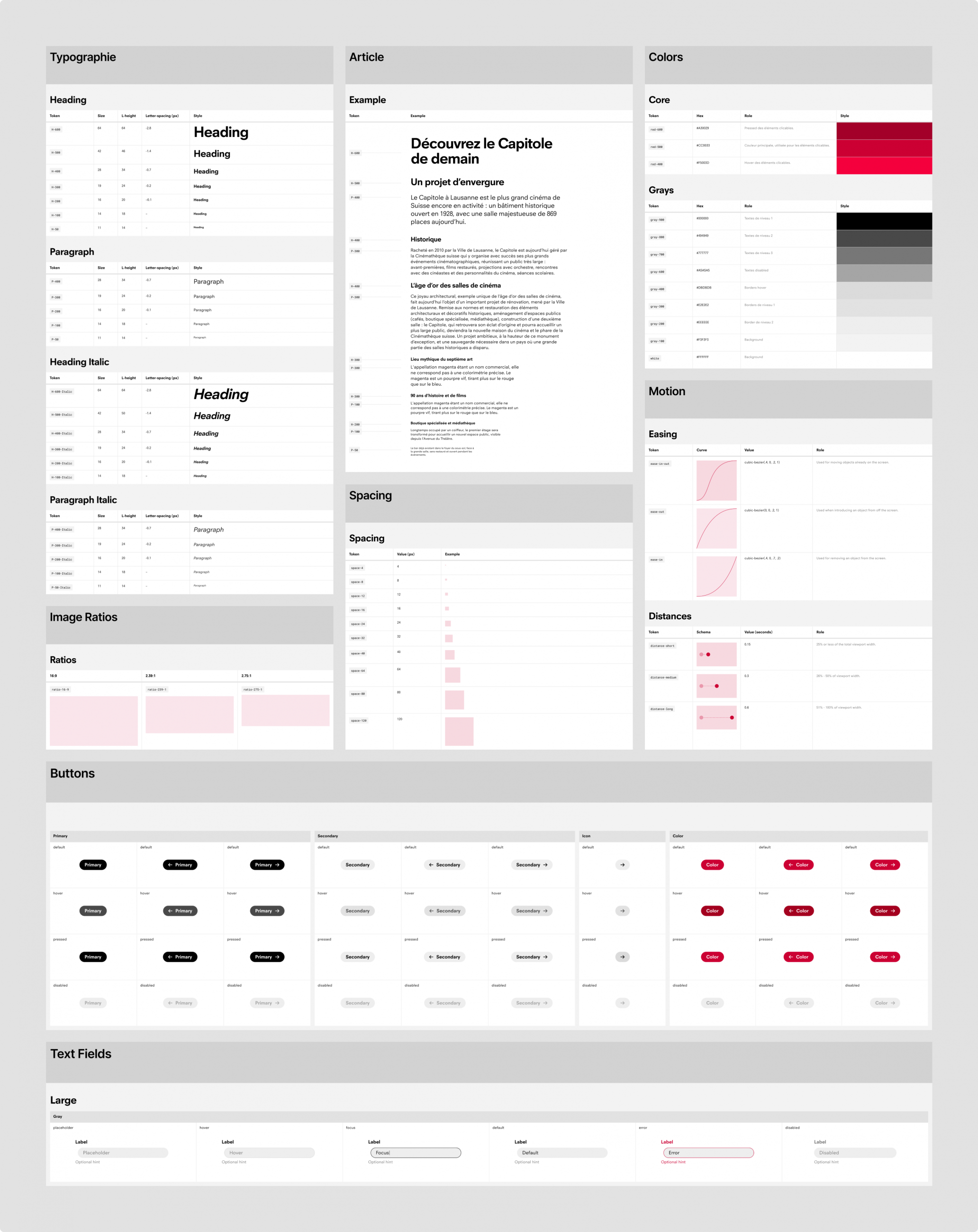
One of CS's strong principles is its use of new colors for each program. We applied our expertise in accessibility to ensure sufficient contrast between colors, ensuring all users have comfortable readability. Thus, films are visually linked to cycles, similar to the paper program.
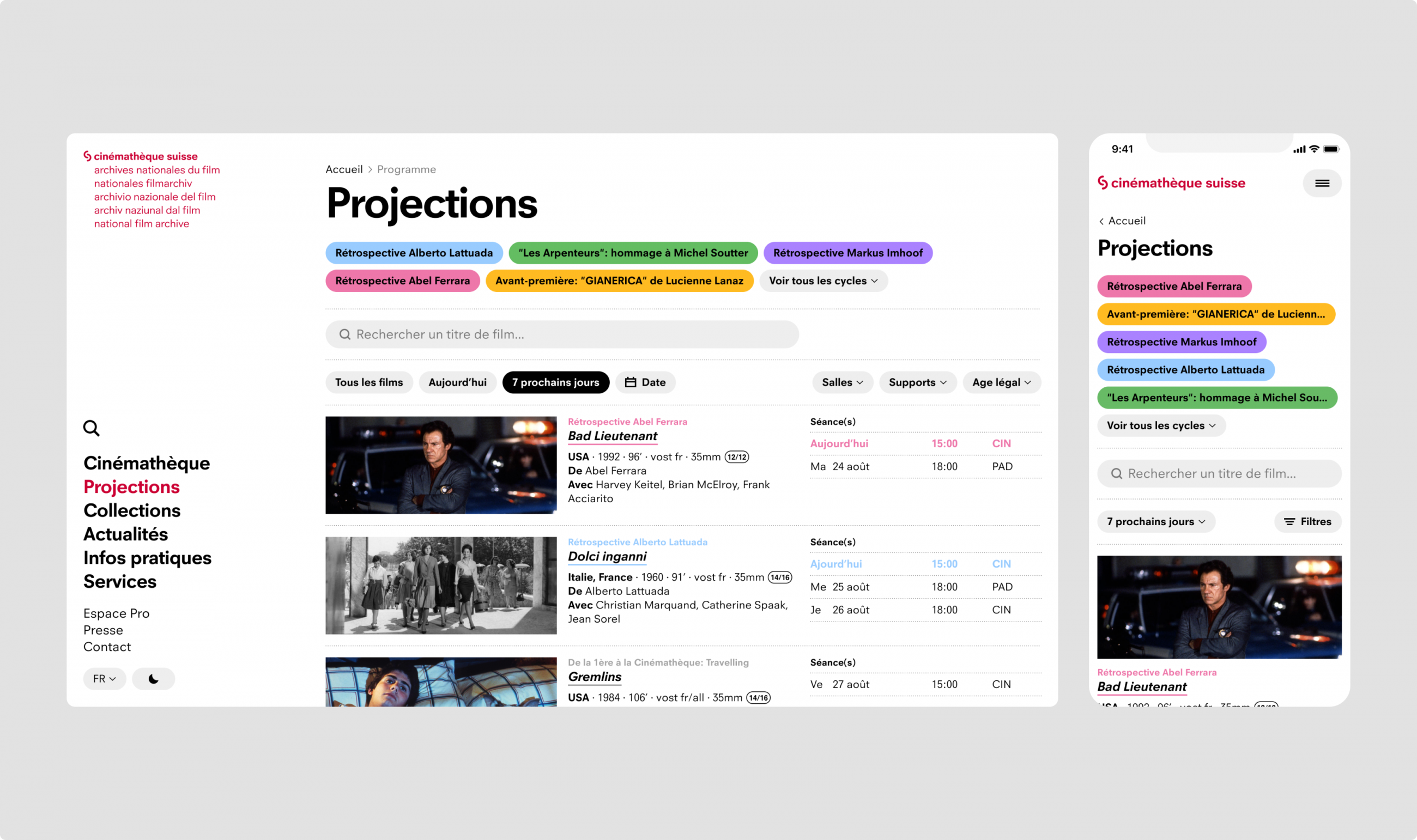
Images et immersion
It's no surprise that the Swiss Film Archive possesses an astronomical amount of images. These are handled with the utmost respect, aiming to avoid retouching or cropping whenever possible. The entire website has been designed with this approach in mind. As a result, various formats coexist seamlessly. On the 'Film Archive' page, you will find an immersive patchwork where you can navigate as if the photos were spread out on a table.

Dark Mode
We quickly suggested the addition of a dark mode. The connection to darkened theaters is obvious, and it enhances the images. Practically, it generates much less light for someone using the site in a theater, just before a screening, for example, to check the film's duration or learn about the director's background.
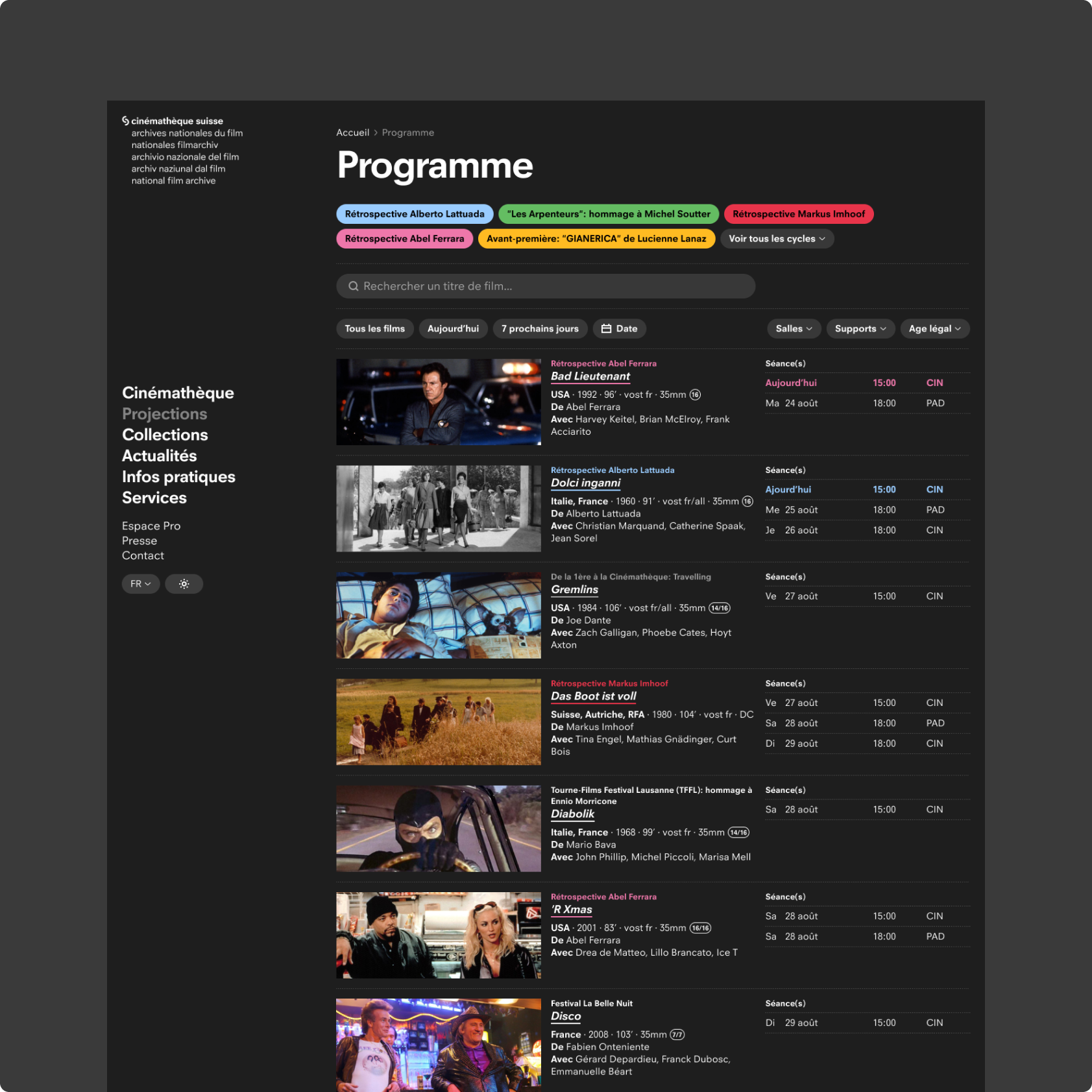
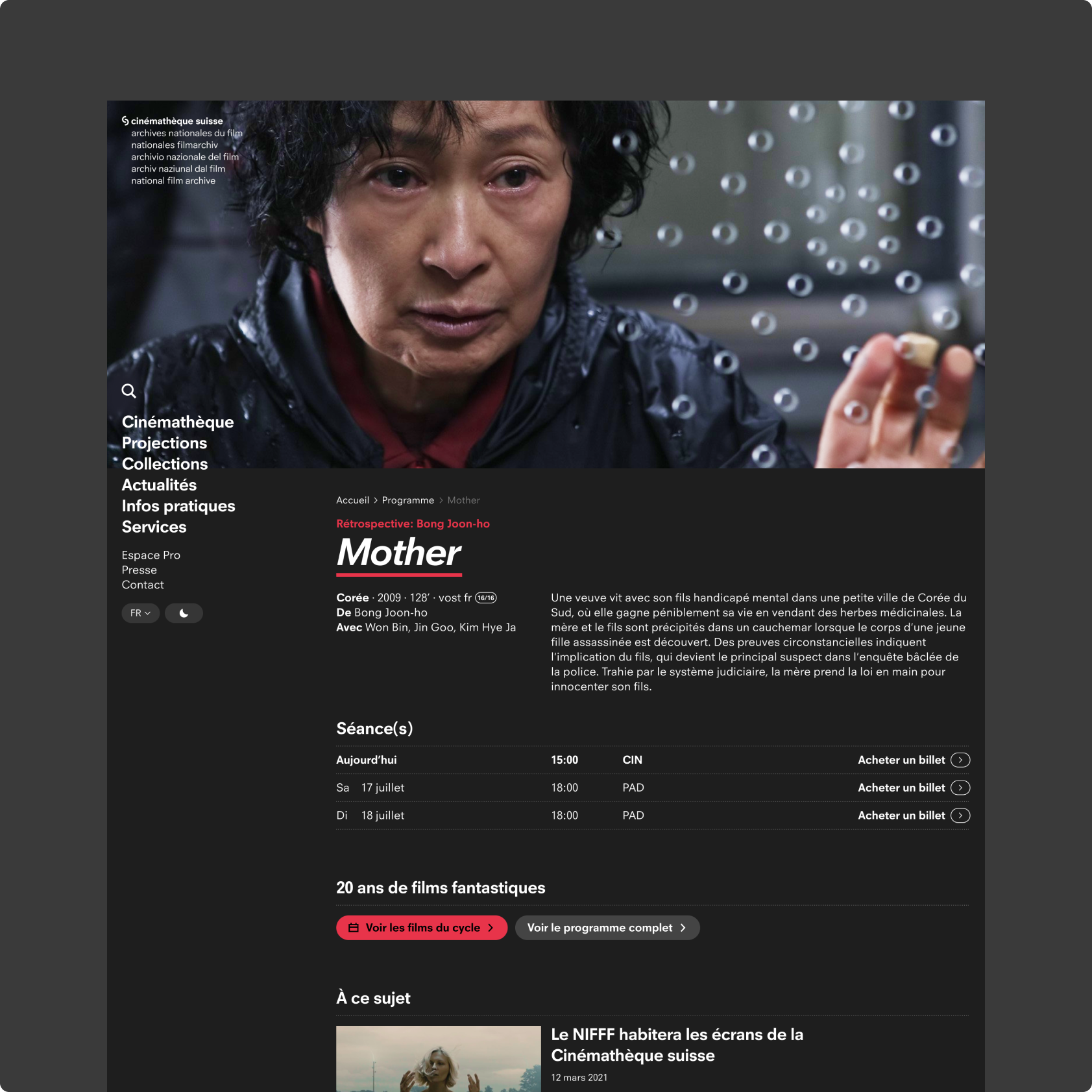
Two sites, one identity
One of the objectives of the site was to better highlight the work of the Swiss Film Archive. The site containing the screening schedule (hereafter referred to as "Live") did not allow for easy navigation back to the main site. Our task was to redesign the main site, transitioning from the old CMS Typo3 to Drupal, and to update the existing Laravel application (the Live) with primarily frontend work.
To achieve this, a separate style guide was developed and then shared via an npm package. This ensured visual consistency between the two sites. Most importantly, the shared header and footer between the two sites facilitated easier navigation. The menu entries are managed directly from Drupal, for which we created an endpoint to share these elements with the Live site. Additionally, we enabled the ability to link Drupal news to the cycles and films on the Live site.
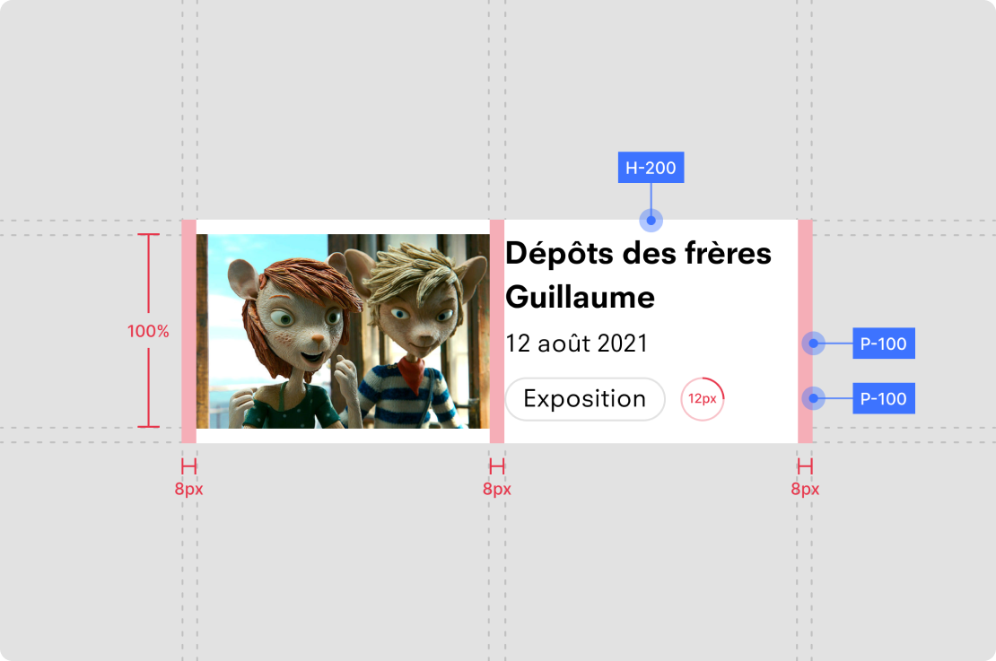
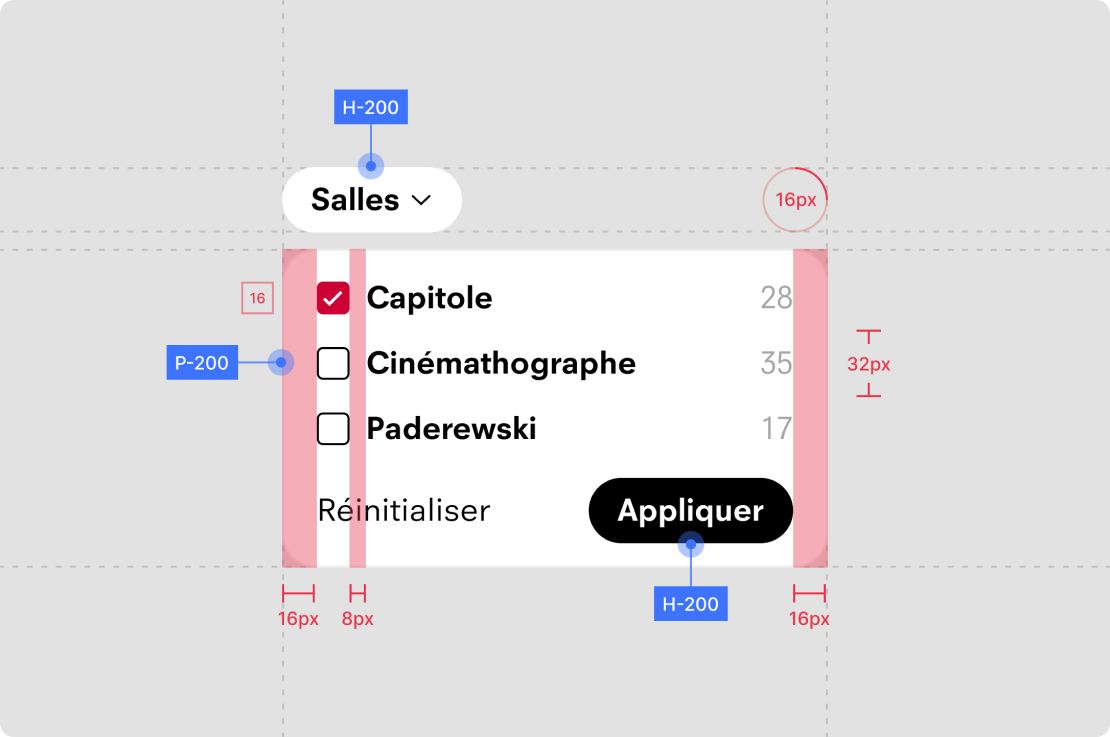
Data Migration
One of the challenges we faced was migrating data from the old CMS Typo3 to the new Drupal database. The goal was to migrate all news items and films currently being shown. This proved to be complicated due to the translation of elements, as they were not directly linked in the Typo3 database. Ultimately, we decided to migrate the news items and films independently in French and German, which means it is not possible to directly switch from the French item to its German translation on the new site.
Frontend
From a frontend perspective, the site contains many images. To minimize the impact this could have on performance, there was a collaborative effort between design and development from the outset, as well as image optimization work (using the
webp image format, lazy loading, and the srcSet attribute)).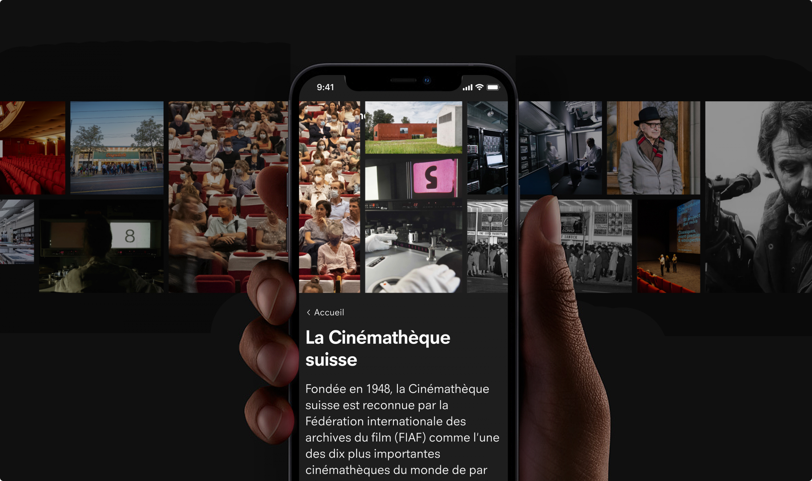
The site also includes some carefully crafted animations. We decided to incorporate them as React widgets for greater development flexibility, while ensuring we minimized the performance impact associated with adding the relatively heavy React library.
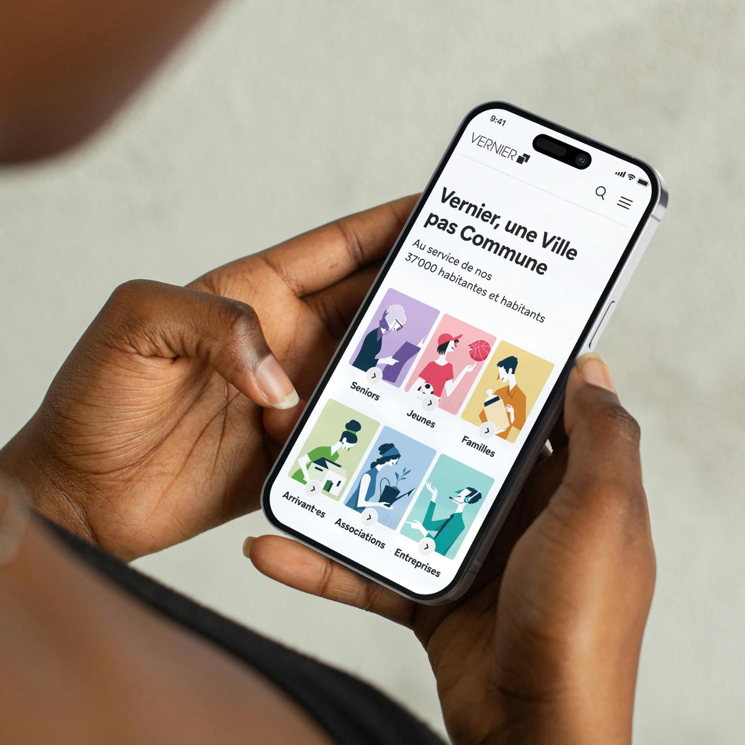
Ville de Vernier
project.teaser.a11y.services"Site Web"
Monolithe
project.teaser.a11y.services"Branding", "Marque", "Naming"