Branding
- Artistic direction
- Positioning
- Visual identity
Design
- Design system & styleguide
- Information architecture
- User research
- Visual design
- Web accessibility
Marketing & Communication
- Content strategy
- Strategic audit
Project management
- Digital transformation
- KPIs and performance monitoring
- Measurements and reporting
Web Development
- API: design & implementation
- CMS Drupal & Wordpress + Symfony
- Technical architecture
Brief
Presence Switzerland, which is part of the Swiss Federal Department of Foreign Affairs (FDFA), is an organization in charge of promoting Switzerland abroad. Antistatique was commissioned to overhaul the organization’s online communication portal, houseofswitzerland.org.
House of Switzerland is, as its name suggests, a home. A home that we hope you’ll make your own! You may come across a building decked out in the Swiss flag at all kinds of events and special occasions. This house is an important communication tool for Presence Switzerland. The website is an online version of the house, and shares highlights, interviews and news items with you. On the “Swiss Stories” page, you’ll find FDFA articles featuring 100% Swiss topics.
We worked with various teams from the department to put together a full range of content that showcases what Switzerland is all about in a modern and multilingual context.
Study and analysis
Our first goal was to understand Presence Switzerland’s domain in order to regroup its needs in a single digital ecoysystem.
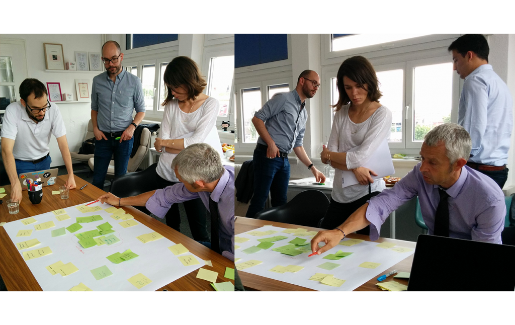
Shareholder mapping workshop – Understanding our audience
We started with a little cartography workshop. We used stakeholder mapping to represent all the actors involved.
This exercise sheds light on what these stakeholders say and think. Thanks to this “map”, we got a better understanding of the environment in which the organization works and the opportunities it encounters, as well as the stumbling blocks.
Personas – Defining our audience
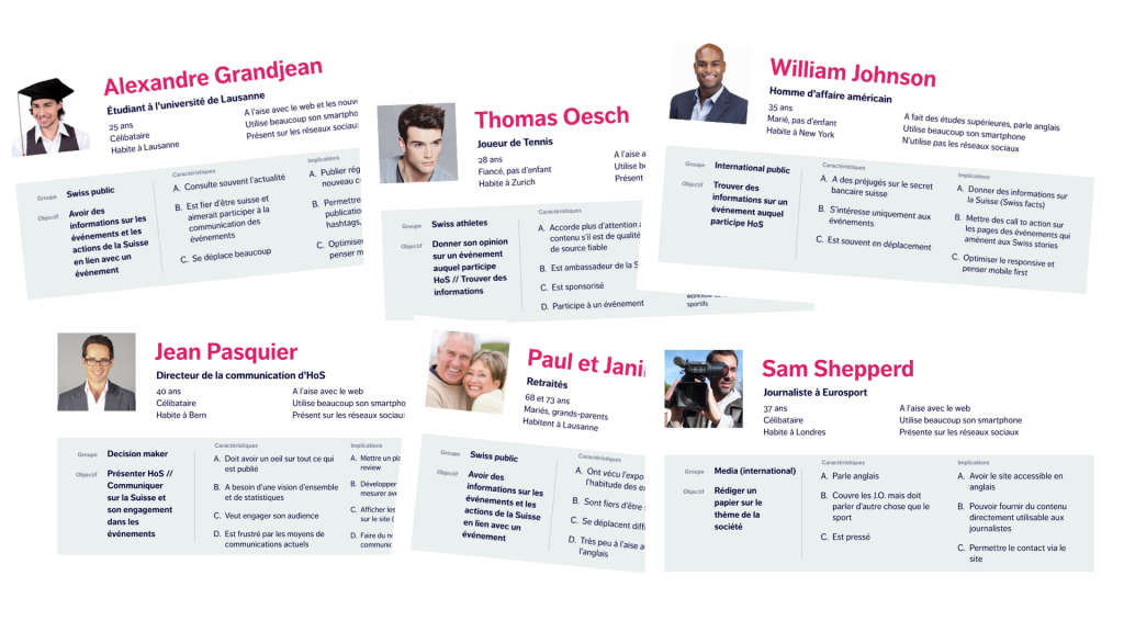
Houseofswitzerland.org targets a number of different audiences. Presence Switzerland wants to reach out to people in foreign countries, as well as inform Swiss people about their presence abroad. There are therefore many types of people involved, with different needs and desires.
Personas help us summarize the needs of a particular group of people. They also help us gather information so that we can understand what other stakeholders – such as moderators or sponsors – expect to get out of the website. Here are a few examples:
- A foreign student who speaks English
- A foreign worker who only speaks Portuguese
- A Swiss or foreign journalist
Proposed solution
Here are a few of the solutions we came up with during our collaboration with Presence Switzerland:
The layout: keeping things simple
Let’s go back to the idea of a house. People inside it have to feel comfortable. The layout of the rooms has to be planned out carefully so that people can move around them easily and intuitively. The same applies to the navigation flow of a website. Visitors should be able to navigate smoothly from one event to another, from an event to a news item, or from one story to another, and so forth.
Promoting the site’s content
One of the main objectives of this project was to highlight the right content at the right moment. Whether you’re on the homepage of houseofswitzerland.org, or another page on the site, you should be able to find all the latest information easily.
The Drupal CMS provides for a comprehensive promotional system, so that the most important information shows up first. We worked with several different solutions to cover all of the website’s needs. The dynamic views system helps keep all the main communication points clear and organized.
Events tab
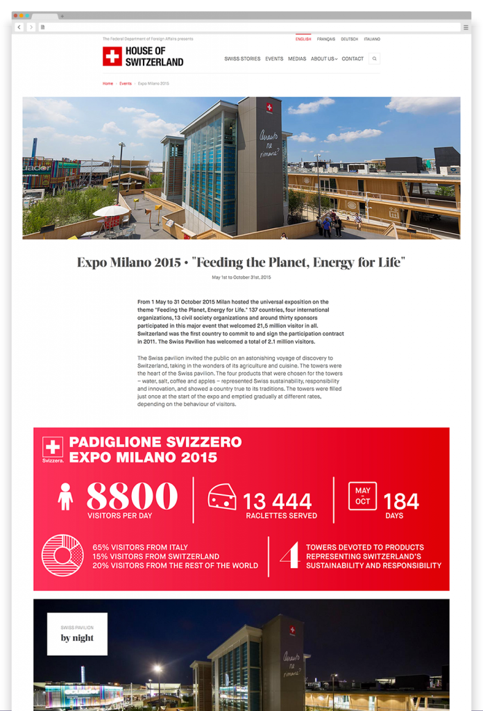
For Presence Switzerland, one of House of Switzerland’s main communication objectives is to promote its events. These events needed to be highly visible and easily accessible from the homepage and the navigation bar.
After discussions with our clients, we decided to create a fact sheet for each event, which contains all essential infomation. The fact sheet promotes the event, and displays related news items, a calendar and social wall. It also provides a record for House of Switzerland’s archives, so that the organization can keep track of all those important moments and continue developing its identity.
Rockin' out the house
Presence Switzerland is part of the FDFA, which is in itself part of the Swiss Confederation. The project was managed by an official government institution, but our goal above all was to promote Switzerland’s assets. Presence Switzerland’s teams were on board right away. They brought a whole lot of personality, energy, desire, charm and that “it-factor”, so that we were able to combine a classical musician’s precision with a little rock n’ roll when designing the site. While the FDFA may have been the symphonic orchestra of this project, Presence Switzerland brought guitar riffs and drum solos into the mix.
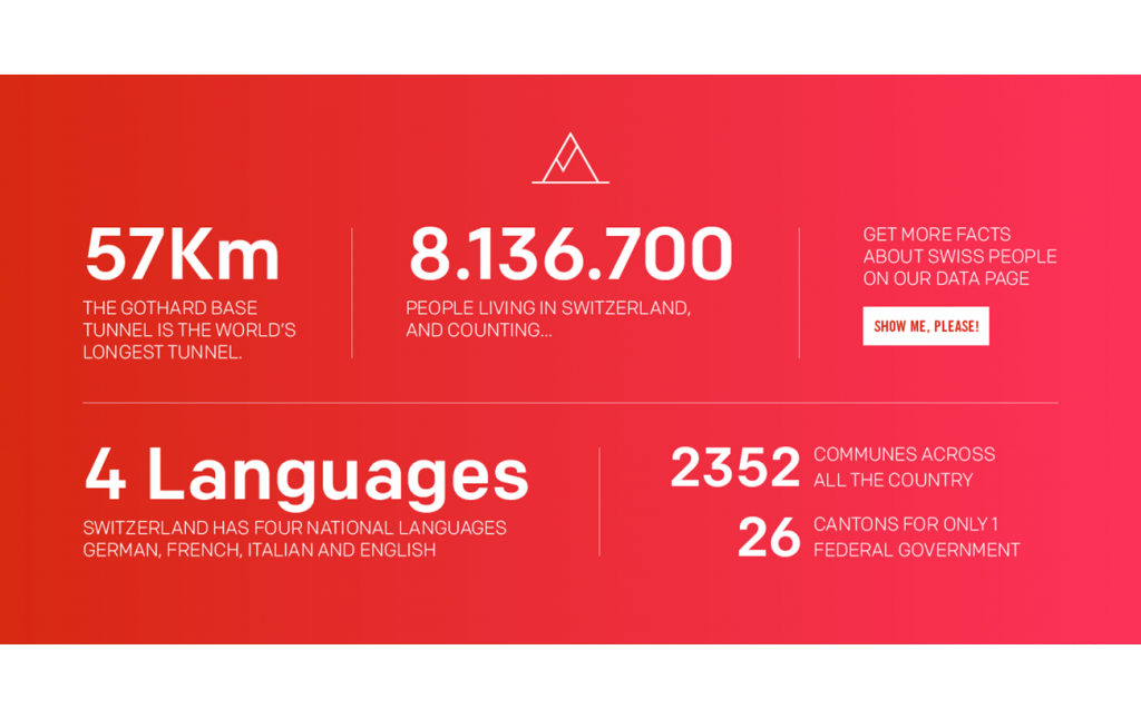
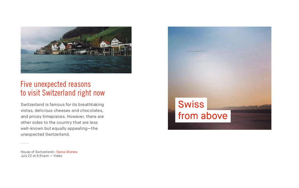
For obvious reasons, we wanted to keep the color red at the forefront of the site, but we sometimes brought it out in different hues and acid tones. While it may be an official building, that didn’t stop us from moving around the furniture to make room for the travel mementos. Once the paint was already dry, we stilll had a couple more decor and renovation ideas. We wanted to make this a magical house of sorts!
Difficulties and constraints
Keeping things simple can often be a complex matter when it comes to the architecture and conception of a website. Before arriving at the final product, we had to go through several versions. Here are two challenges we encountered during the project:
Hanging up all those beautiful pictures: the issue of images, formats and devices
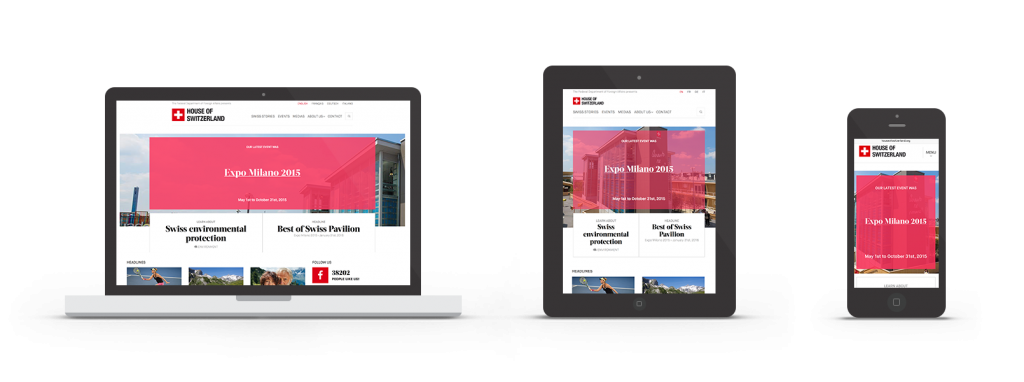
In the House of Switzerland, pictures are the main source of decoration, no matter which room you are in. After all, a picture is worth a thousand words. The images were all different sizes, so we had to find a way to make them all fit together. They also had to translate well onto desktop screens, tablets and smartphones. In other words, we had to work with a Responsive Web Design.
Building for the future: a website made to last
The technical success of a website has a lot to do with optimizing its technology and using the latest frontend techniques. The site had to be built to withstand House of Switzerland’s future travels all over the world.
That’s why we used Atomic Design and the dynamic styleguide. The latter is like a graphic chart, except it’s coded. All the components of the site (a button, photo, picture, etc.) were indexed and accompanied with a sample so that we could test the site on different navigators and devices in our Device Lab.
We worked with Drupal 8. While everything turned out well, we came across a few difficulties during the development process.
Drupal 8
The project began shortly after the latest version of the Drupal 8 CMS officially came out. While a new version requires some learning, it also guarantees the long-term life of a project. Our developers successfully picked up all the new features of Drupal 8 before and during the project.
We like being at the helm of the latest technology and are proud to have carried out one of the first projects in the world that uses this system.
Conclusion
Working for Presence Switzerland was a true honor and we are proud of the results! House of Switzerland now has a digital house worthy of its name to attract new visitors.
Now that the House has been built, we just need to begin developing the neighborhood! More information to come soon.
Testimonial
“ We worked with Antistatique to relaunch the House of Switzerland site. When the agency pitched their idea to us, they proved that they thoroughly understood the challenges facing Presence Switzerland and the difficulty of creating a site that plays many different roles. The Antistatique team managed to meet all our objectives. They proved to be a dynamic partner to work with, from the initial conception of the project to the creation of the site. They came up with solutions that were both technically sound and visually effective. The final result fully met our expectations and will allow us to further develop the site according to our needs ”Renée Bäni
Responsable digital
Le Temps
project.teaser.a11y.servicesWebsite

