
Le Temps
Le Temps - Website redesign and styleguide creation - letemps.ch
Website redesign and styleguide creation - letemps.ch
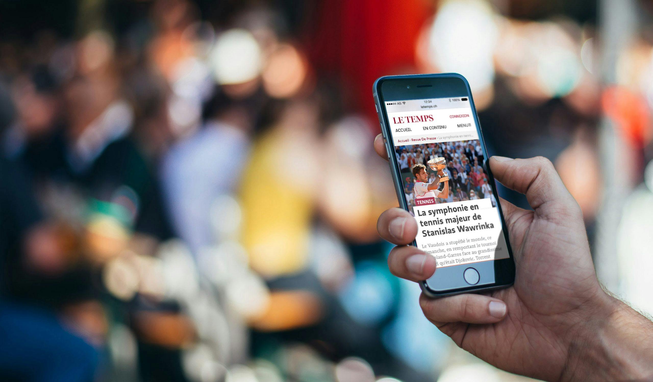
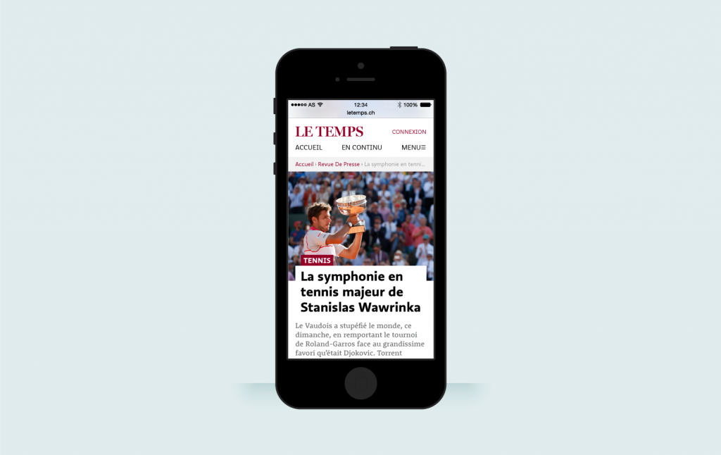
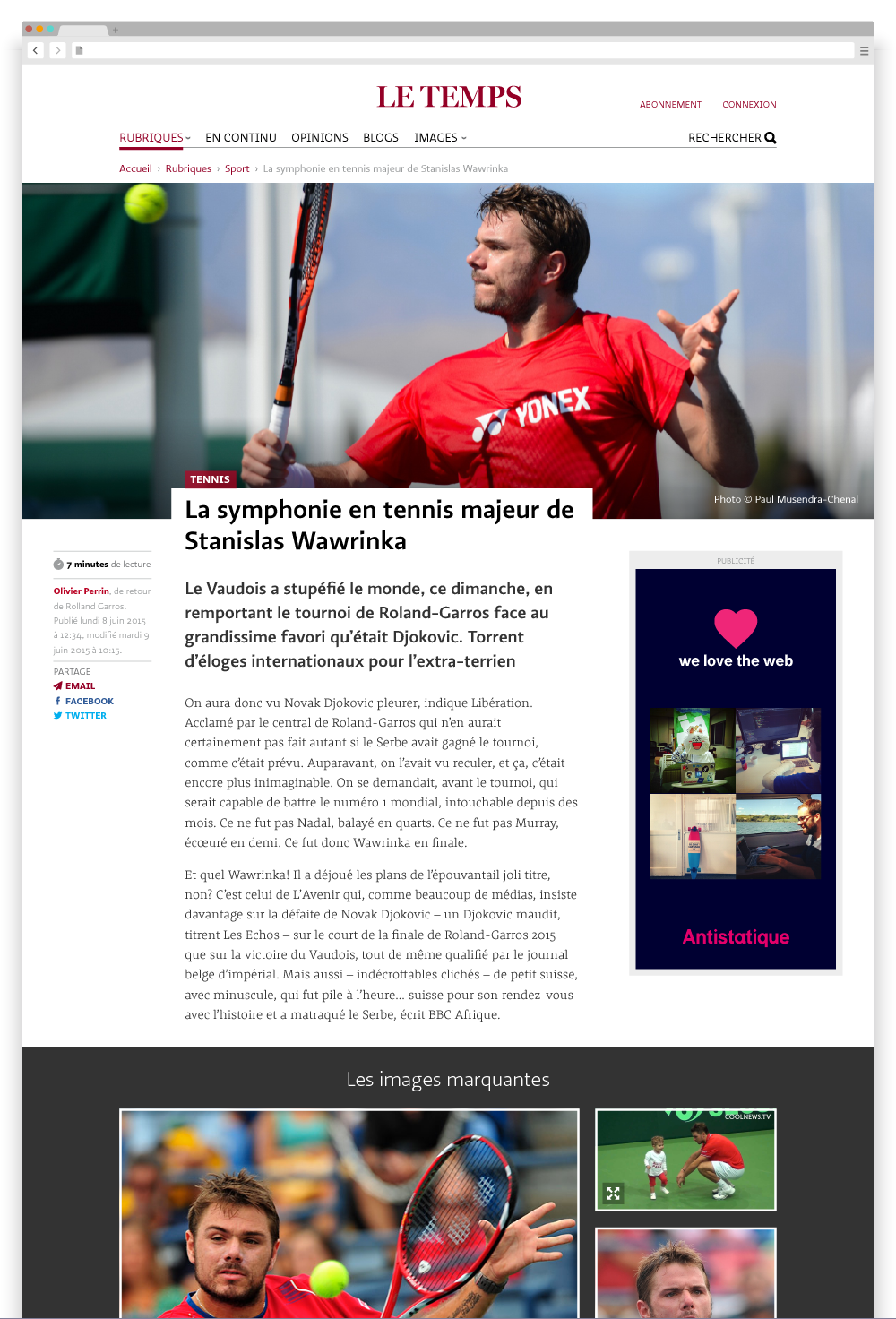
letemps.chA reader experience worthy of a top-notch quality newspaper, no matter the size of your screen.
A few days ago, Le Temps launched its new website. Unlike the majority of readers, the Antistatique team wasn’t taken by surprise. That’s because we’ve been working on this website for several months. Although we’re proud of all our projects, working with Le Temps was an exceptional experience. It was a pleasure to work with a team that shares our values and is, little by little, skillfully going about the digital transformation of their paper.
The Antistatique edge
- At Antistatique, we don’t just want to produce an attractive website; our aim, above all, is to create a flawless user experience
- All throughout a project, our teams are constantly communicating with each other so that we can detect problems early on, ensure that the proposed solutions are technically feasible, and guarantee that every aspect of the final product works towards the same goal
- Our projects are designed for the long term, but are also constantly evolving
- We are transparent with our clients and share results with the web design community

Today, you’ll find information everywhere. And it’s often free. Many web users follow the news through social media, which have been adopted by traditional media sources. In this shifting environment, Le Temps has decided that readers should pay for access to the majority of its articles.
The success of this business model depends on two factors: high-quality content and an exceptional user experience that rivals other leading news sources in the francophone world. That’s where Antistatique’s expertise comes in.
Challenge accepted
Far from scaring us away, the magnitude of this task only made us all the more determined to succeed. Throughout the project, we upheld the following mission: to offer visitors a user experience that would measure up to the quality of the newspaper. That meant showcasing the content, holding the reader’s attention through to the end of each article, and providing users with an optimal reading experience, regardless of what device they are using.
As we do with each project, we started by immersing ourselves in our client’s world. In order to make the right decisions and offer good advice, we absorbed ourselves in the process of creating a newspaper. We wanted to learn about the roles of journalists, photographers, illustrators, freelancers and researchers, and understand the relationships between them. We wanted to grasp the true value of a headline. And we wanted to know exactly what it is that journalists are seeking from their readership.
How the site works
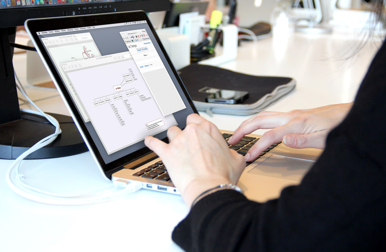
Once we had done our homework, we jumped into the first phase of the project: the functional design of the site. We did this by creating wireframes, which are diagrams of the various steps involved when consulting the site, minus the visual components. That got us thinking about how the site works, in particular when it comes to human factors and usability – the mainstays of an exceptional user experience.
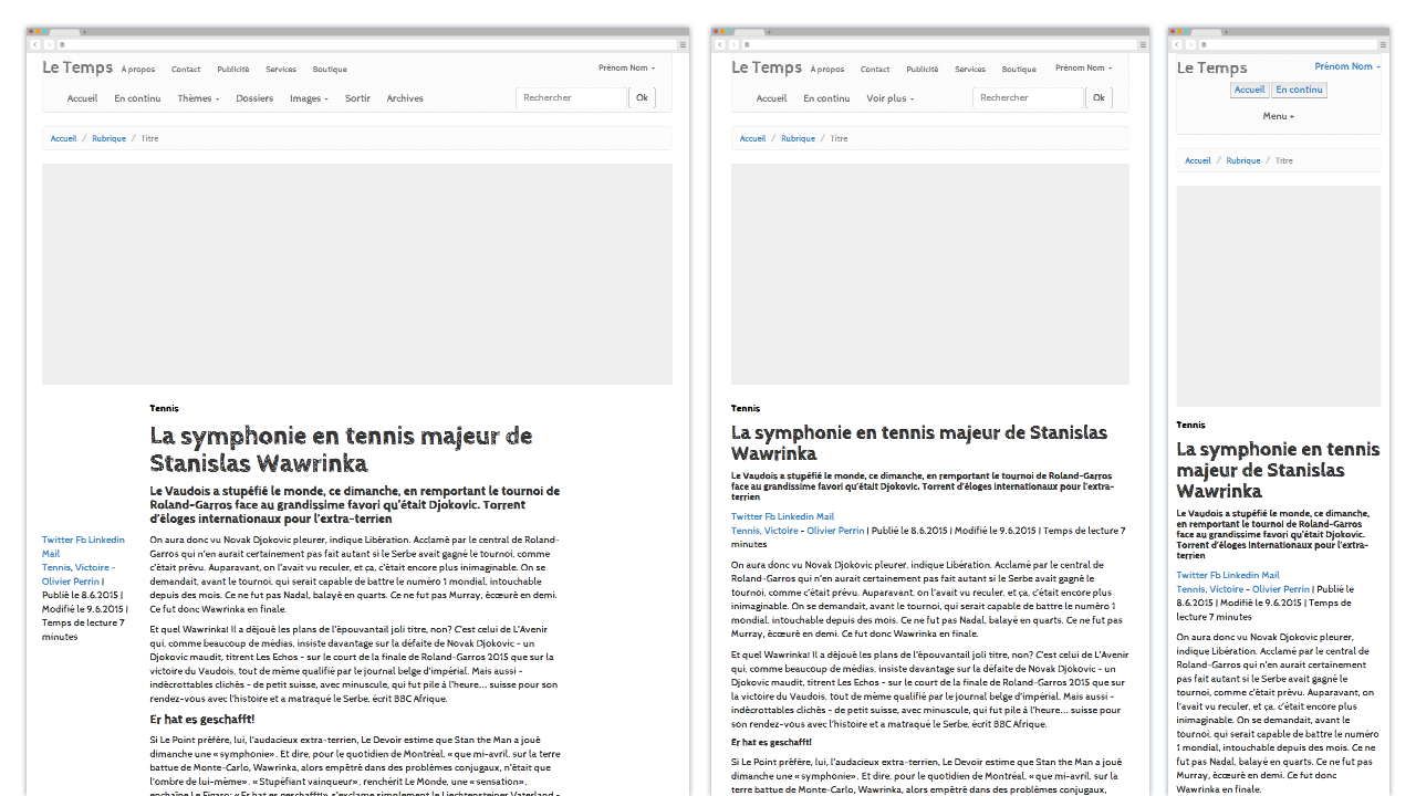
The main challenge was to highlight the content produced by the newspaper’s team. It was also at this point that we decided where to put buttons, how to structure pages, and how each page should vary depending on whether the reader is using a computer or smartphone.
The design
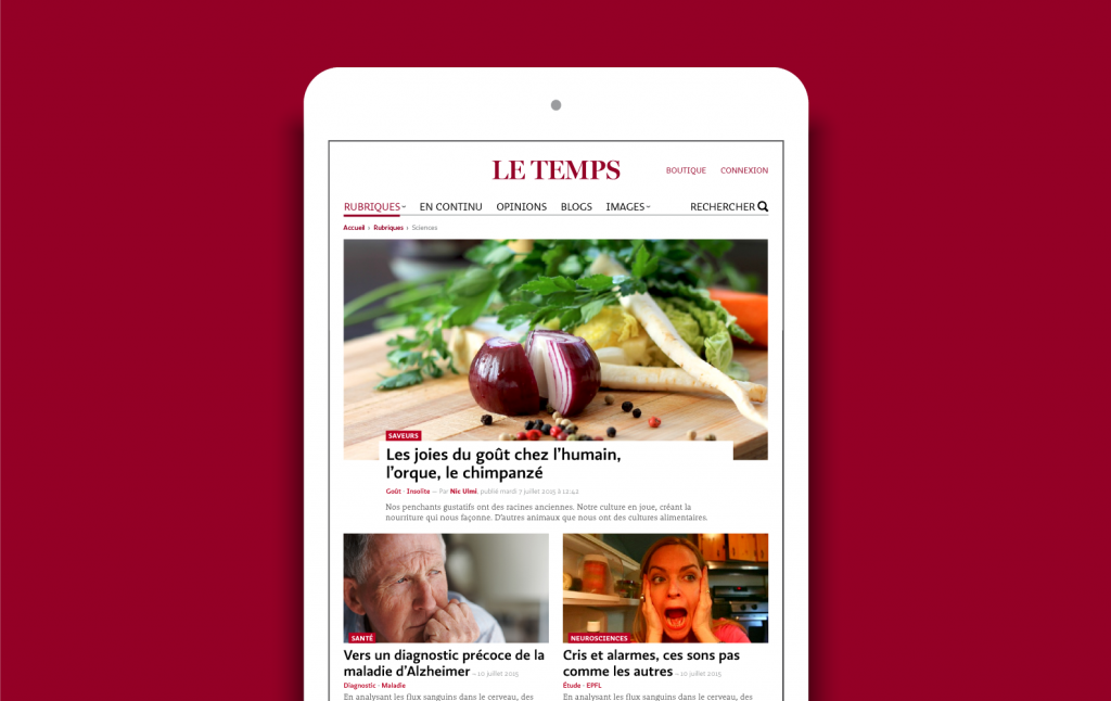
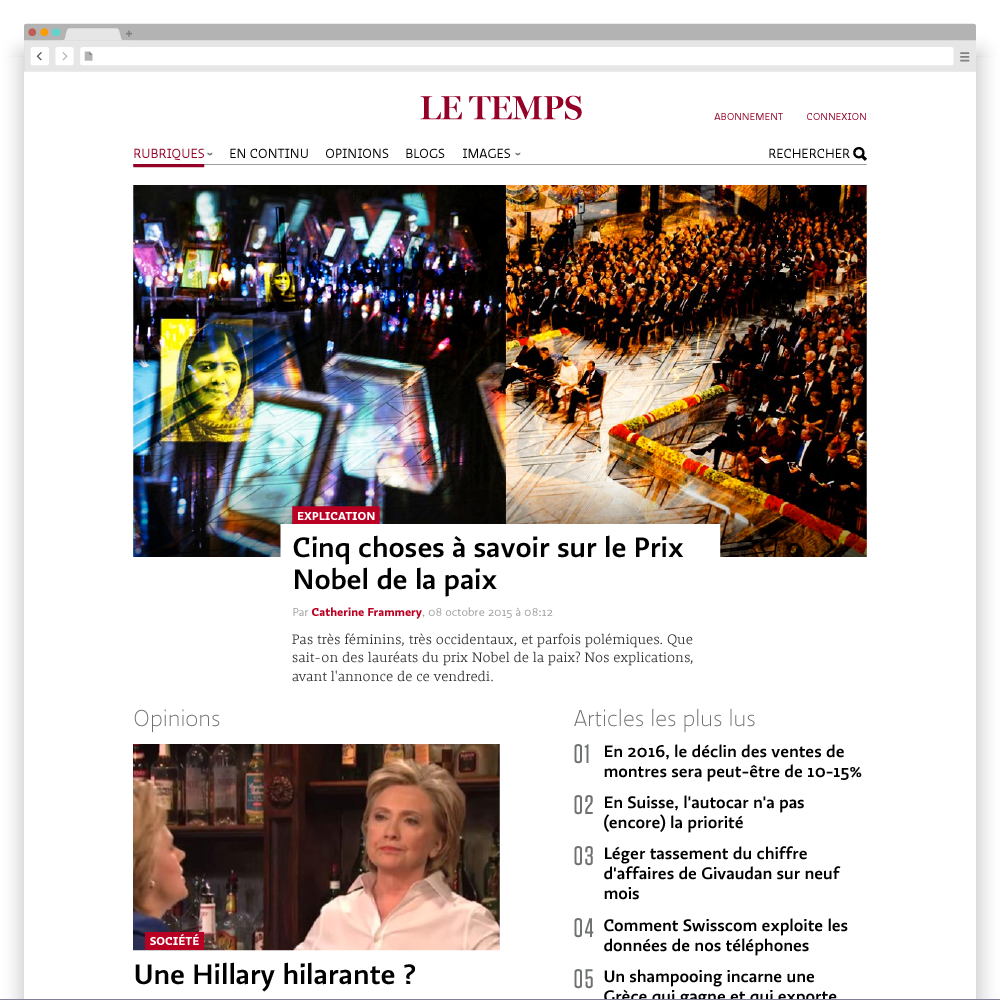
Once we knew how the site and its different parts were going to work, we tackled the graphic design of the site. Basing our design on the new logo and graphic charter of Le Temps, we created pages that are both simple and elegant. After all, the background should never take the spotlight away from the true star of a newspaper: the content.
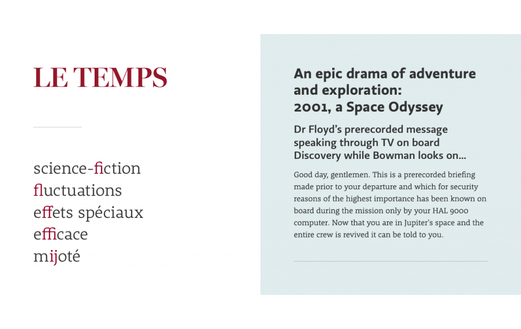
Our designers particularly enjoyed exchanges with the typographical experts of Le Temps. There were passionate discussions about the shapes of letters and choice of ligatures, as well as a whole series of typographical tweaks for a sophisticated reader experience. We also needed fallback solutions to guarantee the desired aesthetic result on different generations of browsers.
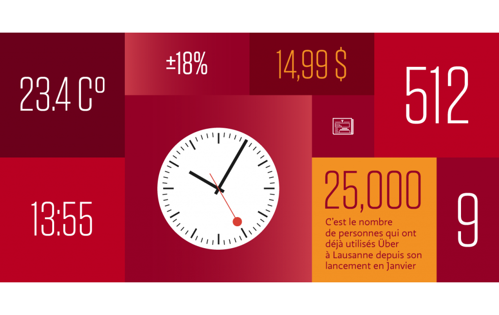
The visual design contributes as much to the bright colours of the newspaper as the various types of graphics, including photos, computer graphics, videos, and ads. We also thought about how the blocks of content would appear in various contexts. And evidently, throughout the project, we took into consideration the different screen sizes of users.
The technical side of things
We believe that a site shouldn’t remain fixed once it has been published. On the contrary, it has to live, grow, and adapt to an environment that continues to rapidly evolve. That’s why we think about pages like LEGO blocks. Each creation is made of individual parts that can be easily taken apart and reconstructed, or separated into different groups. Each element we’ve developed for the site can easily be reused for future developments, or adapted for different types of digital media.
For this building-block approach, we applied the principles of Atomic Design, which establish a hierarchy between the different parts. An atom – the smallest element of an interface – joins with other atoms to form a molecule. Molecules in turn combine to form an organism. Organisms come together to form templates. A template – which is where the content is placed when a page is viewed – provides the structure of a page.
A site that is constantly evolving
Next, we implemented our dynamic style guide system, which works like a digital graphic charter. Each element of the site, from a button to a photo to a table, is indexed and accompanied by an example. That allows us to easily test each element on different navigators and devices in our Device Lab. Unlike a classic charter, our style guide evolves; it is updated each time we publish new content.
This system, combined with the building-block approach, allows the site to continuously develop without us having to intervene for each individual page. The site will transform little by little, rather than having to be completely reworked to respond to technological changes and user behaviour.
And this is only the beginning
It’s not every day that a web agency gets the opportunity to work on such a project. Being able to focus on what we consider to be the essence of a web project – the content and how to feature it – is particularly rewarding.
Le Temps only launched its new website a few days ago, but we’re already getting positive feedback. The average time visitors are spending on each page has risen significantly and the bounce rate is going down. And those are just the initial results. While there’s still a long way to go, the digital future of Le Temps looks promising indeed.
“ Antistatique won the competition launched in 2014 for the redesign of the site du Temps. We wanted not only a responsive site, but also an evolving concept that allows us to react quickly by adapting the design to new trends and new writing needs. We did not know if an agency would be able to satisfy us. Antistatic proposed 2 innovative concept: the Atomic Design and the dynamic style guide. Year after year, letemps.ch has evolved but remains faithful to Antistatique's basic design principles, which have allowed us to win several awards and a great respect in the world of French-language media. When I talk to Antistatic teams, I know that I'm not dealing with mere performers who are better at design or code than me. Rather, they are people with whom we lead stimulating reflections on the relationship between a media and its audience. And graphics is just one of the outputs that follows. ”Gaël Hürlimann • Gaël Hürlimann, Editor-in-chief of Le Temps
