
Ville de Neuchâtel
Museums of Neuchâtel, follow the guides!
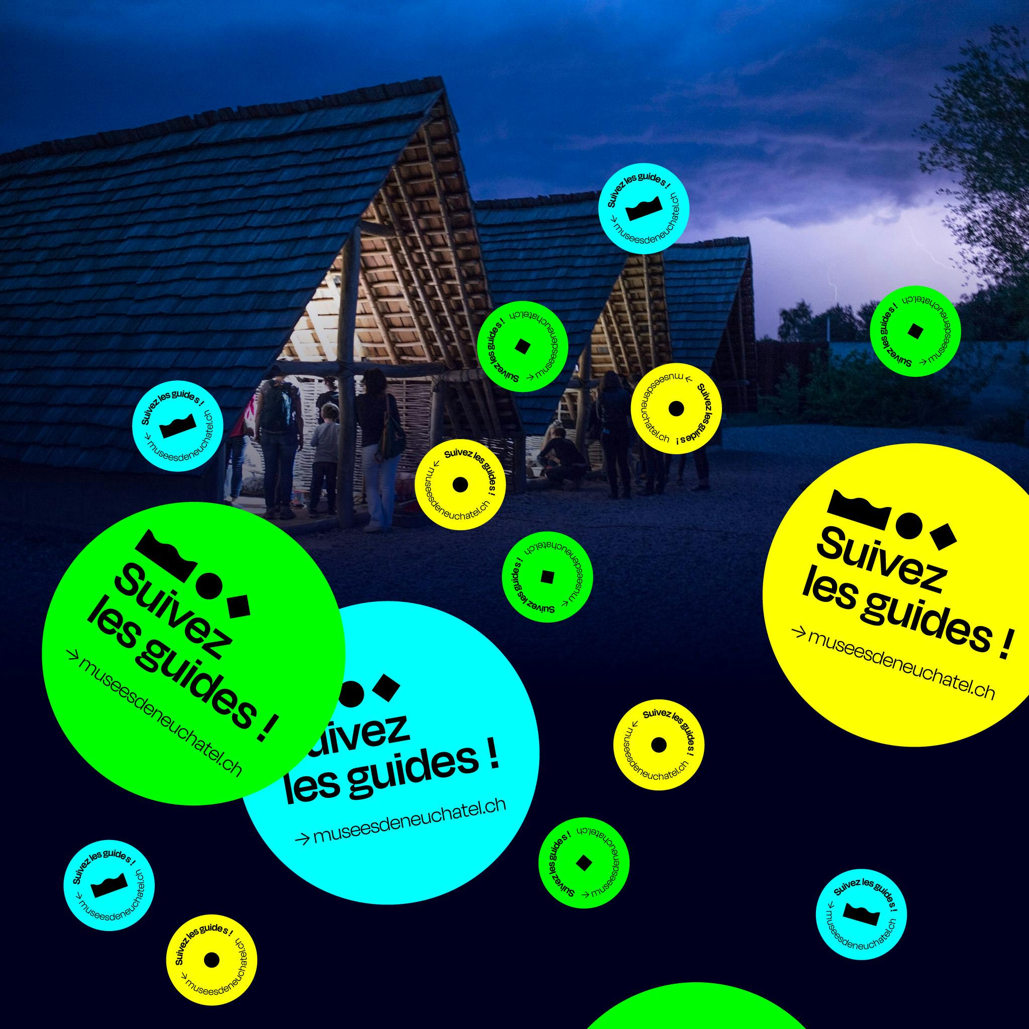
Let's go to the museums! That's the spirit in which we worked on this campaign. We want to attract, seduce, intrigue, tempt, amuse, shake up and inform the public with contrasting visuals in memorable colors.
museesdeneuchatel.chBranding
- Artistic direction
- Charter and documentation
- Visual identity
Design
- Interaction design
- Motion design
- Visual design
Marketing & Communication
- Communication strategy
- Media strategy and acquisition
- Social media strategy
Project management
- KPIs and performance monitoring
Web Development
- JavaScript development
- Mobile development
Branding
- Artistic direction
- Charter and documentation
- Visual identity
Design
- Interaction design
- Motion design
- Visual design
Marketing & Communication
- Communication strategy
- Media strategy and acquisition
- Social media strategy
Project management
- KPIs and performance monitoring
Web Development
- JavaScript development
- Mobile development
Let's go to the museums! This is the spirit in which we have worked on this campaign. We want to attract, seduce, intrigue, tempt, amuse, shake up and inform the public with contrasting visuals in memorable colors. This campaign comes to the people to propose to them to (re)discover these places more life and surprises. The City of Neuchâtel is behind this initiative and we are delighted to have been able to implement it with North Communication.
Key visual elements of the campaign
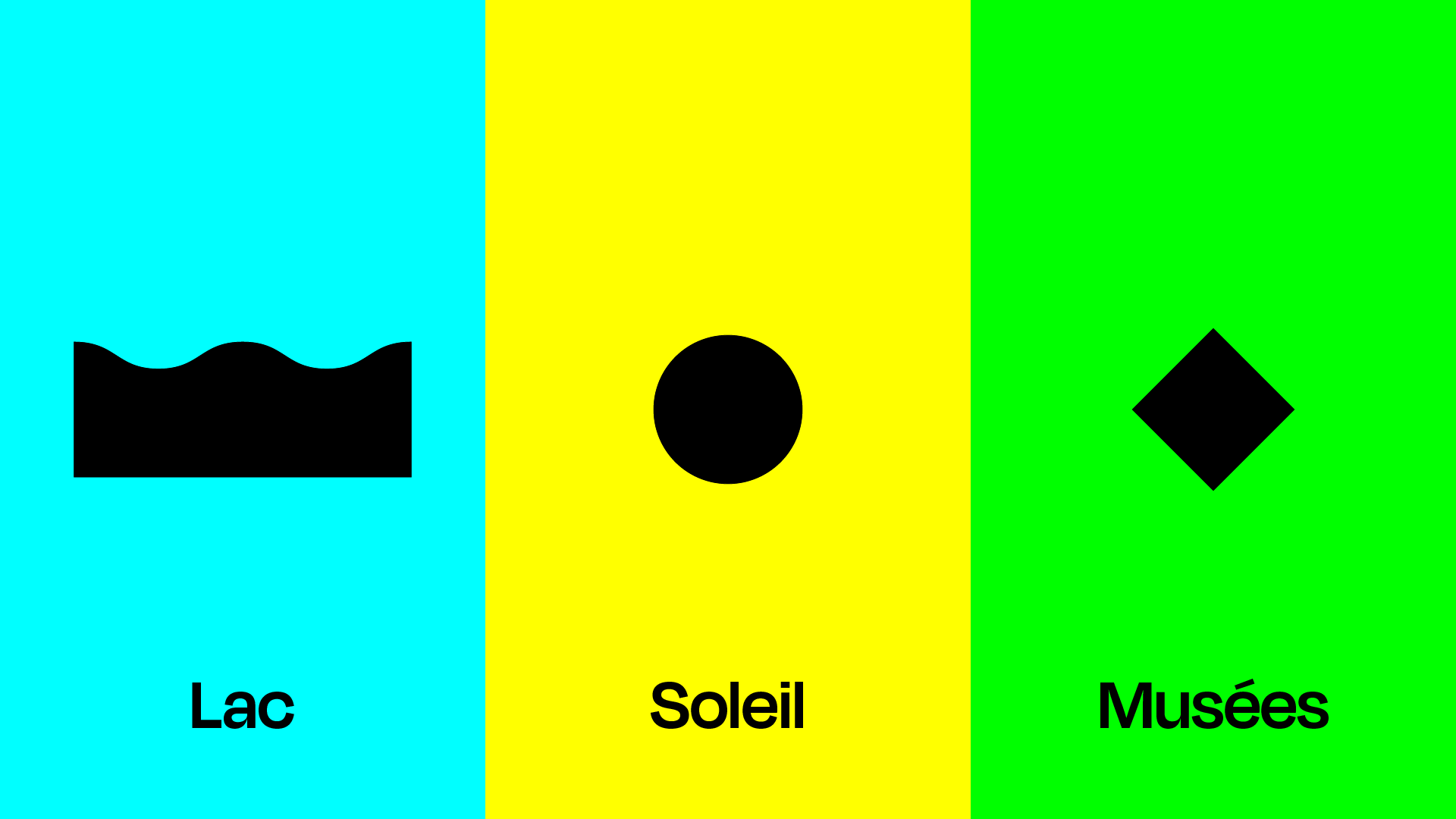
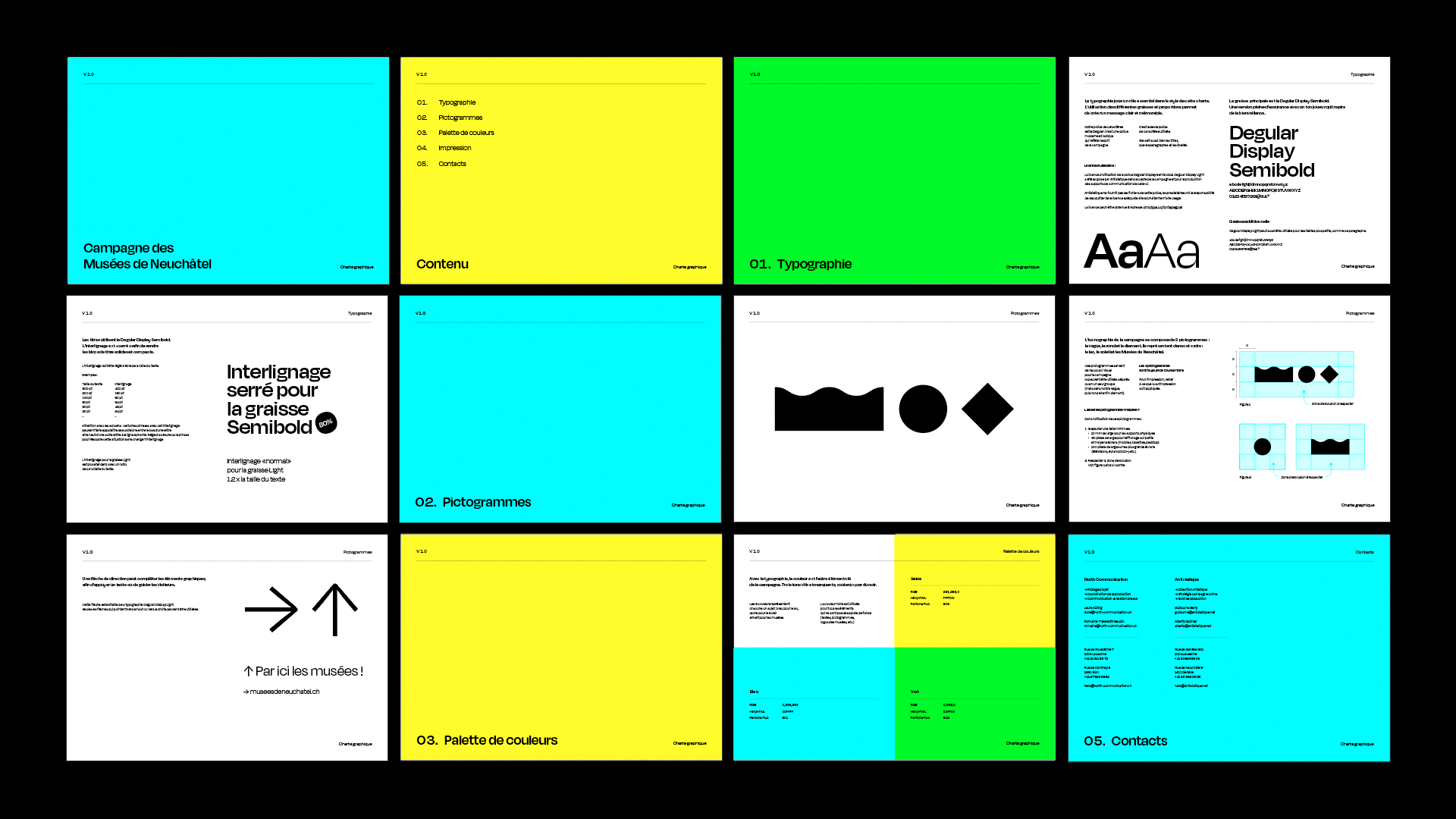
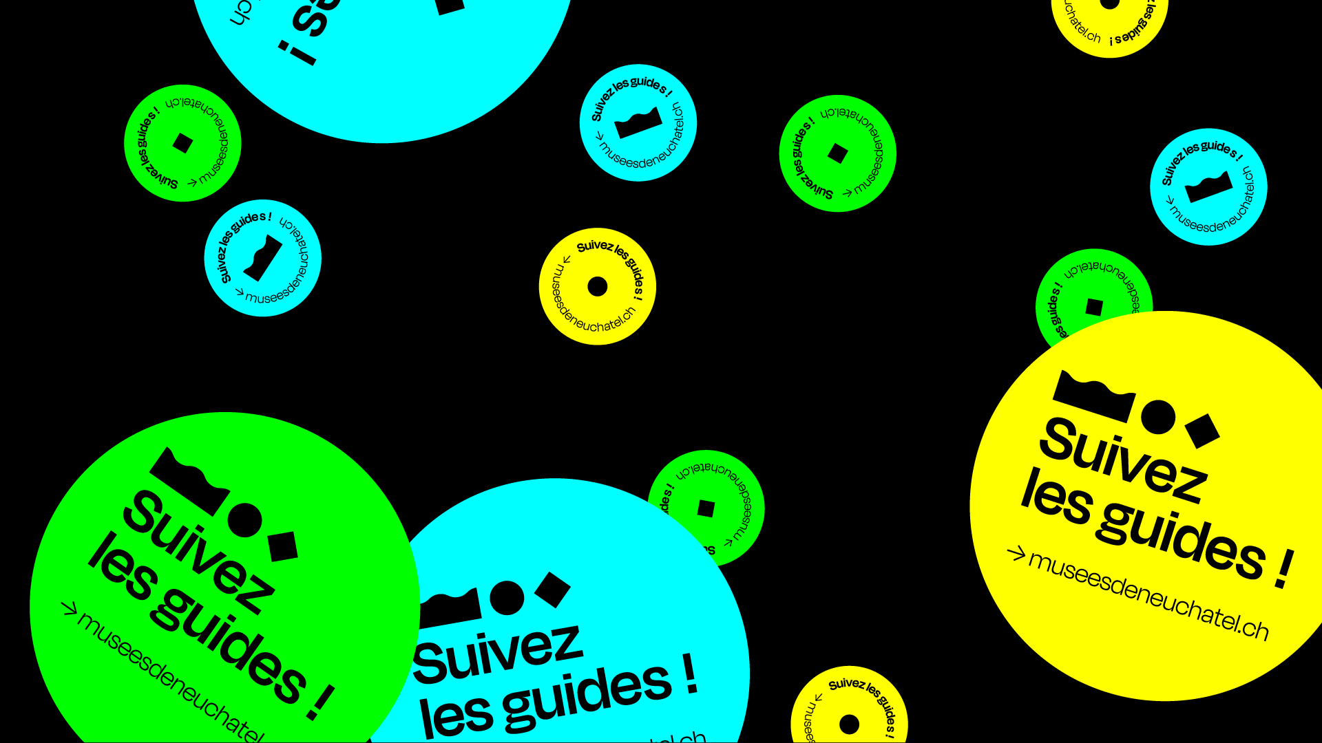
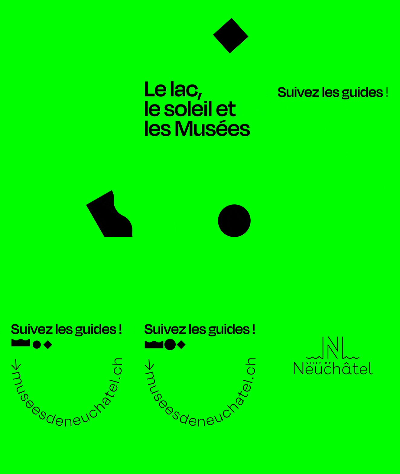
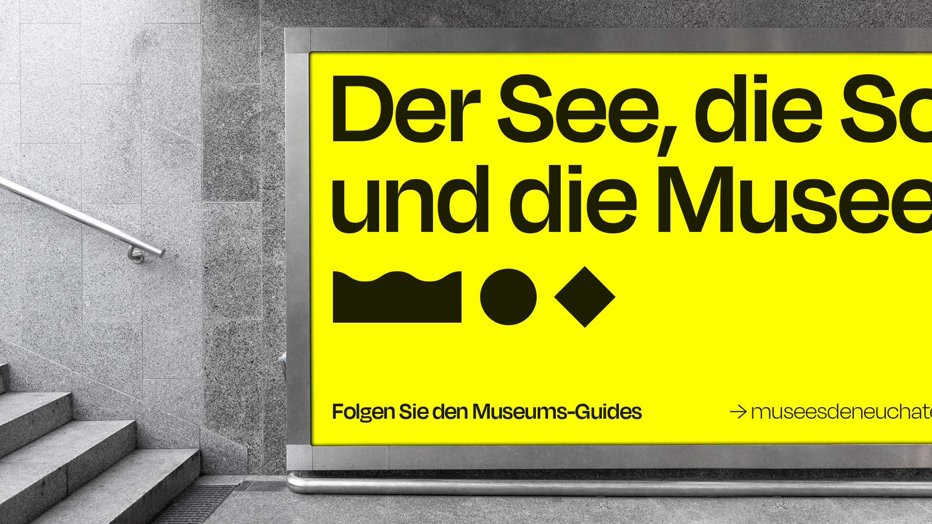
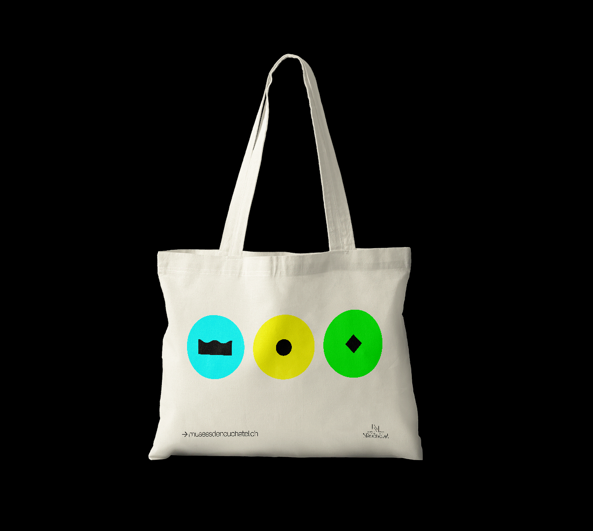
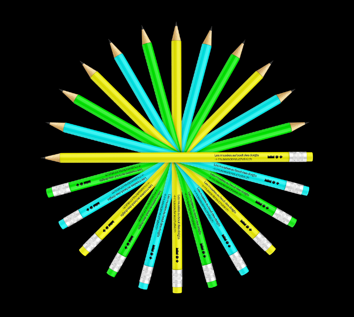
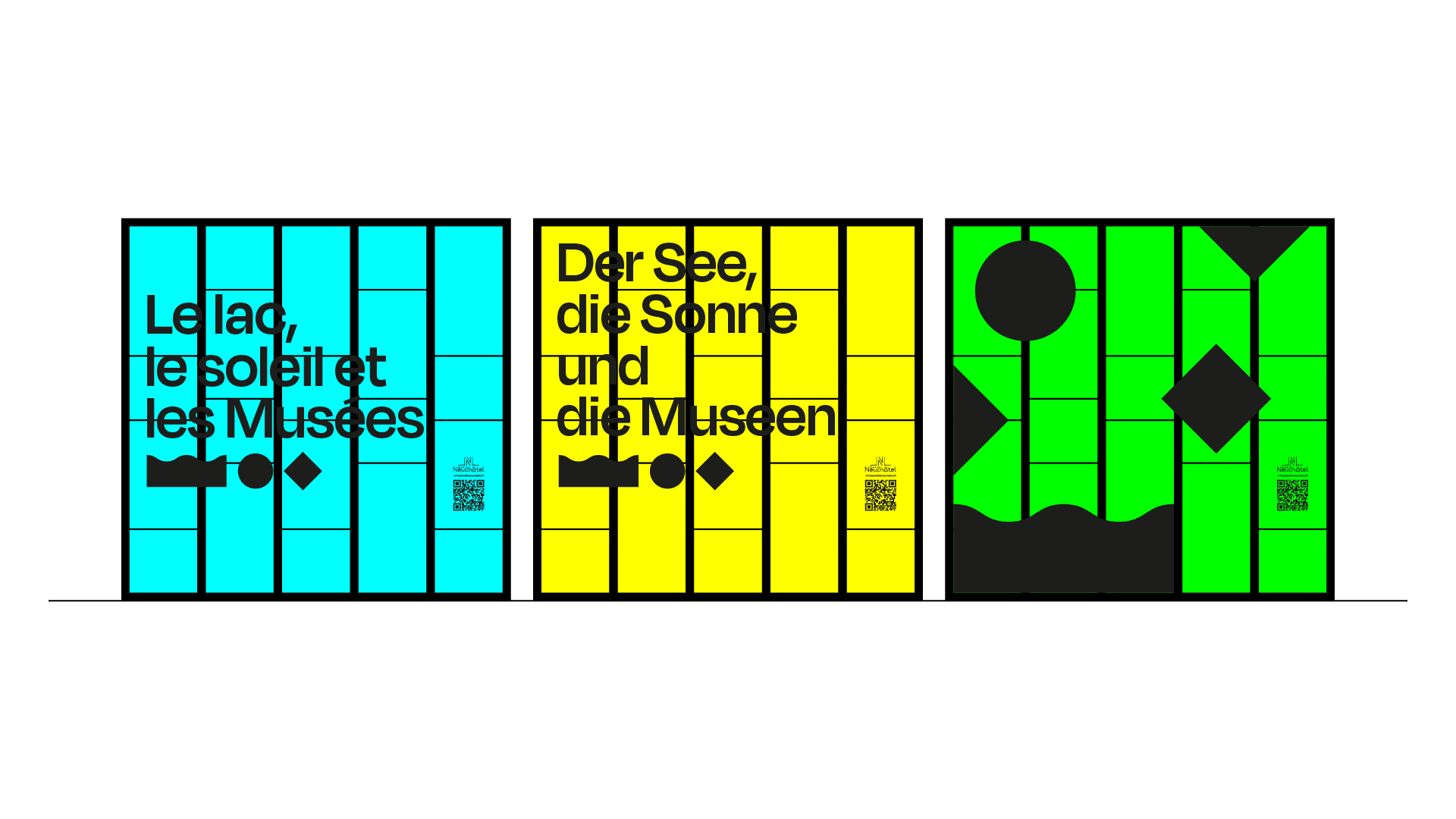
Fluorescent colors, pictograms in your face and good humor: a cocktail full of energy! Yellow for the sun, blue for the lake (or the sky) and green for the territory where the museums bloom. Three pictograms to support this palette: the round for the sun, the wave for the aquatic element (check the link with the geography of the city and its new identity) and finally the diamond-shaped to symbolize the museums (like on a treasure map for example). With these simple and effective elements, we are ready to communicate.
Branding elements
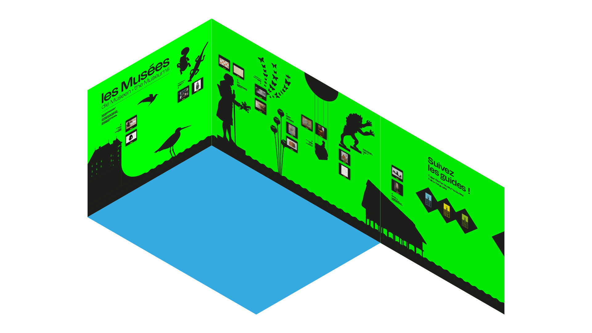
Glimpse of some of the elements that make up the graphic identity of the campaign.
Implementing
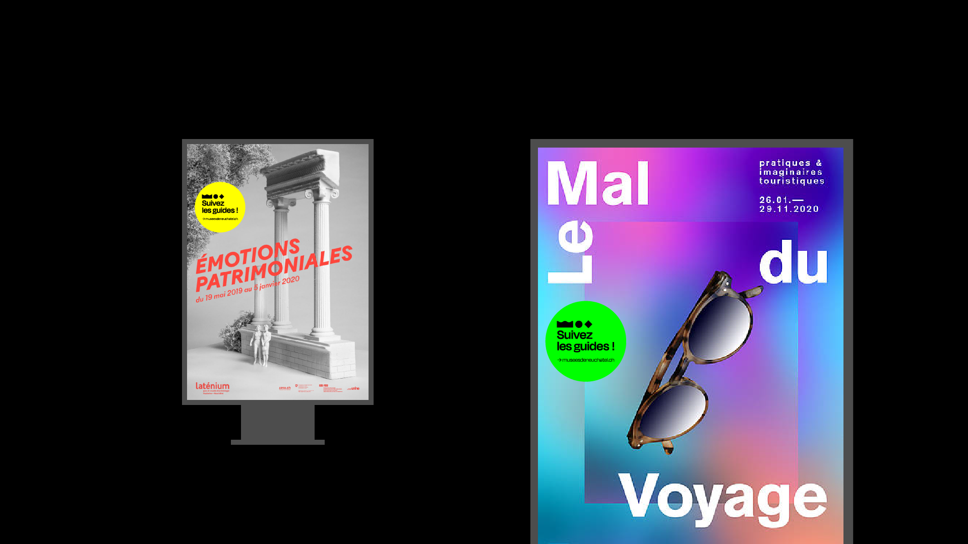
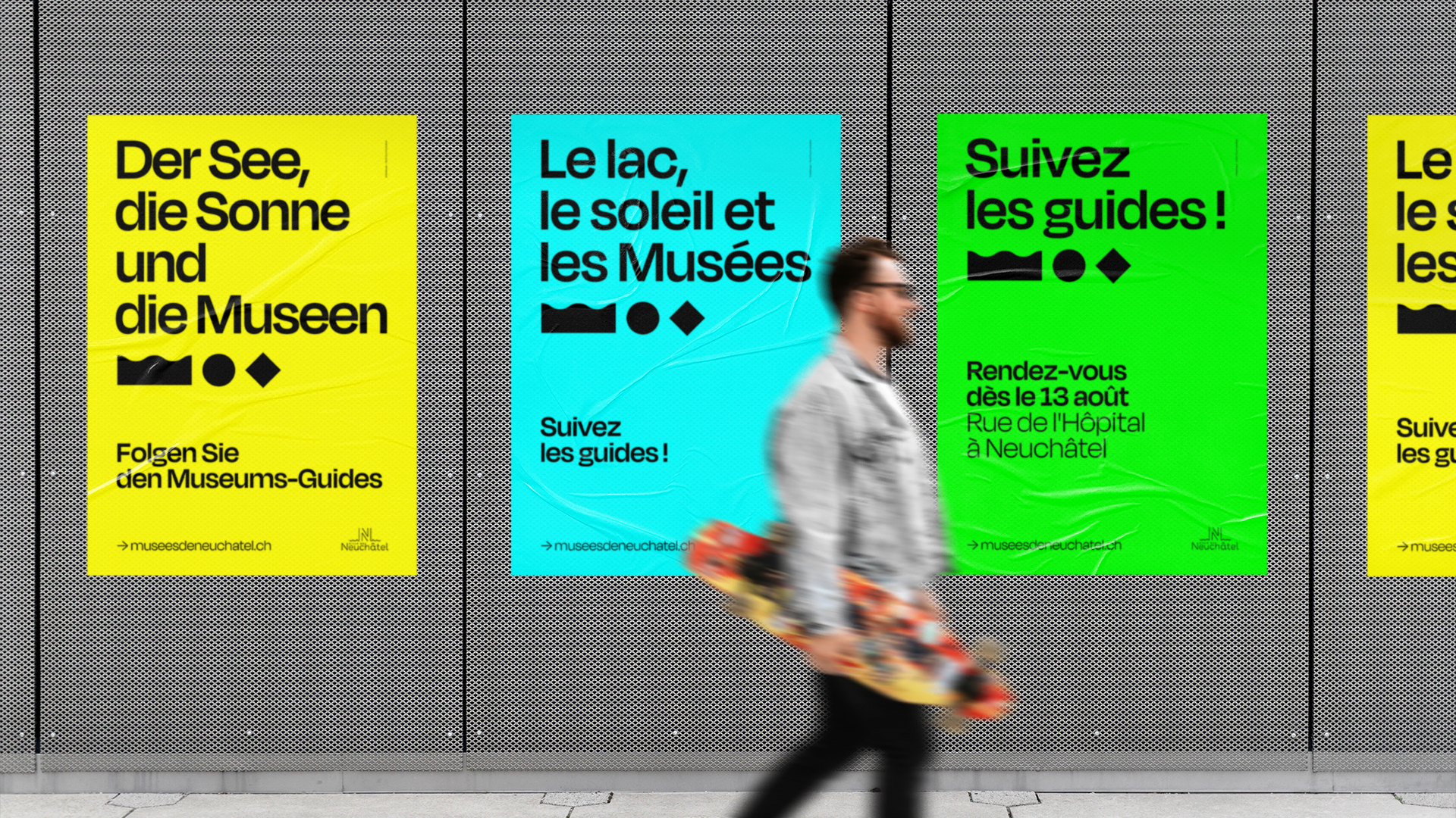
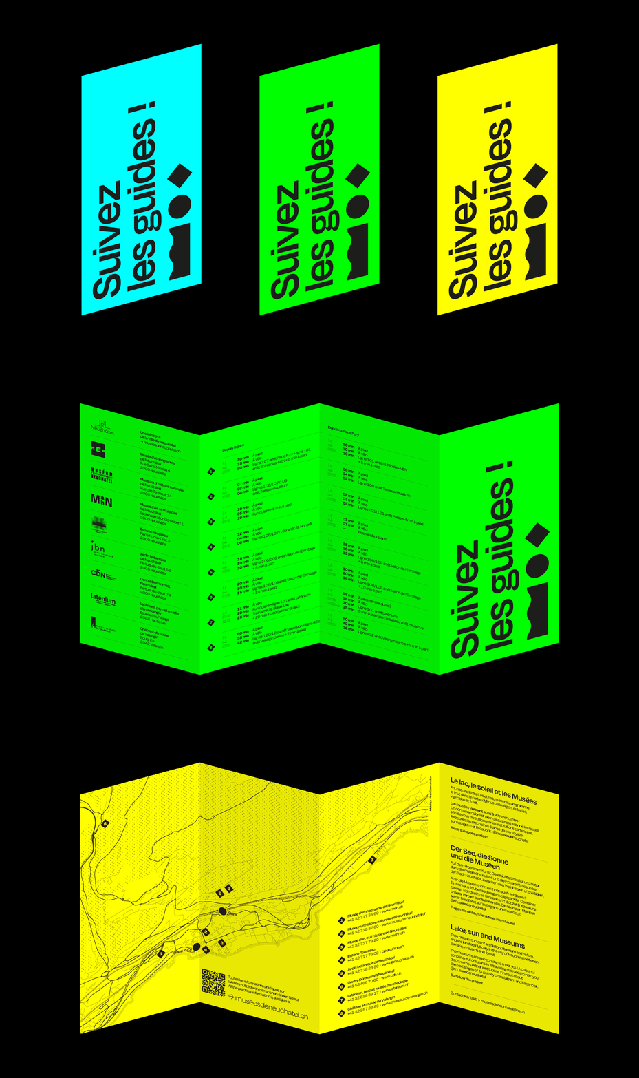
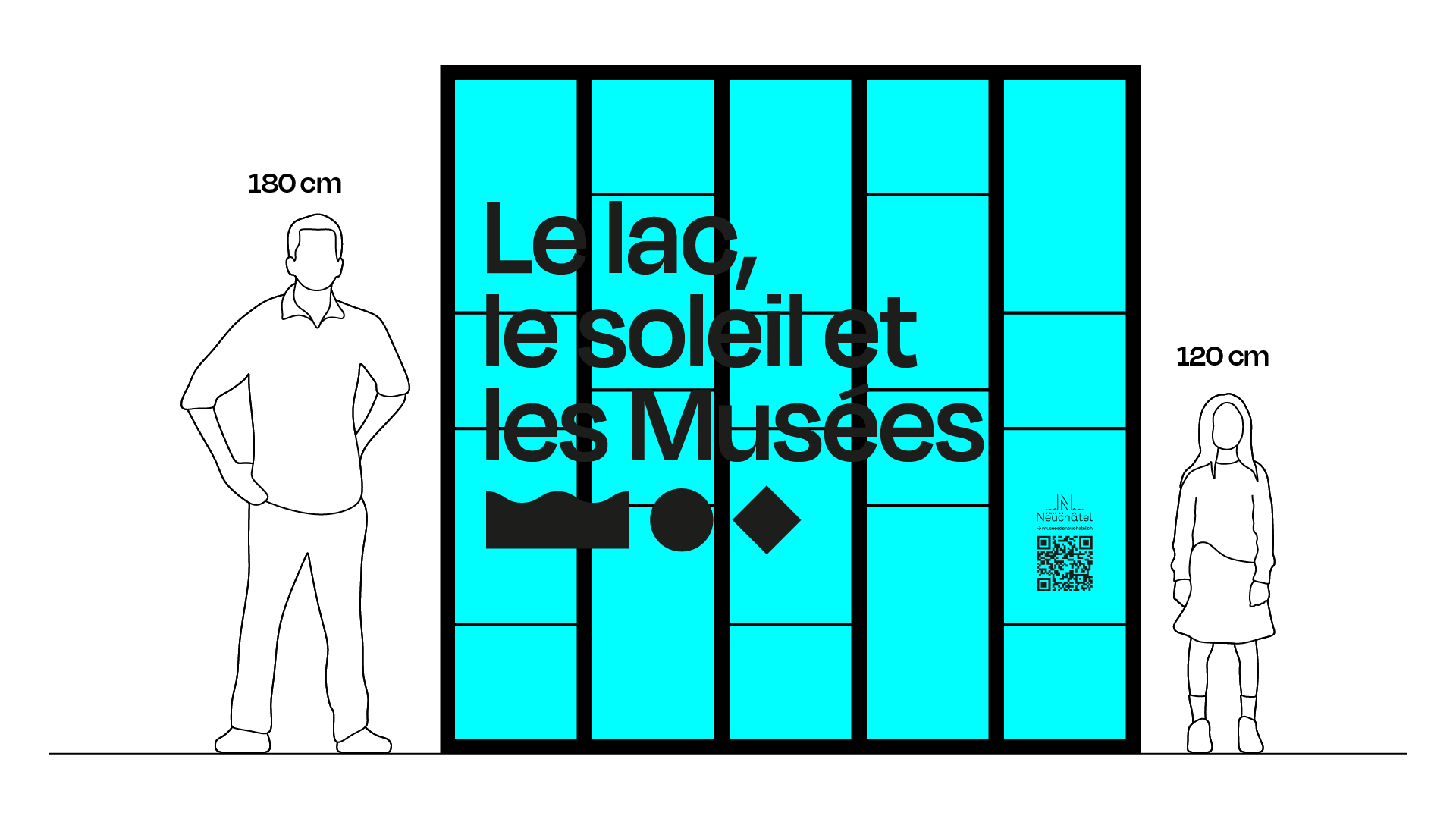
Once the graphic bases were laid out, we matched them to the global message (the texts of the campaign). This gives a strong set of different communication media prints and digital.
Motion design
Glimpse of the animations for the digital campaign. Make the pictograms dance with lightness to echo the season and the energy of this communication.
Landing page
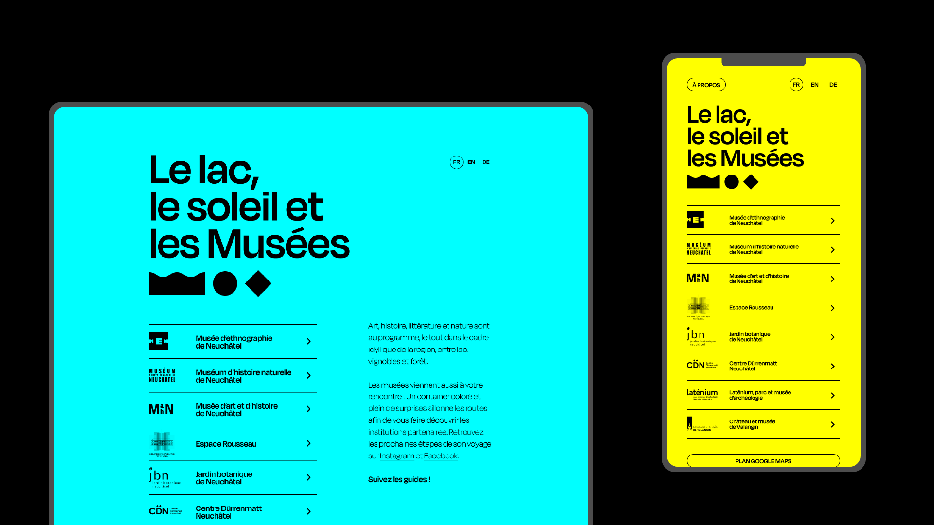
A web page to relay information, but especially to accompany visitors in their trips. The emphasis was on the use of soft modes of transportation and public transport. The background of the page randomly changes colors when loading, adding an extra element of surprise.
Launch Weekend
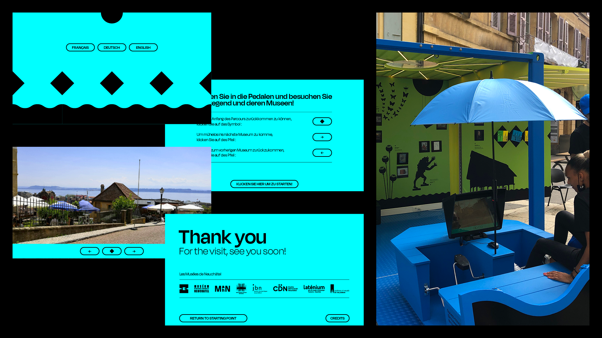
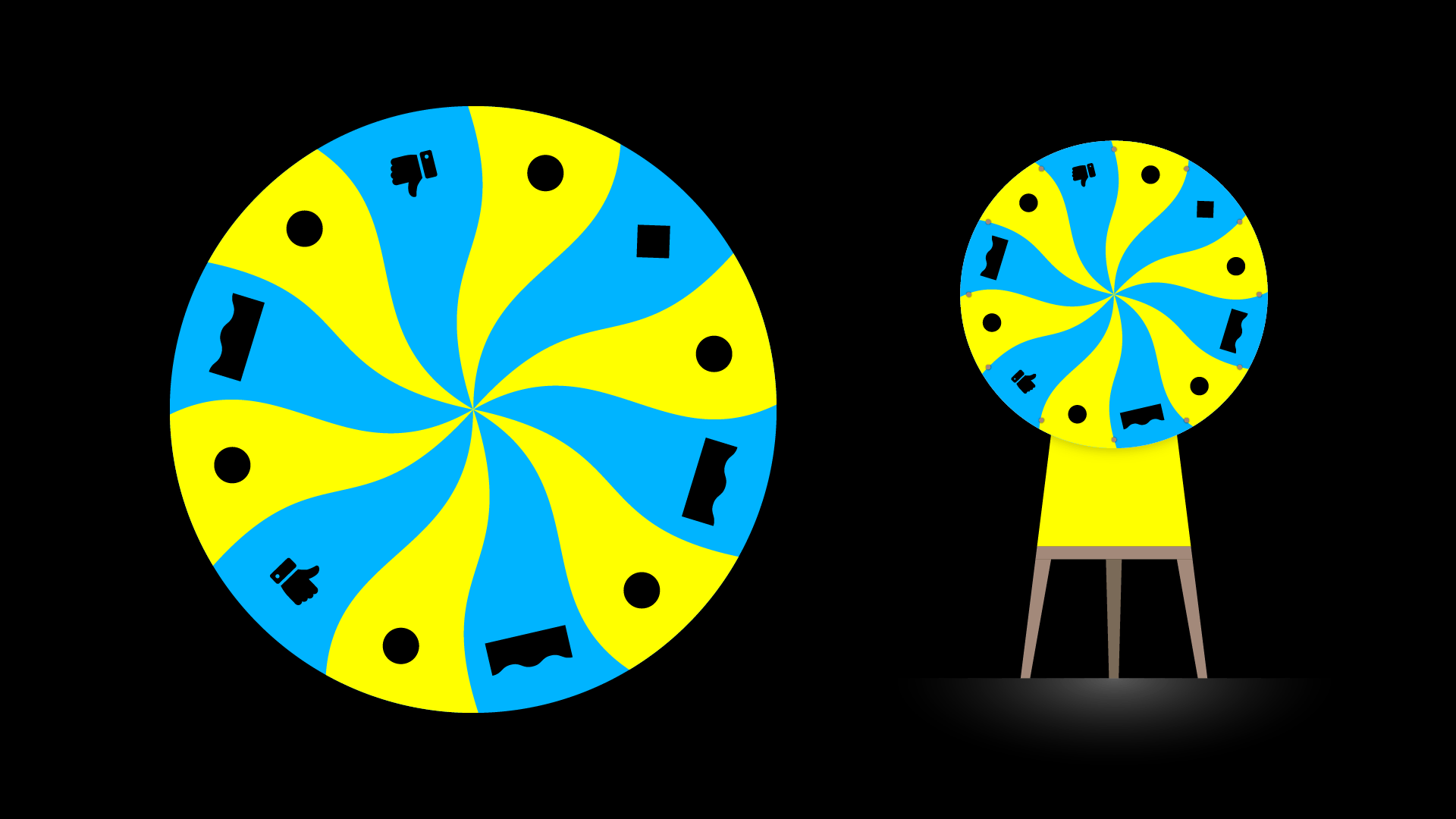
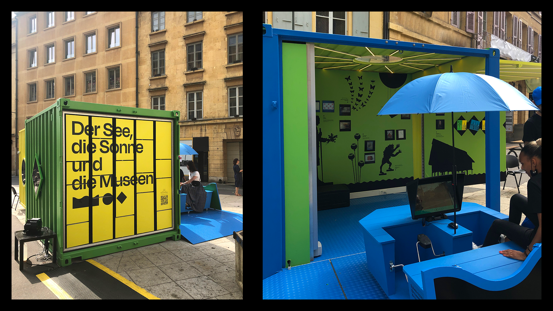
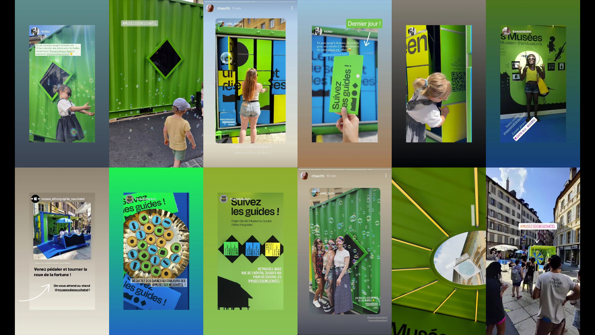
North Communication had planned a lot of things for the launch weekend. We helped them put in image several supports: the interior and exterior dressing of the container with its fresco and its playful wall, the interactive pedal boat, the wheel of luck or various goodies offered to the passers-by. The press conference, followed by the launch weekend, were a great success and the sun was out!
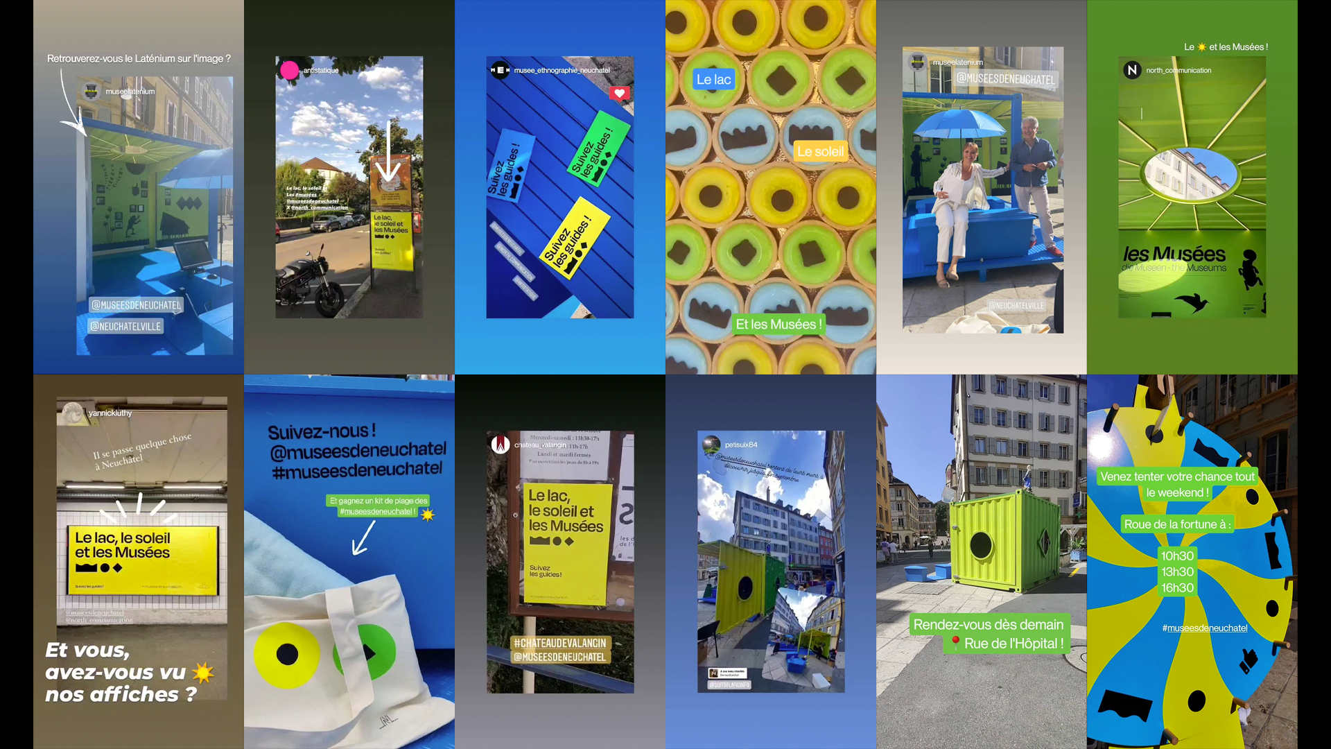
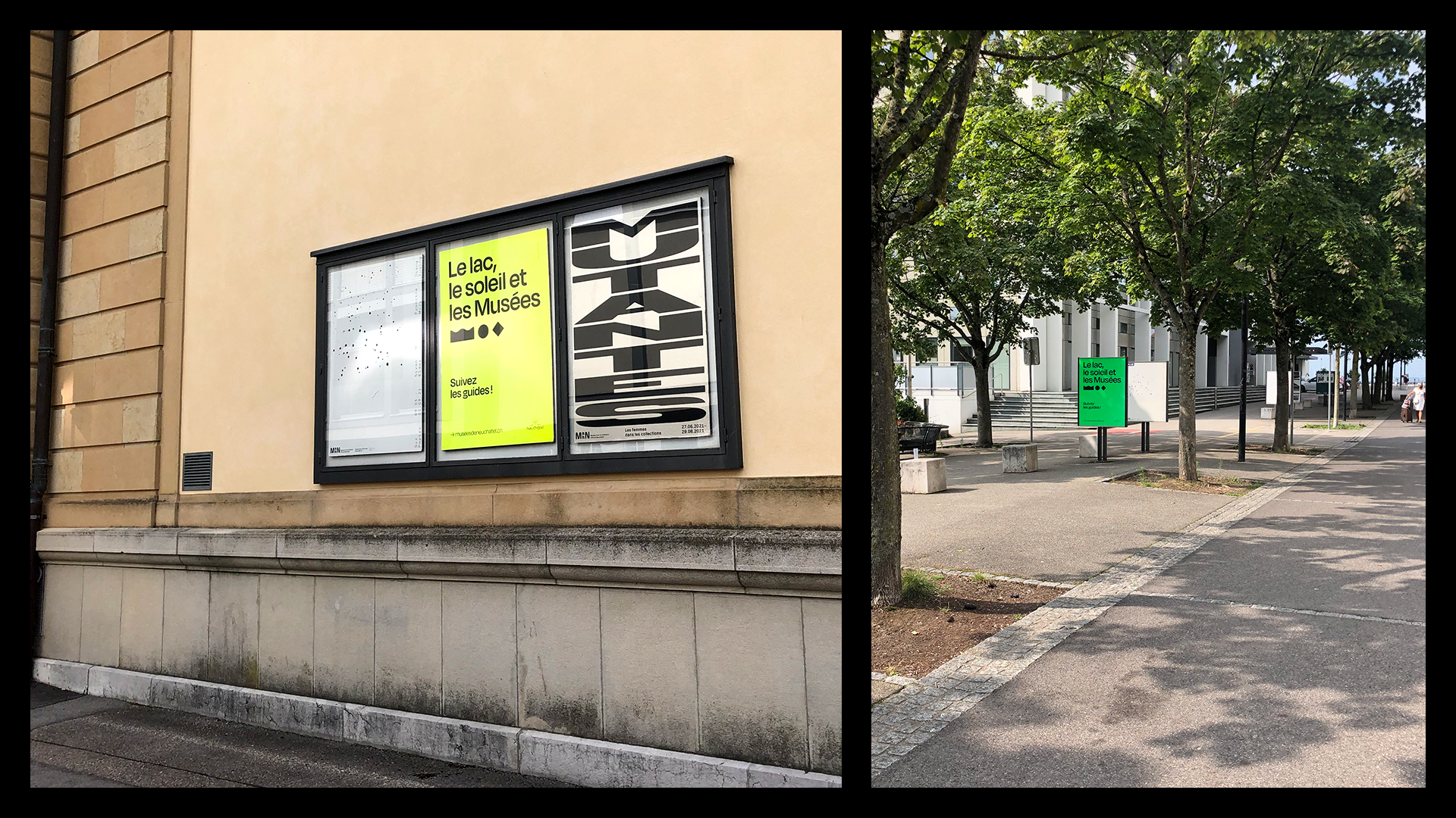
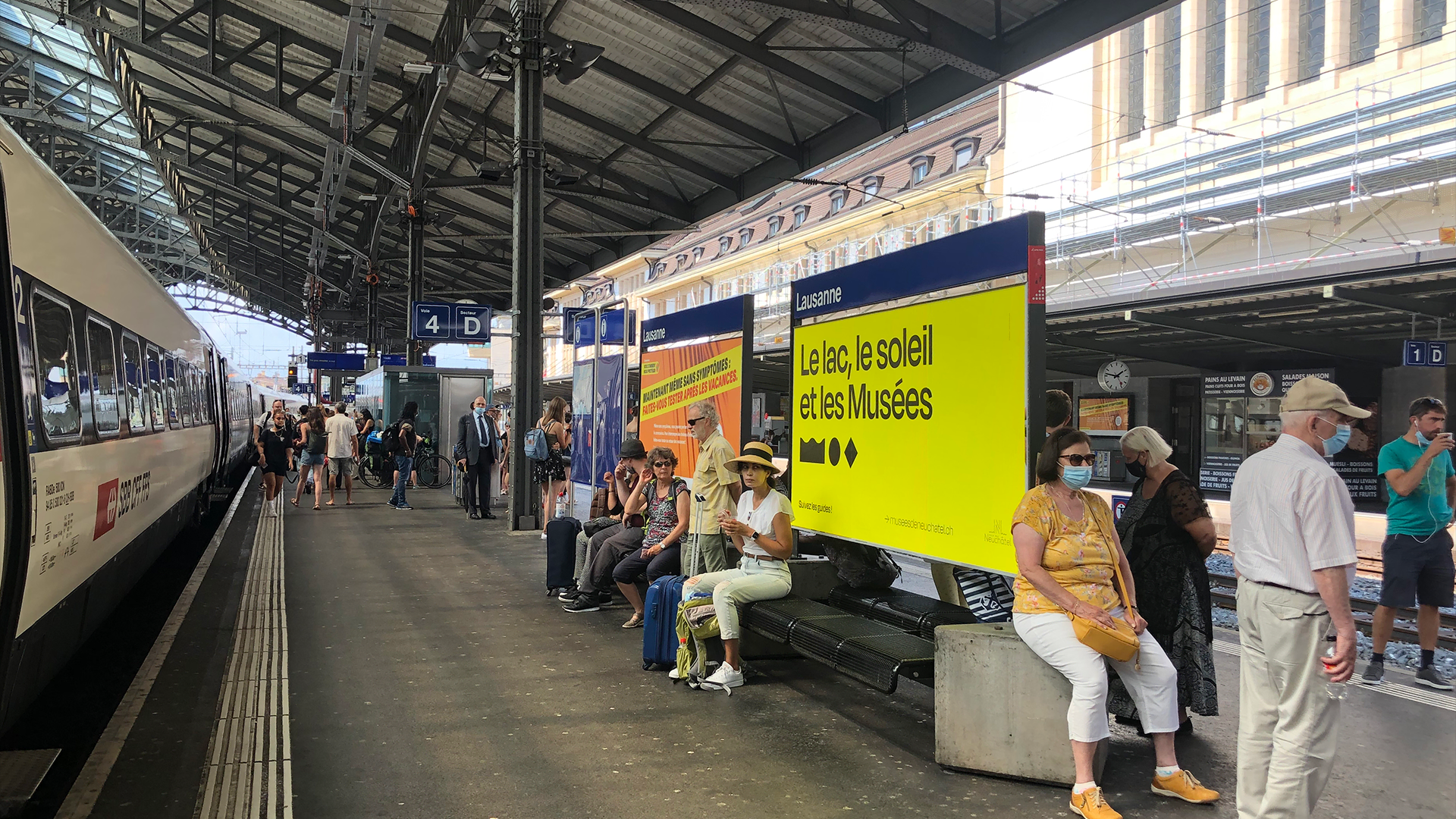
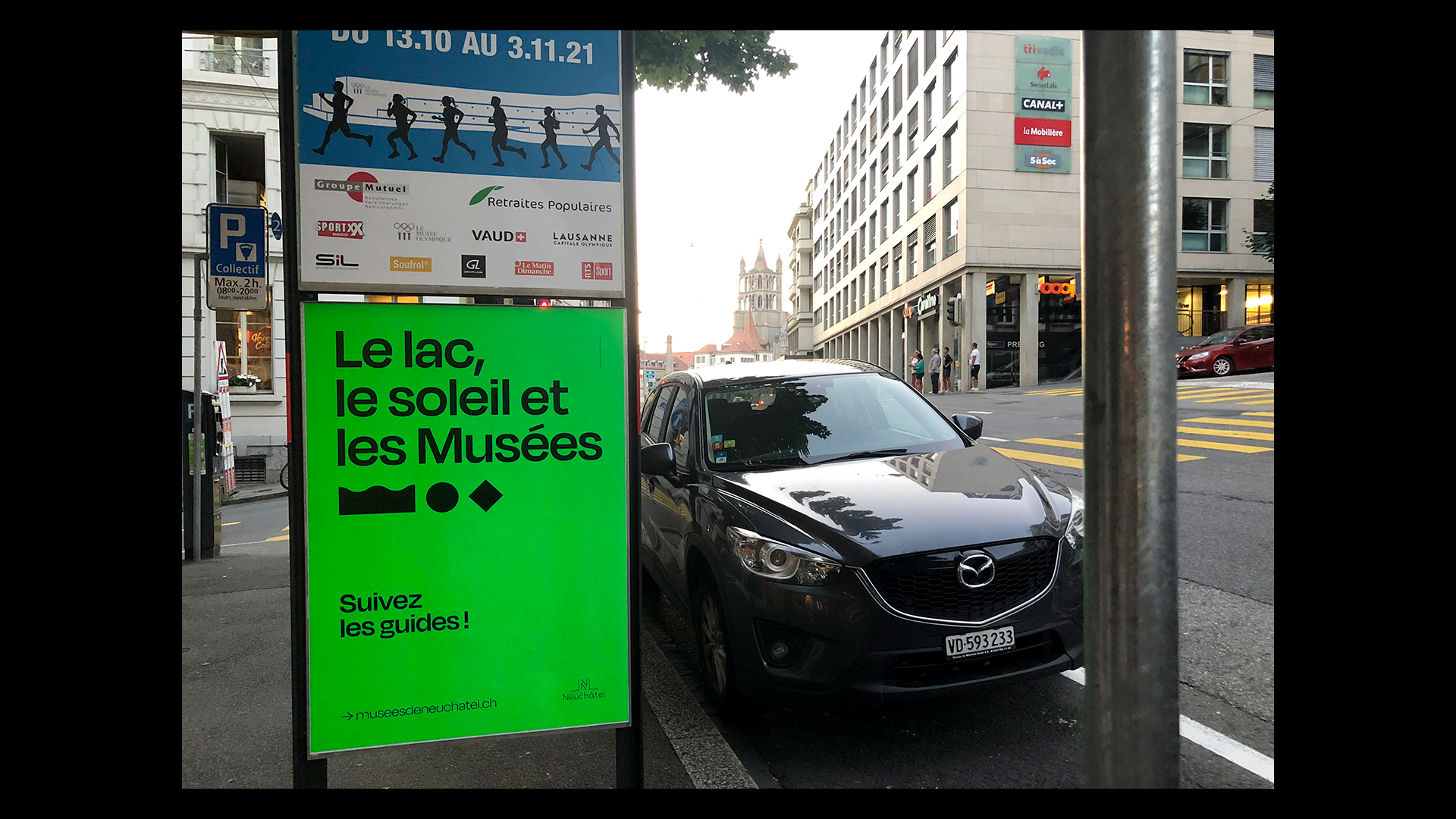
Poster hunt
In the streets of Neuchâtel, but also in Lausanne.
What's next?
See you on the road to cross the container! And also see you next year for the continuation of this campaign high in culture and color.

House Of Perreo
project.teaser.a11y.services"Branding", "Marque", "Naming"
