
Ville de Genève
City of Geneva - official website redesign
Research, architecture and visual design for the City of Geneva website. A multi-year project for a sustainable design oriented towards people living and wishing to live in Geneva.
geneve.chA great city project
We were very pleased to start the design work for this great website redesign project. This new mandate matched with our offices opening in Geneva. We were also looking forward to bringing our expertise to this platform, to serve the citizens of Geneva.
The design approach in a major project
Antistatique is obviously not the only stakeholder in this ambitious project, there are different departments involved. Before starting, there will also be an upstream ergonomic analysis of Telono. We’ve absorbed the reports of usability tests from the former website and have also integrated the given recommendations into our workflow for the new platform. A fresher website that better meets current behaviours and, of course, people's expectations regarding access to information.
The plan - or the Art of wireframes
We often compare the design work of a website to an architect’s work, as for us, wireframes represent the plan or the skeleton of a page. This makes the information architecture tangible and shows the layout of each page. We make visible the hierarchy of information and the interface components. These wireframes also serve as a support for usability tests. For this project we created HTML template pages. This solution allowed us to demonstrate the "responsive" pages during the steering committee meetings. These deliverables facilitate the discussion with the team ant their awareness of the complexity or simplicity of the solutions proposed on the screens.
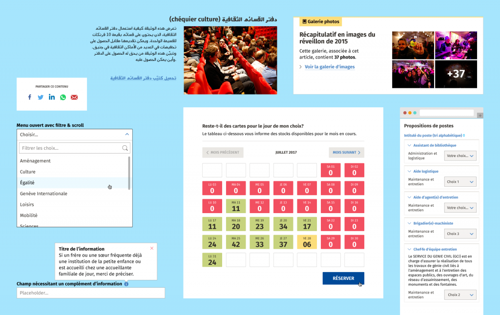
In parallel to wireframes, we maintain a comprehensive list of components called "component matrix". It’s a list of things that can be modified if needed: what, what name, in what form, what information, for what kind of display. This document is used by everyone during the different project phases.
The visual design
Art direction and web design
“Geneva: city life” or “Geneva – get informed, get inspired”. These are two sample catchphrases that could summarise our visual approach. Although the website has a public information service goal, Geneva is a city on the move, where the social and cultural scene is alive and kicking. Just like the two sides of a coin: the website of the City of Geneva must offer both of these aspects.
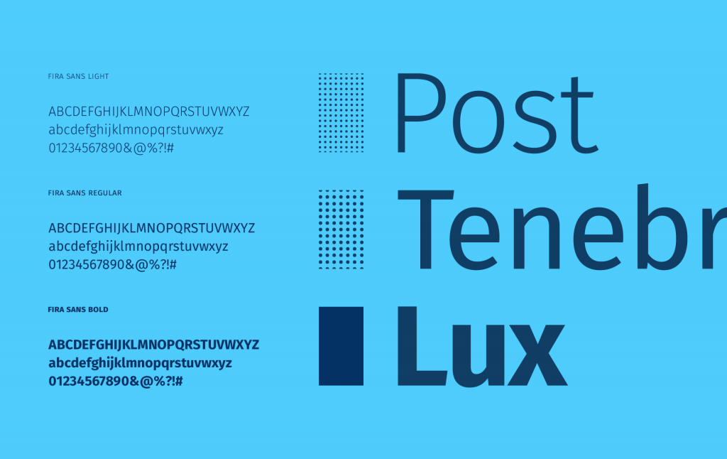
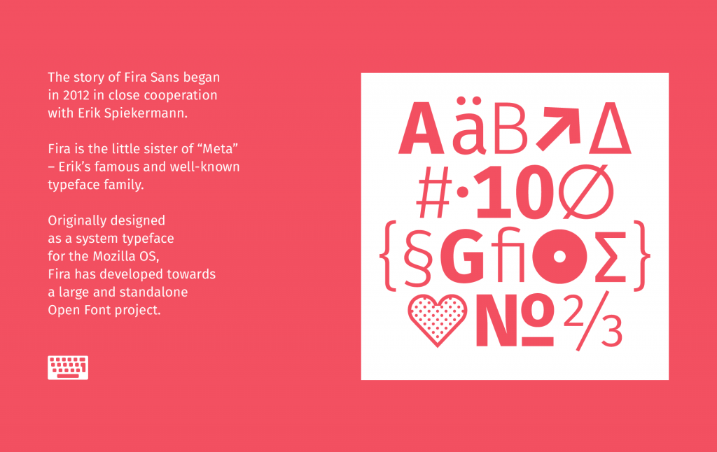
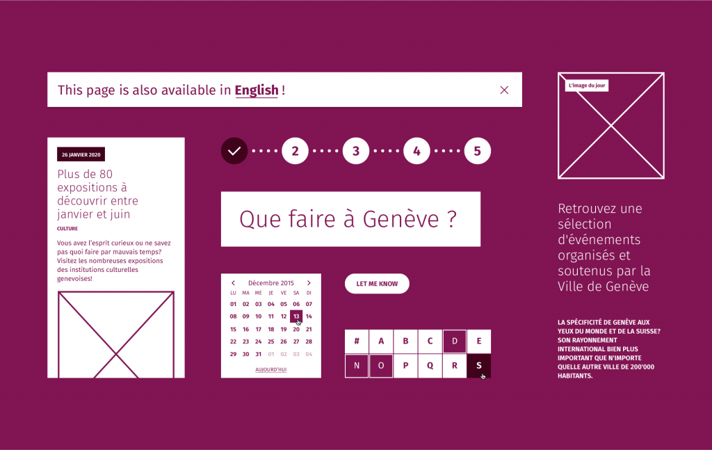
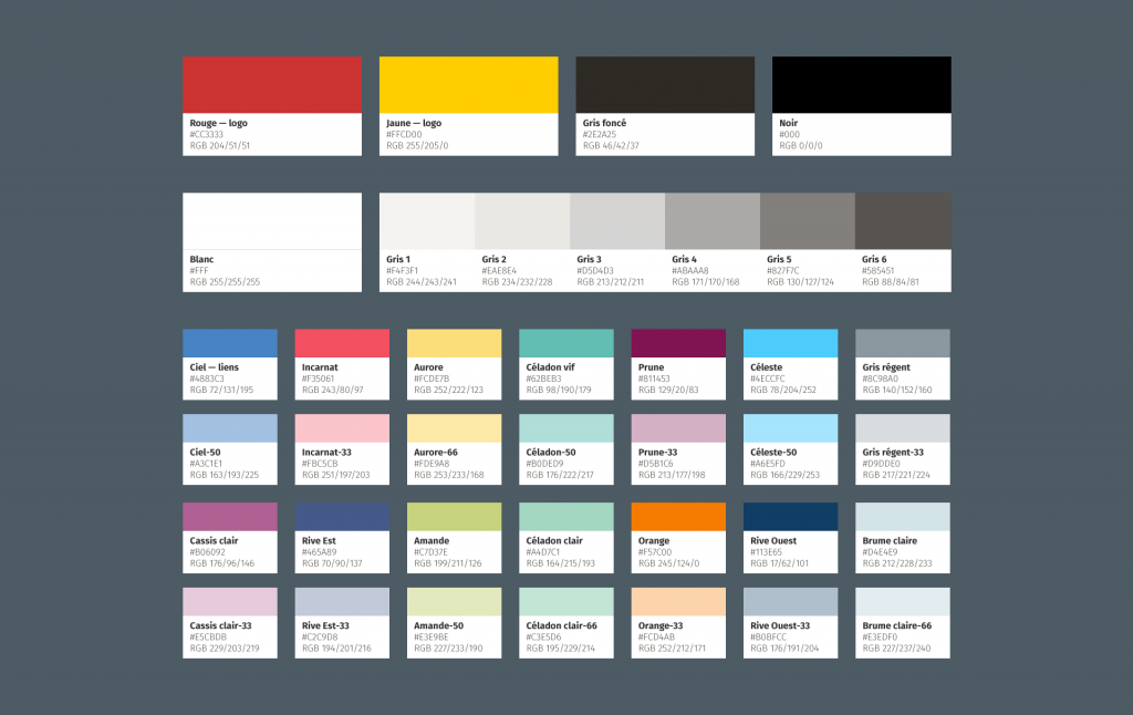
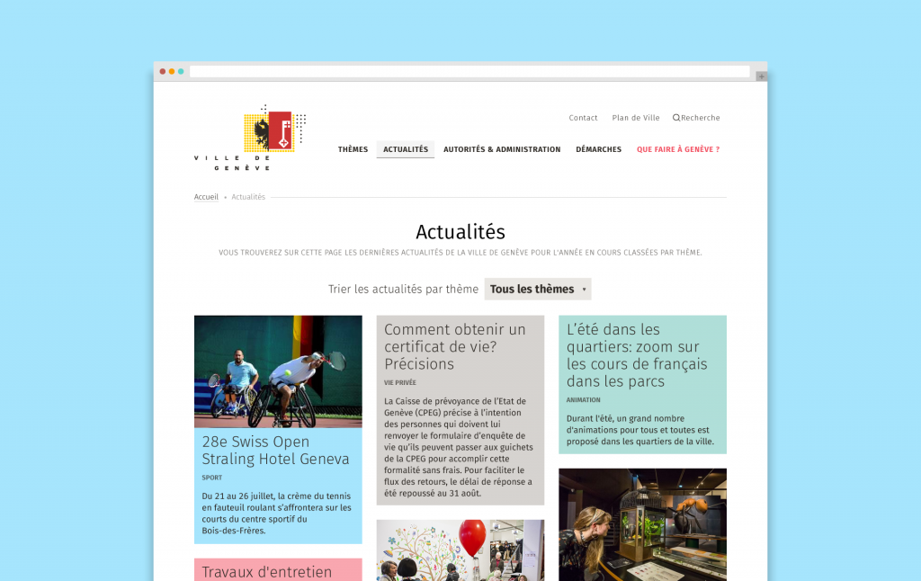
We’ve therefore proposed an interface that combines a strict construction with a charming “je ne sais quoi”. You'll find the information and we'll charm you along the way.
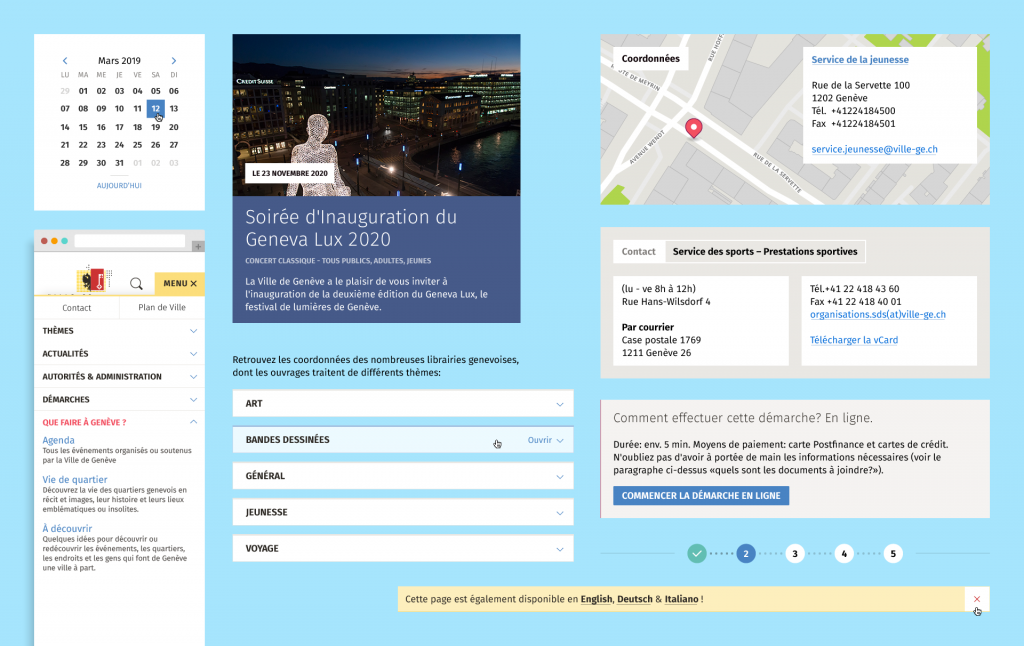
Again, we’re not starting this project from scratch. The City of Geneva has already a solid styleguide we can work on. We therefore made sure it extends online and can be expanded. All the mockups, templates, components, interactions and animations reflect these design intentions.
Illustrations “made for Geneva”
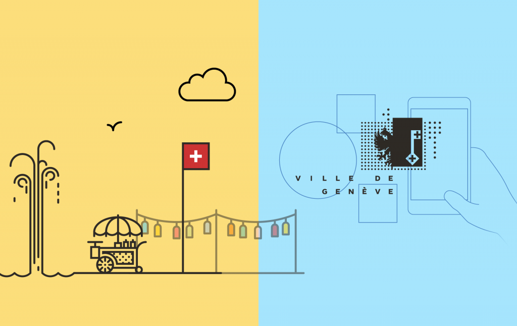
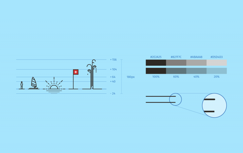
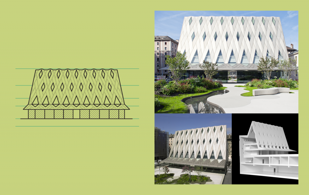
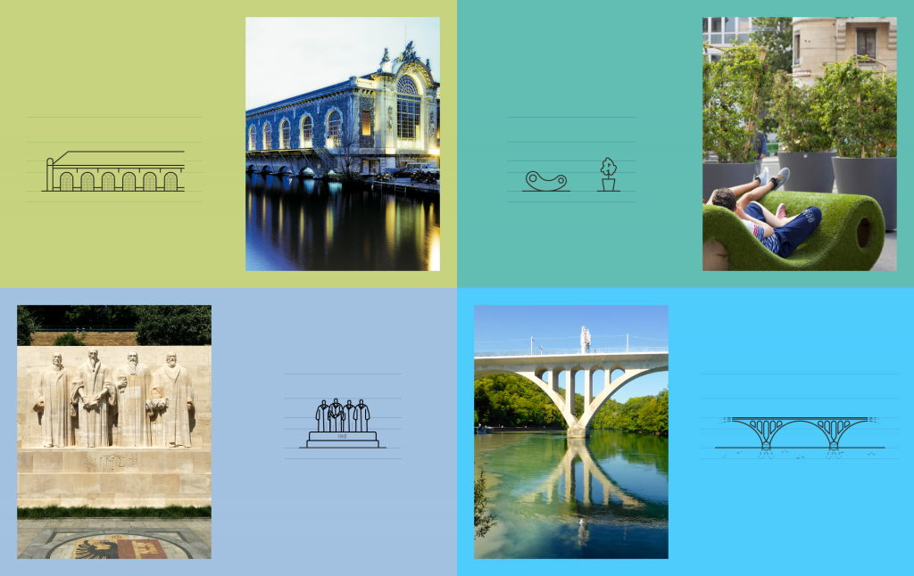
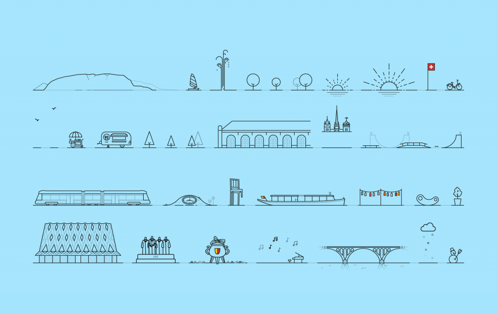
The footer of the site hosts a series of custom illustrations. This sympathetic and engaging illustrated landscape allows depicting the cityscape of Geneva to people passing by and to propose a refreshed look to the citizens. We made about thirty of these elements, which can be used by the team in different parts of the website. To compose new landscapes or embellish a communication detail. Some of these are even animated. We dare you to spot them of the website!
A collection of pictograms for city maps
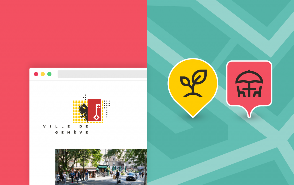
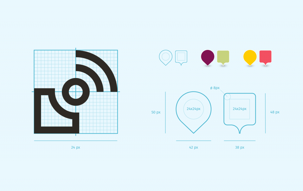
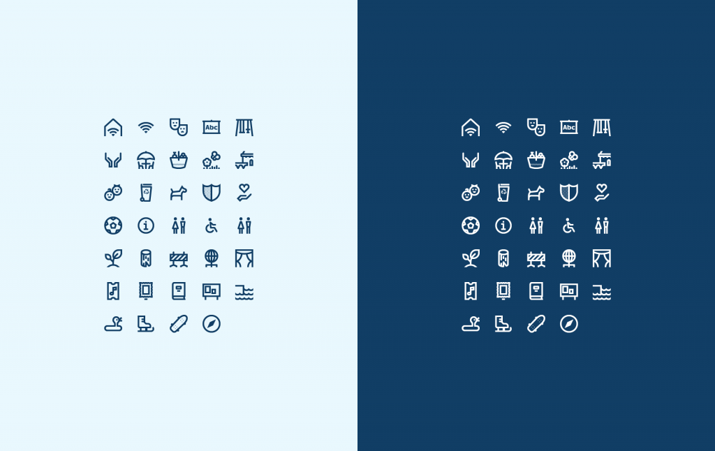
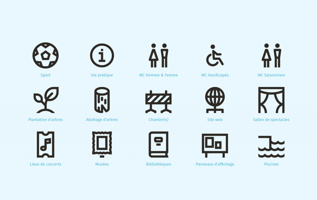
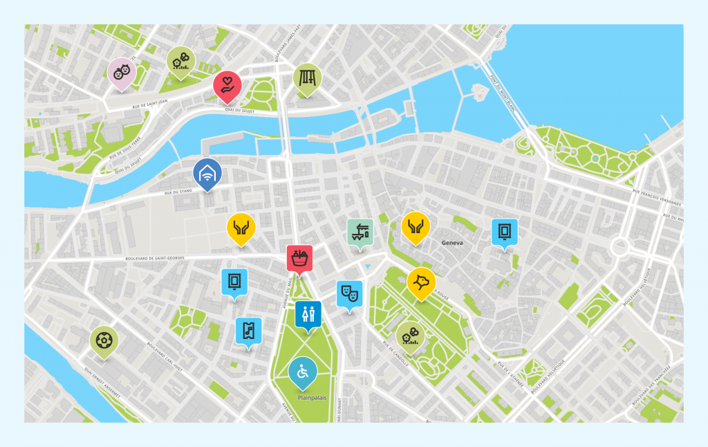
When you think of a city, you most probably also think of a city map. The City of Geneva is no exception to this rule. These maps must display the numerous services of Geneva therefore we designed a custom icon collection. The aim is to bring visual consistency to information display. The second goal is to provide a foundation collection that can be expanded further as needed. You will will, of course, see a connection between the illustrations and this icon collection.
The “Que faire à Genève” newsletter
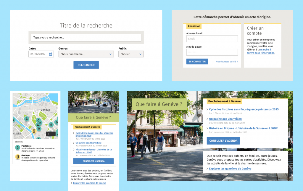
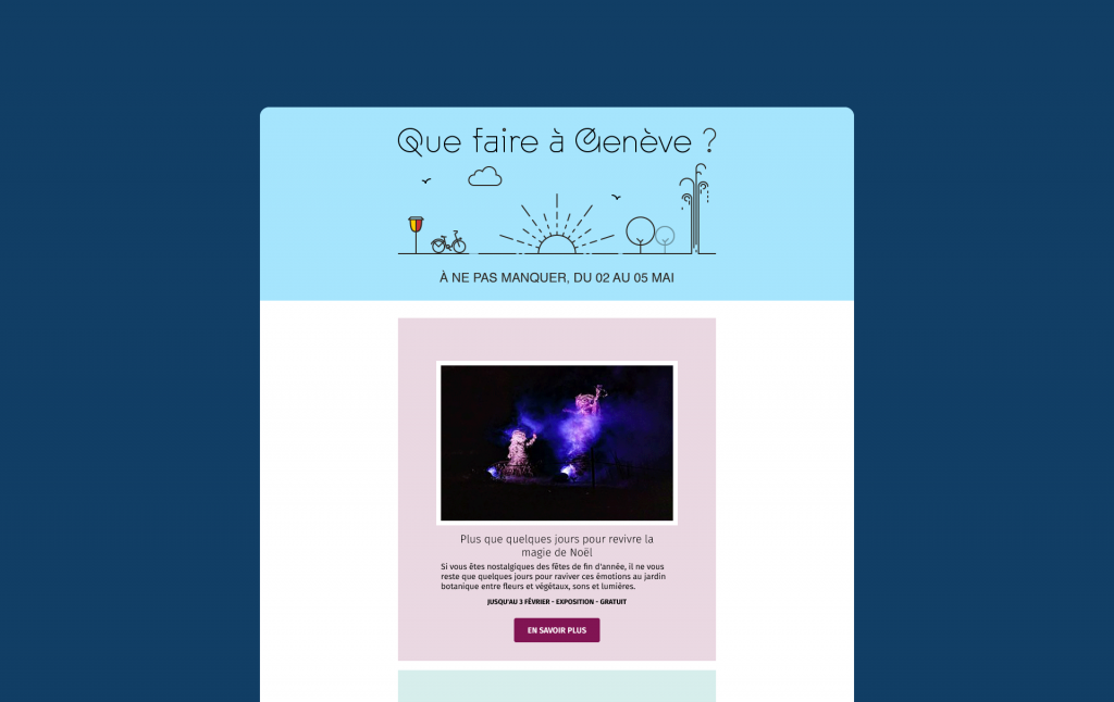
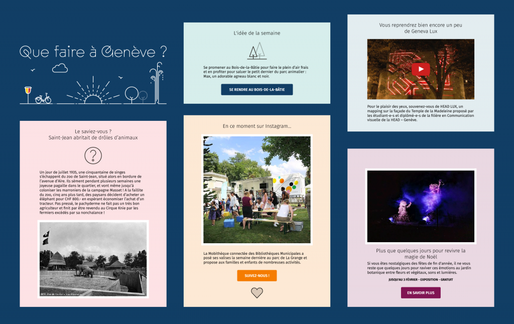
The newsletter is an important and powerful tool in today’s communication strategy for cities. Geneva has the possibility to stand out with a refreshing offer of weekend events. We composed a modular template for this newsletter. A fresh dose of information that shows readers what to do and where to go out in Geneva. You wonder what to plan? Start by subscribing to the newsletter!
Handover for technical implementation
We made sure that all these design elements were well-documented, to get a smooth transition to HTML/CSS templates. We wanted to make sure that the work done so far would move forward in the given direction. We're used to coding both frontend and backend of projects, so we were able to provide the technical team with a well documented design. Of course, we had our curiosity sustained on a regular basis to make sure it was understood and well implemented.
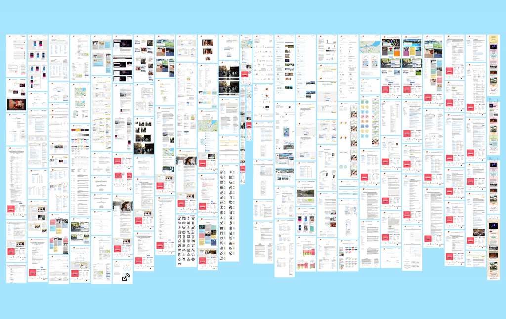
Just below you can find an overview of the approximately 130 mockups made to document the design of this project.
The "real" project begins
The new website is online, and we are happy and proud of it. It's time for the people of Geneva to make this new platform their own. It’s common for us to say that the projects begin once they have been pushed online… Now that everyone has access to it, the website will evolve and grow, like a child that’s leaving the family nest. Have a good trip, see you soon!


