In 2026, there are three major image formats used on the web: JPEG (along with its cousins PNG and GIF), WebP, and AVIF. Three formats, three eras, three different philosophies.
These formats don't coexist by accident. Each one is the result of a technological leap forward. JPEG is the veteran—universal, reliable, and supported by every browser for decades. WebP and AVIF are much newer, and not every browser (or cloud provider) fully supports them yet... but we'll come back to that. 😉
Before diving into formats, I'd like to explain why this topic is far more important than it might seem.

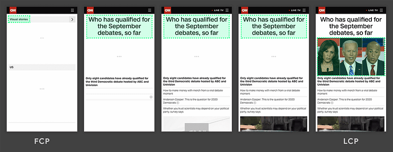
The three Core Web Vitals metrics—LCP, INP, and CLS—are all directly affected by image weight and loading behavior.
Why Image Formats Matter
Here's a truth that's often underestimated: images account for a huge portion of a web page's total weight. And page weight has a direct impact on loading speed. And loading speed? Google pays very close attention to it.
Through the Core Web Vitals, Google heavily penalizes slow websites in search rankings. Images are at the center of the issue. According to the 2025 Web Almanac, they are responsible for the Largest Contentful Paint (LCP) on 85% of desktop pages and 76% of mobile pages.
Optimizing your images is probably the single most impactful thing you can do to improve web performance—and therefore SEO.
To address this problem, there are two golden rules:
- Compress images using a modern, efficient format.
- Serve the correct image size for the user's screen.
Let's start with compression.
WebP and AVIF: The Compression Revolution
The numbers are striking: a 3 MB JPEG can be reduced to around 600 KB with AVIF while maintaining the same visual quality. The equivalent WebP version would typically weigh around 1.95 MB.
In short:
- WebP compresses roughly 25% better than JPEG
- AVIF goes even further, delivering 50% to 80% savings
This level of reduction fundamentally changes the performance equation.
Compression Alone Isn't Enough
Imagine serving a 4,000-pixel-wide image to a mobile user when it only occupies 400 pixels on screen.
That's 100 times more pixels than necessary being transferred across the network.
A monumental waste—and once again, Core Web Vitals will make you pay for it.
That's 100 times more pixels than necessary being transferred across the network.
A monumental waste—and once again, Core Web Vitals will make you pay for it.
“ The rule is simple: never serve an image that's larger than the size at which it will actually be displayed. ”
Our Process at Antistatique
To manage this properly, design and frontend teams need to agree on two things upfront:
- All image aspect ratios used throughout the project (1:1, 16:9, 4:3, etc.)
- A predefined set of image widths available to browsers
With these two pieces of information, every required image variation can be generated automatically.
To simplify this process, we use a small script that can be adapted to the configuration requirements of any technology stack.
For example, in a WordPress theme:
// bun run web/app/themes/my-theme/assets/config/images.ts | pbcopy

const ratios = ['3:2', '5:6', '16:9', '21:9', '1:1', 'original'];
const widths = [30, 256, 384, 690, 750, 828, 1080, 1400, 1920, 2048, 3840];
const formats = ['jpg', 'webp', 'avif'];

const imageStyles: string[] = [];

for (const ratio of ratios) {
  for (const width of widths) {
    for (const format of formats) {
      if (ratio === 'original') {
        imageStyles.push(`          [
            'name' => 'original_${width}_${format}',
            'width' => ${width},
            'height' => 9999,
            'crop' => false,
          ],`)
      } else {
        const [w, h] = ratio.split(':').map(Number);
        imageStyles.push(`          [
            'name' => '${w}_${h}_${width}_${format}',
            'width' => ${width},
            'height' => ${Math.round(width*h/w)},
            'crop' => true,
          ],`)
      }
    }
  }
}

for (const style of imageStyles) {
  console.log(style);
}
With this fairly typical setup—5 fixed aspect ratios, one flexible ratio (original), 11 widths, and 3 output formats—we end up generating 198 files for every uploaded image !
That's when we started asking the real question.
Do We Really Need Three Formats?
Originally, AVIF arrived long after WebP. But in 2026, let's look at browser support:
WebP: caniuse.com/webp
- 🌍 Global : 96.39%
- 🇨🇭 Switzerland : 94.52%

AVIF : caniuse.com/avif
- 🌍 Global : 94.89%
- 🇨🇭 Switzerland : 93.26%

The gap?
Less than one percentage point.
And AVIF delivers significantly better compression than WebP. The conclusion was obvious:
At Antistatique, we decided in 2026 to completely drop WebP in favor of AVIF.
We now generate AVIF variants exclusively, freeing up a substantial amount of disk space previously occupied by WebP and JPEG files that were rarely—if ever—served to users.
What About the ~6% Who Don't Support AVIF?
Good question.
Without a fallback, those users see... a blank box.
Without a fallback, those users see... a blank box.
Not ideal.
At the same time, we didn't want to generate dozens of JPEG variants for just 6% of users. That would recreate the very problem we're trying to solve: wasted storage and unnecessary environmental impact.
We needed a third option.
At the same time, we didn't want to generate dozens of JPEG variants for just 6% of users. That would recreate the very problem we're trying to solve: wasted storage and unnecessary environmental impact.
We needed a third option.
Enter Dithering
The idea came from Low-tech Magazine, a blog hosted on a solar-powered server whose visual design fully embraces technical constraints.
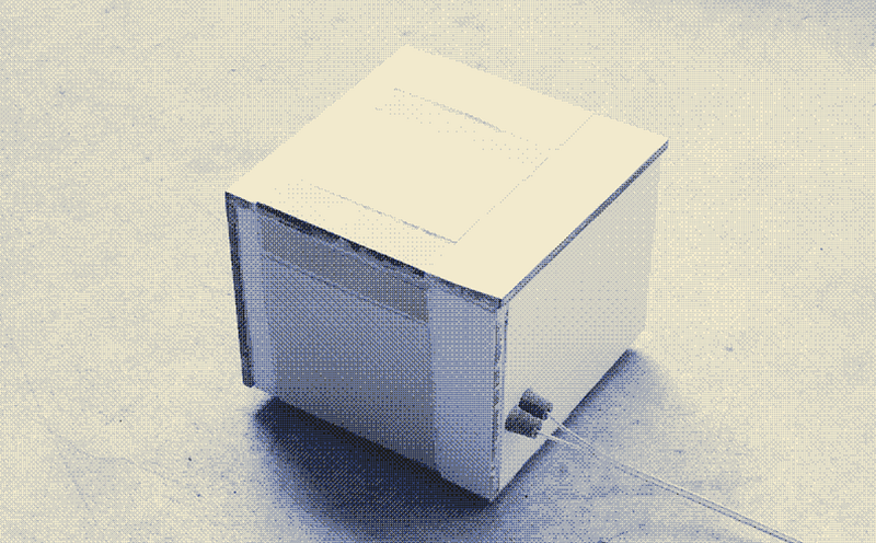
The dithering effect produces a low-resolution monochrome image that resembles an old film photograph. Less impressive than the original image? Sure. But it only weighs a few hundred bytes and remains compatible with browsers from another era.
The concept is simple: generate a single fallback version of each image:
- Low resolution
- Monochrome
- PNG format
Because with so few colors, PNG often weighs less than JPEG. The image is incredibly lightweight—even when the original file is 5000 × 4000 pixels. No breakpoint-specific versions. No optimized formats. Just one tiny file that works everywhere.
Here's a simple ImageMagick command for generating our dithered fallback:
$ magick in.jpg -scale 640 -colorspace Gray -ordered-dither h4x4o -colorspace sRGB -opaque black out.pngIs it faithful to the original image? No. Is it readable? Absolutely. And most importantly, who are we targeting? Users running browsers that haven't been updated since 2019. They probably have bigger challenges on the modern web than image quality. 😄
Conclusion
Our final stack looks like this:
- ✅ AVIF — multiple responsive sizes for 94%+ of users
- ✅ Dither fallback — a single low-resolution monochrome image for everyone else
The benefits are tangible:
- Our projects consistently maintain 100/100 Core Web Vitals scores
- We generate only the images our users actually need
- We save gigabytes of disk space that would otherwise sit unused
- And we make a small contribution to sustainability, because every byte avoided is energy saved
A small teaser if you'd like to go further: we'll soon publish an article about what may become the future image format of the web: JPEG XL.
Stay tuned. 🤓
❤️ Over to your keyboards.
Sources
Hardi (Juin 2025) — Core Web Vitals: How Image Optimization Impacts Your Lighthouse Score.
https://dev.to/hardik_b2d8f0bca/core-web-vitals-how-image-optimization-impacts-your-lighthouse-score-3407
https://dev.to/hardik_b2d8f0bca/core-web-vitals-how-image-optimization-impacts-your-lighthouse-score-3407
Kostya Stepanov (Fév. 2026) — How Web Design Impacts Page Speed and Core Web Vitals.
https://medium.com/@Shakuro/how-web-design-impacts-page-speed-and-core-web-vitals-ea441796b5e5
https://medium.com/@Shakuro/how-web-design-impacts-page-speed-and-core-web-vitals-ea441796b5e5
HTTP Archive (Avr. 2026) — The Web Almanac.
https://almanac.httparchive.org/en/2025/performance
https://almanac.httparchive.org/en/2025/performance
Andrei Alba (Nov. 2025) — AVIF vs WebP: Which Modern Image Format Is Better?
https://shortpixel.com/blog/avif-vs-webp
https://shortpixel.com/blog/avif-vs-webp