Chrono24 : The luxury watch buying experience
Auteur(s) de l'article
A purchase that is both emotional and rational
I still remember my first watch, a beautiful blue Flik Flak. I won’t lie, it was pretty cool. At the time, though, I had no idea about the massive luxury watch industry.
If I could choose my Flik Flak in complete innocence back then, it would be a very different story today if I were buying the watch of my dreams. As you probably know, a luxury watch is quite an investment. And investment usually means a long period of reflection (at least for me, even if this scenario is purely hypothetical. You do you).
When someone buys a luxury watch, several questions come into play:
- Is the price justified?
- Is the seller reliable?
- Is this the right model?
- Is this the market price?
Answering these questions (sometimes quickly, sometimes not) often leads to multiple browsing sessions, plenty of comparisons, and a constant search for reassurance.
A different kind of e-commerce journey
In a “typical” e-commerce experience, the goal is often to speed up the purchase decision. Discounts, abandoned cart emails… in short, everything is designed to push us to act quickly.
But this isn’t the case for every product. Buying a luxury watch is far from a typical purchase. It’s a long and thoughtful journey. The objective of the user experience shifts: instead of accelerating the decision, it needs to reassure and support the buyer’s reflection, something Chrono24 clearly understands.
In this context, trying to shorten the journey at all costs, as many e-commerce platforms do, would likely be a mistake. Chrono24 takes the opposite approach: building a platform that supports the decision rather than rushing it.
In practice, this means:
- detailed and verifiable information
- trust signals (certifications, buyer protection)
- tools to compare and save watches
The idea is simple: give users the time and the tools they need to make a confident decision.
The strategy: encouraging exploration
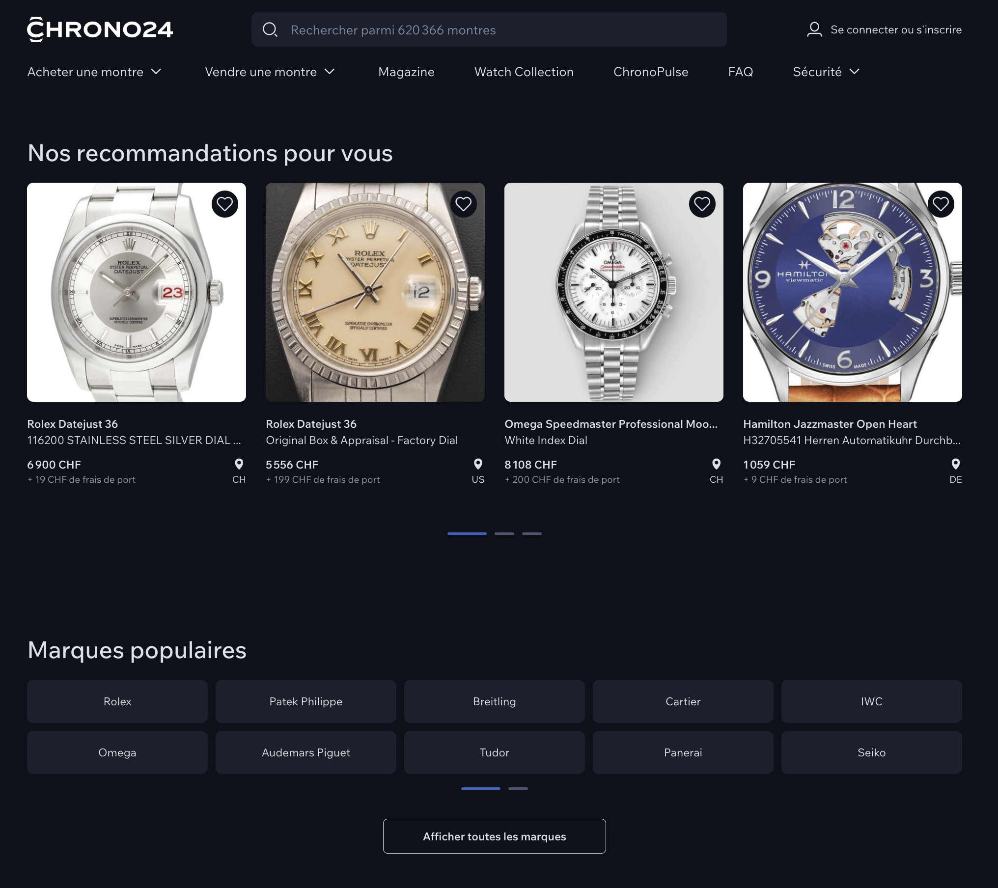
As soon as users land on the site, everything is designed to encourage exploration. The search bar is highly visible, popular brands are highlighted, and trust signals appear early in the experience. Once users log in, the experience becomes more personalized. Suggestions are based on browsing history and preferences, helping maintain continuity in the search process.
The product page then becomes the central point of the journey. It’s where users come back multiple times to compare options, check details, and most importantly… picture themselves wearing the watch. I’ll admit I also caught myself imagining what it would be like to wear that beautiful Rolex. Key elements such as the price, images, and model are immediately visible, while more technical details appear further down the page for those who want to dive deeper.
A solid and consistent UI
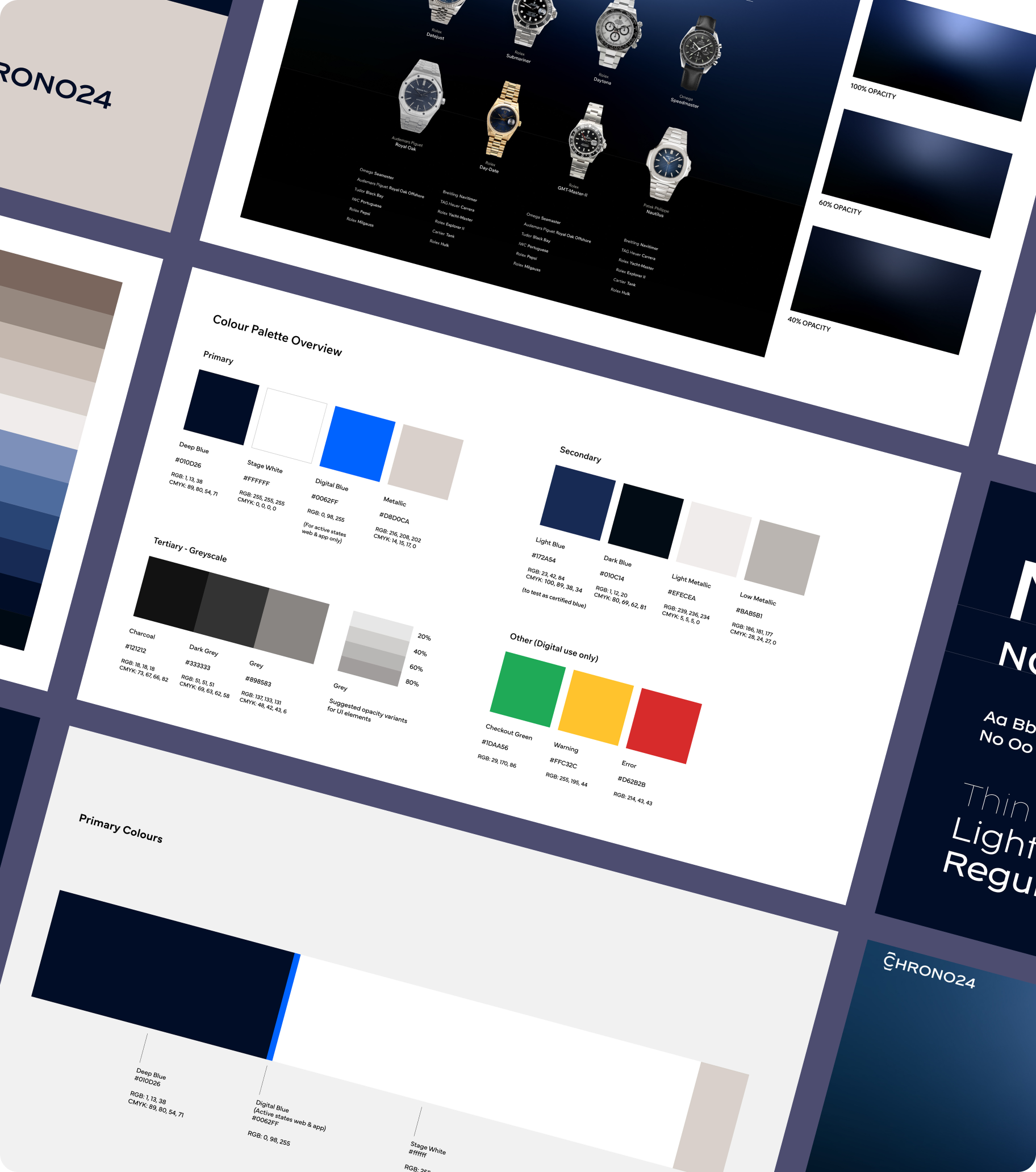
On the interface side, Chrono24 is pretty much top of the class. The design system is well structured and helps maintain visual consistency at scale. Beyond the aesthetic aspect, it also allows teams to design and develop faster, since the components and rules are already defined and ready to use.
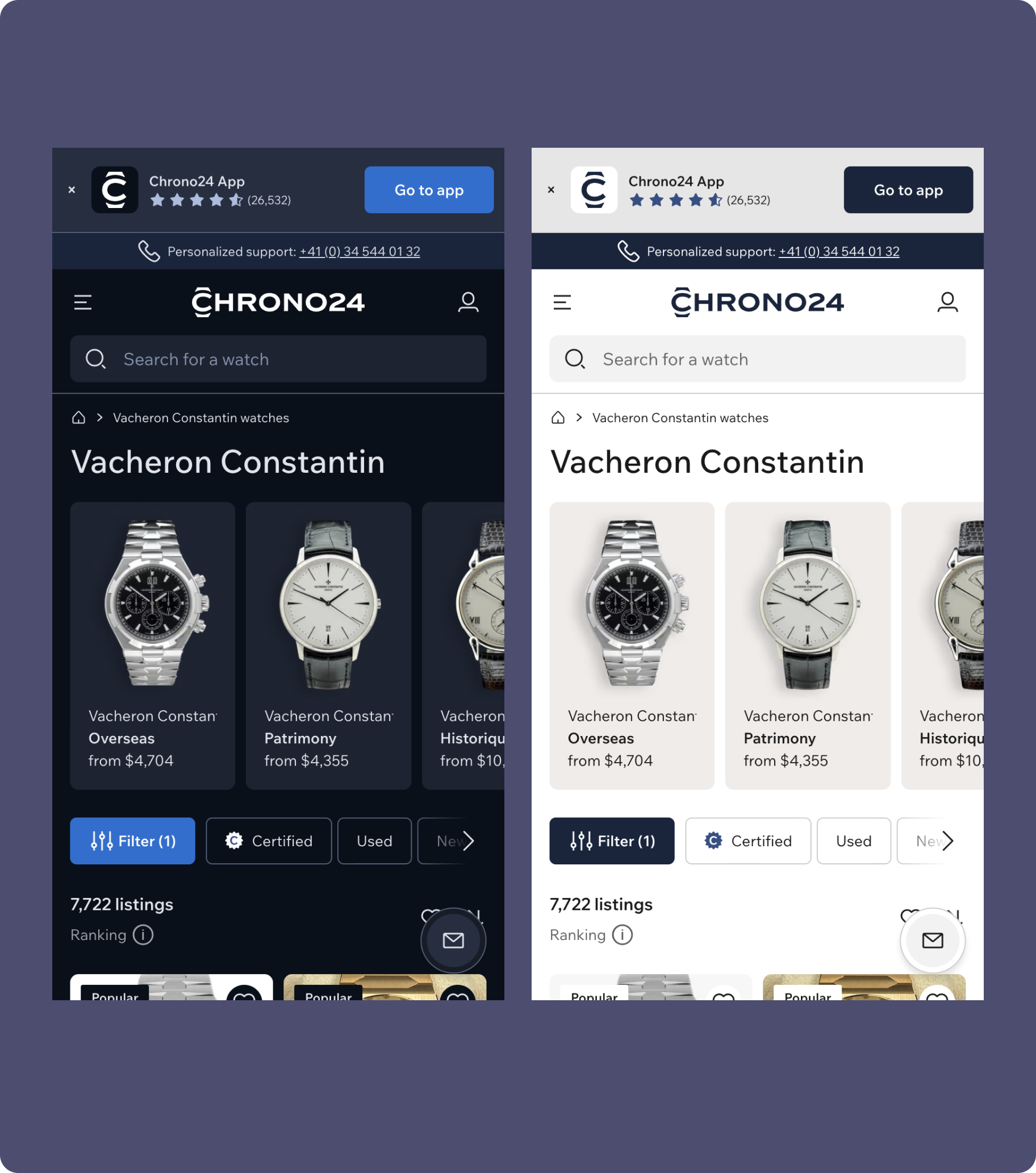
On mobile, the experience is particularly well optimized. Touch targets are designed for thumb navigation, which reduces errors and makes browsing smooth on smaller screens.
Special mention for the dark mode: a real masterclass (especially coming from someone who complained about it in our last newsletter).
The search filters are also well designed. The most common options are immediately visible, while more experienced users can access more granular filters.
Accessibility meets AA standards, with compliant color contrasts and keyboard navigation. However, we did notice a slight visual ambiguity in some components: it can sometimes be difficult to distinguish what is clickable from what is not.
A quick reminder: accessibility is essential for inclusion. In addition, search engines like Google technically favor websites whose semantic structure is accessible.
The real challenge: managing information density
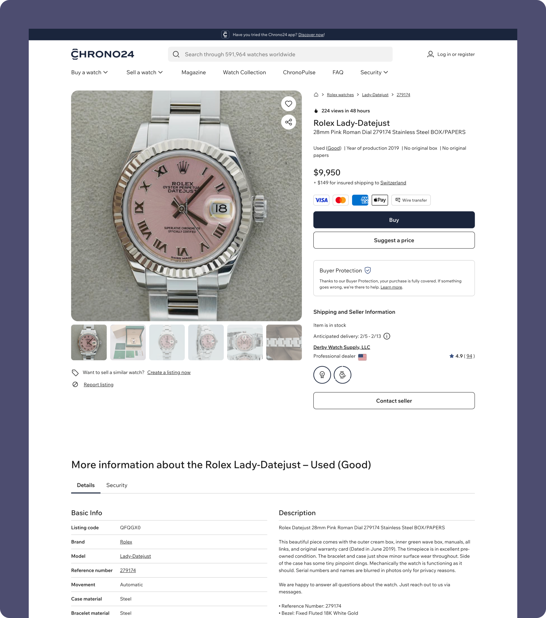
If there is one point that stands out from the analysis, it is the information density on the product page. In a high-involvement purchase like this, information is obviously essential. But it’s a delicate balance: too little information creates friction… and too much does as well.
An interface that is too dense can:
- increase cognitive load
- give a more “catalog” than “luxury” impression
- harm the perceived value of high-end products
The challenge for Chrono24 will likely be finding a better balance between rich information and visual elegance. For example, A/B testing or heatmaps can help identify low-engagement elements and simplify certain sections.
Key Takeaways
Chrono24’s example highlights an important UX principle: not every shopping journey needs to be accelerated.
For high-involvement purchases, the experience should primarily:
- reduce uncertainty
- build trust
- support the decision-making process
Every digital product has different goals, which require thoughtful strategy, collaboration, and user-centered design. And if you’re looking for support with your own UX/UI projects… you know where to find us ;)